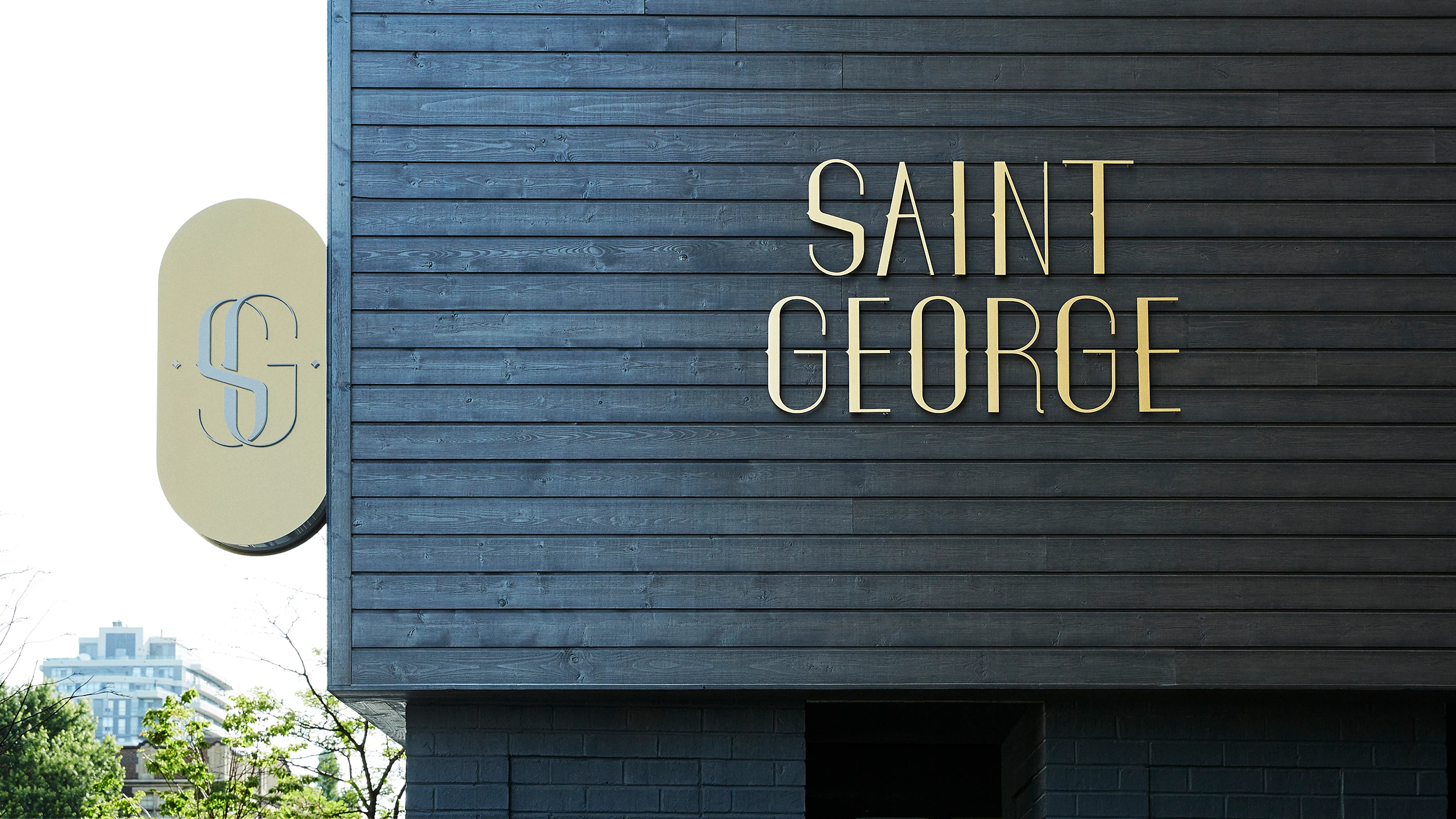
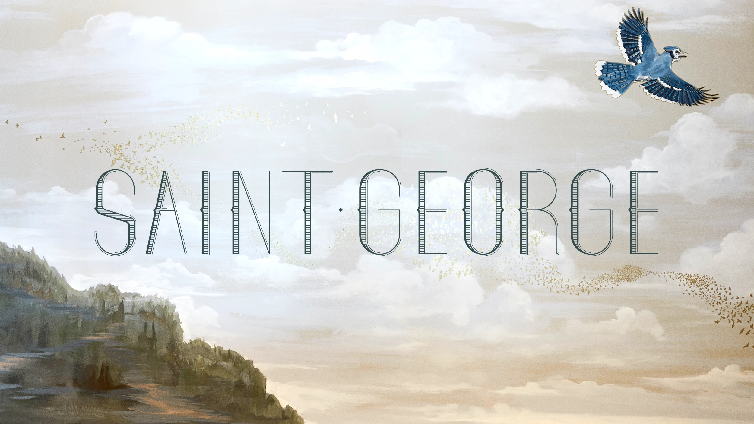
Saint George
Custom lettering and wordmark are signature visual identity elements for Kimpton’s premier Toronto outpost.
Client:
Created with Fine for Kimpton Hotels & Restaurants
Project Components:
Brand Identity, Digital, Environments
Location Photography:
Kimpton Hotels & Restaurants
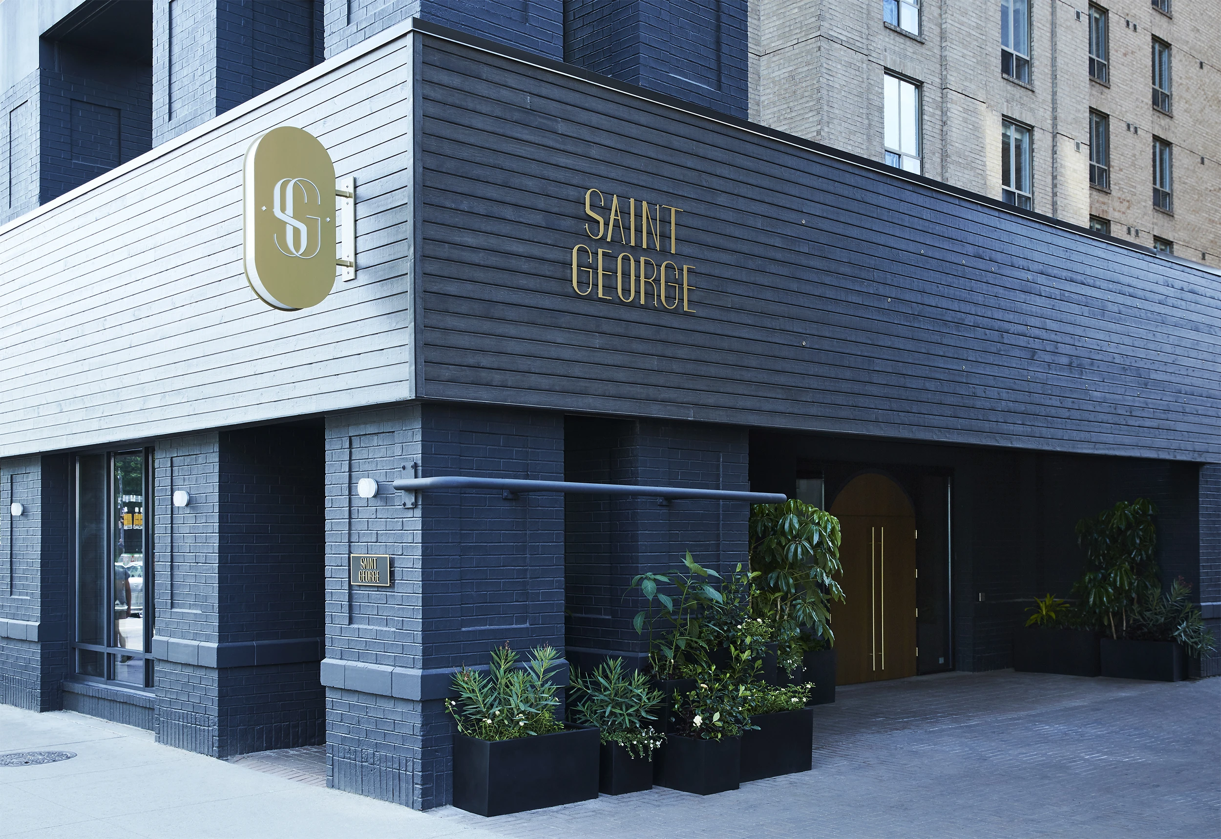
Exterior with Jerry Rugg art by Gabby Frank
Acknowledgements:
Graphis Identity Silver
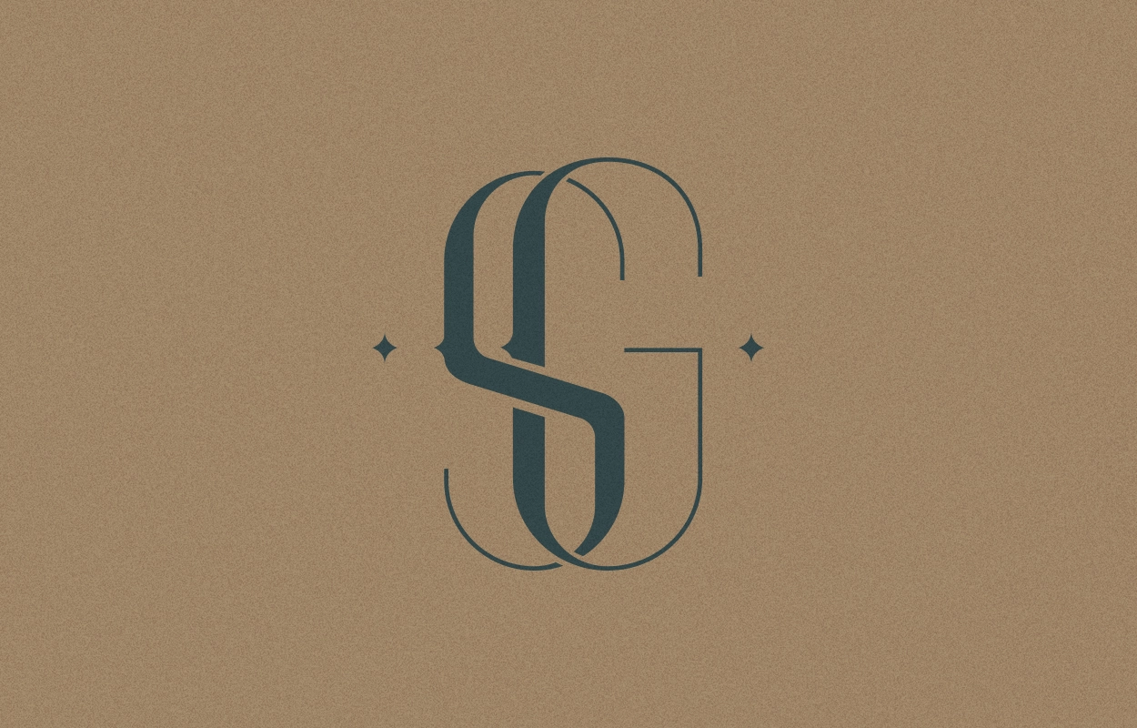
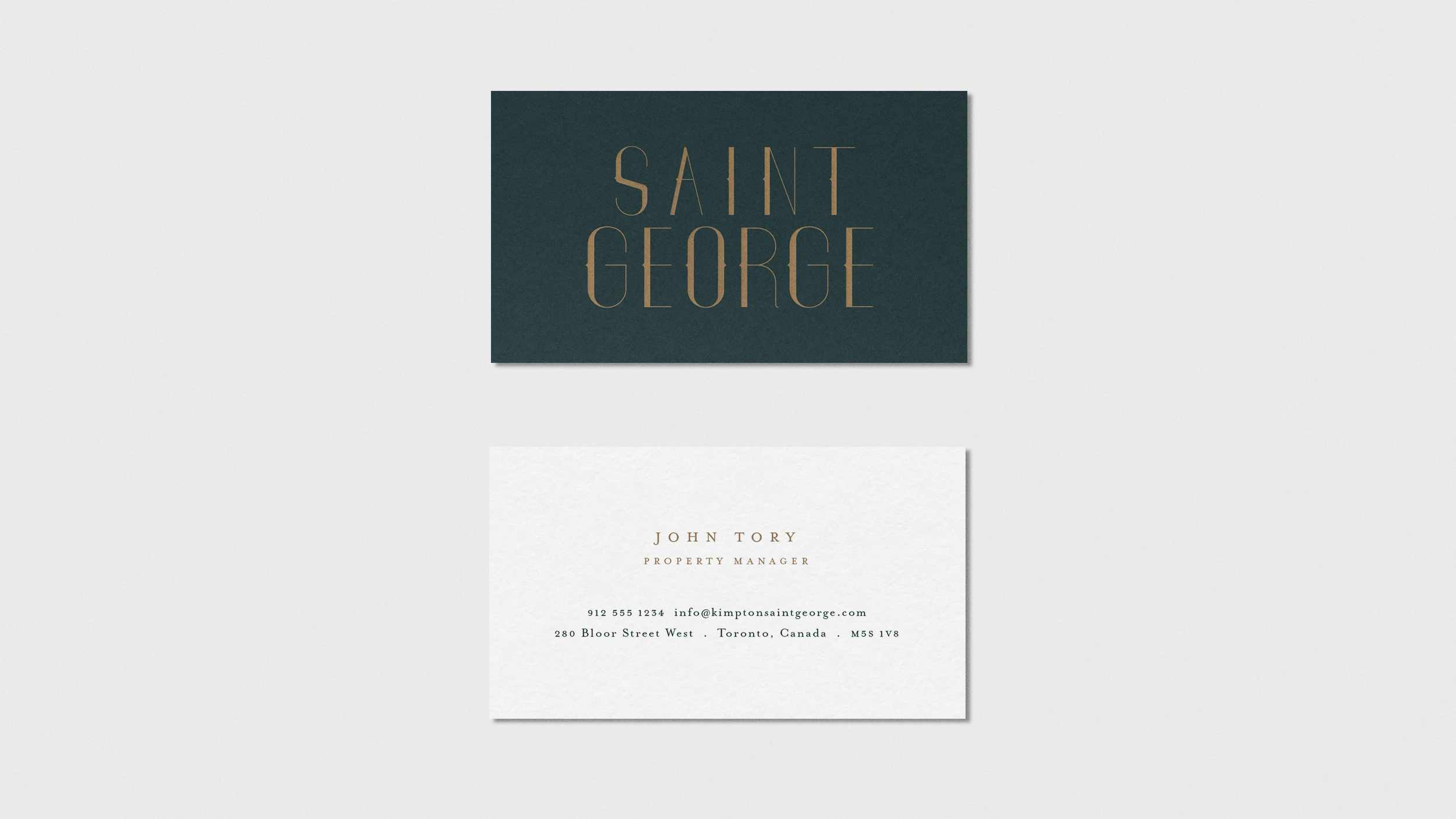
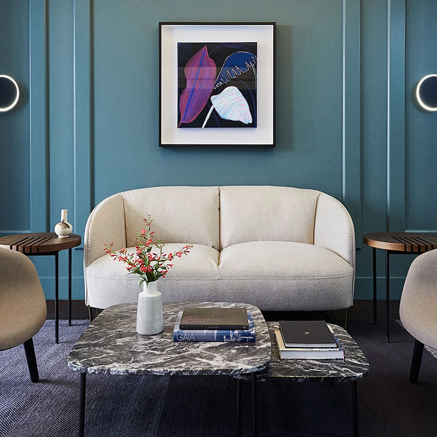
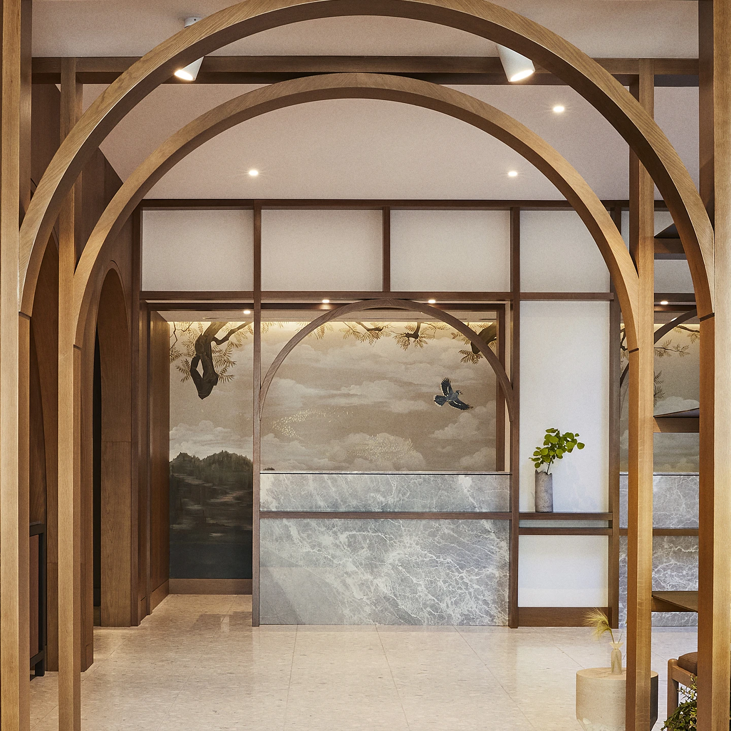
We designed a full alphabet of custom lettering to establish the signature wordmark for the Kimpton Saint George visual identity. Rooted in Toronto’s vibrant cultural Annex neighborhood, Kimpton repositioned and reimagined the old 188-room Holiday Inn into a chic, boutique experience for the brand’s first Canadian outpost. The interior design of The Saint George is characterized by warm earthy tones and plush surfaces, natural materials such as ash wood and granite, and punctuated by playful moments of decor and works by local artists including Tisha Myles and Jerry Rugg. The visual identity for Saint George embodies this artistic extravagance and channels Toronto’s layered heritage, while presenting a modern, Beaux Arts-inspired elegance that reflects the affluence of greater Yorkville with its display of craftsmanship. The visual identity approach keeps Kimpton’s overarching design-led ethos of being ridiculously personal and never boring.
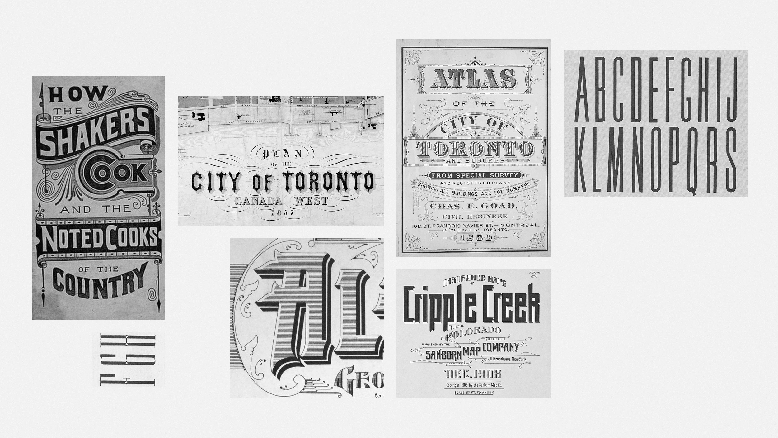
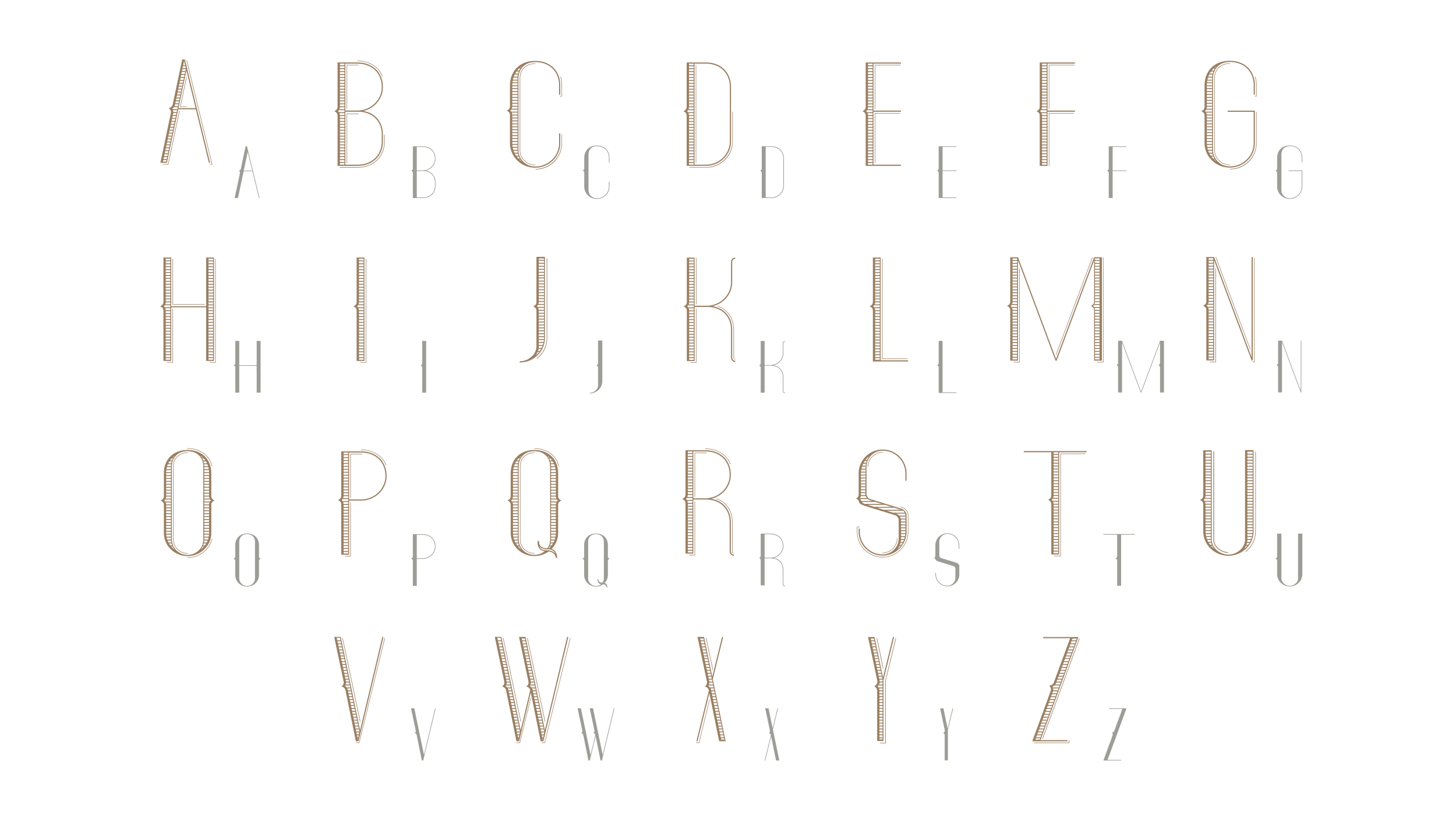
The custom logotype lettering drew from several key influences. The concept renderings of the interior featured multiple distinct moments with geometric, rounded archways (a nod to Toronto’s diverse architectural style and eras) which inspired the forms of the S and G. The original signage of Honest Ed’s— a kitschy landmark store in the neighborhood, had bifurcated letterforms which signaled an eclectic quality that felt like an appropriate nod to the locality and historical significance of of the projects location. Lastly, drawing from research from our TypeDeck and TypeWrap projects a lot of the found typographic ephemera including the Sandborne Company insurance maps featured ornamental elements such as linear shadow, dramatic thicks and tins, and linear hatch patterns all of which aligned with the moves that Mason Studio envisioned with the interior.
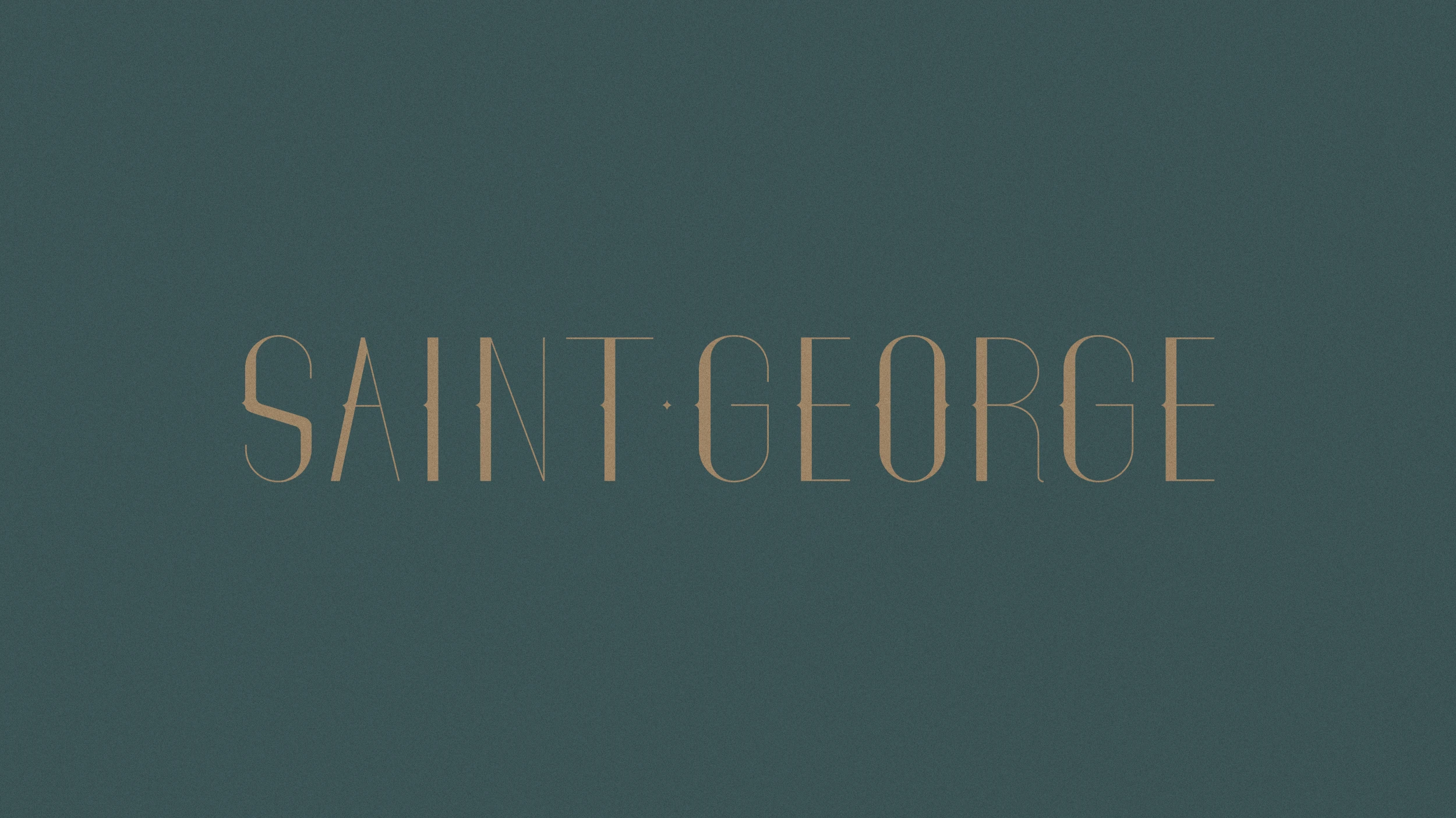
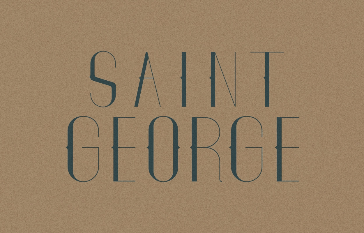
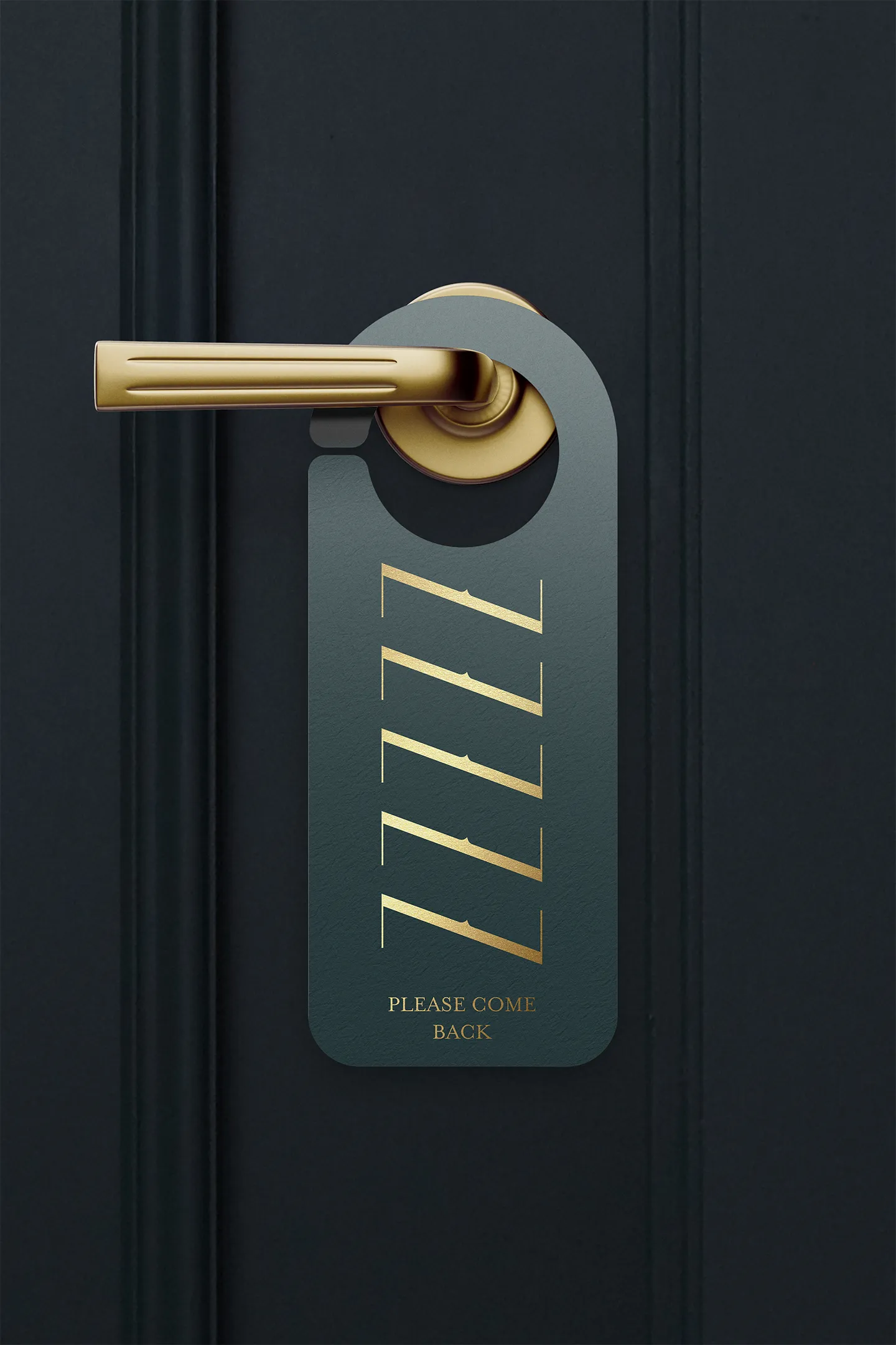
Multiple configurations of the logotype and lettering were created to establish a modular system with longevity and flexibility while delivering a contemporary expression that embraced eclecticism with an emphasis on craftsmanship. Many of the most complicated letterforms of the alphabet where part of the initial logotype drawing, giving way to both full decorative and solid alphabets which provided the identity with a signature graphic asset.


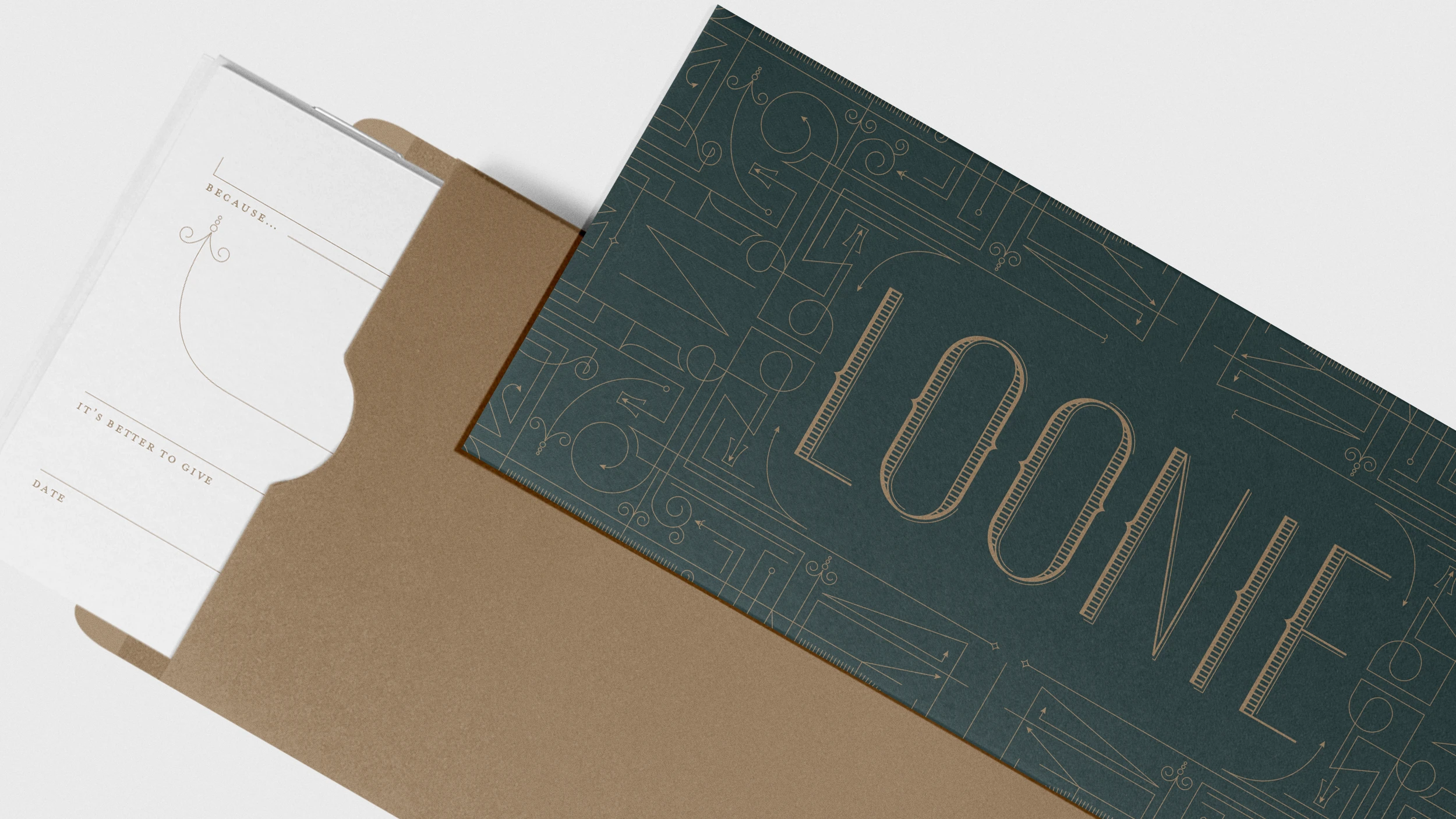
A graphic pattern in the same style of the ornamented version of the logotype was drawn to provide an additional layer of texture and an additional graphic device that could be scaled, cropped and enhanced with elevated production techniques including foil stamping for signature moments. The custom alphabet was combined with the pattern for signature moments including gift certificates featuring the word Loonie —a nod to the famous Canadian one dollar gold coin.

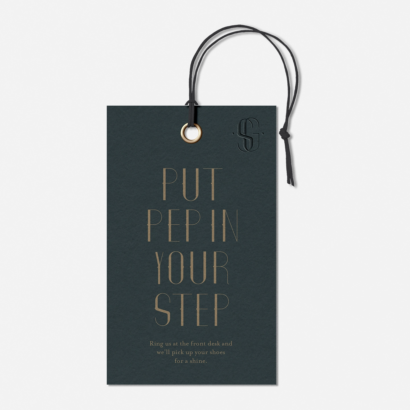
Playful messaging was elevated through the use of the custom alphabet for experiences including umbrellas available in the lobby, and shoe shine services—moments of delight that inspire guests to take a second look.
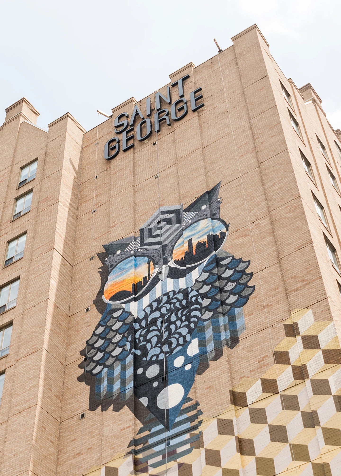
Toronto street artist Jerry Rugg was commissioned to paint the owl mural with glasses reflecting the city skyline. The stacked Saint George logotype offers an eclectic juxtaposition to the mural and the original architecture of the building.
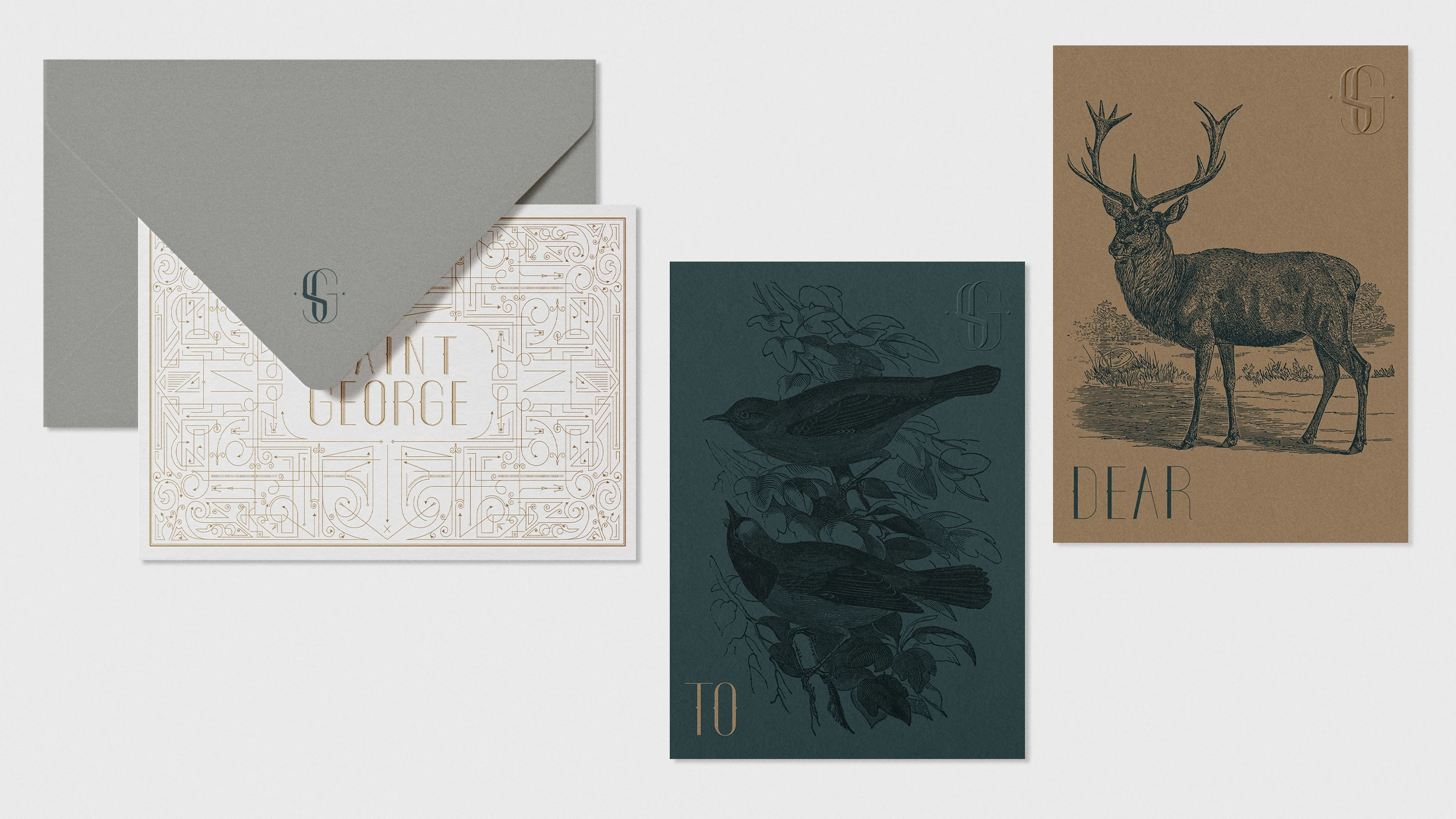
Notecards featuring engraved-stye illustrations of various Canadian native wildlife were paired with homophones to extend the playful and witty experience for guests to take with them.