Cookbooks
Art direction and design for cookbooks and food-related publications
Client:
Fairwinds Press, Quarry Books, Quarto Publishing Group, Harvard Commons
Project Components:
Editorial Design, Illustration
Designing for content we’re personally connected to always brings extra energy to our work—the topic of food and cooking is a perfect example. We love collaborating with content creators, photographers, and stylists to craft rich, beautiful imagery paired with clean, intuitive design with clear typography and strong content hierarchy. Sure, there’s no shortage of recipe websites and apps—Colleen Miller, for example, helped bring Food Network’s In The Kitchen and Cupcakes apps to life—but there’s something uniquely satisfying about creating a physical archive of recipes and food stories. Something you can hold, flip through, and proudly keep on the shelf.
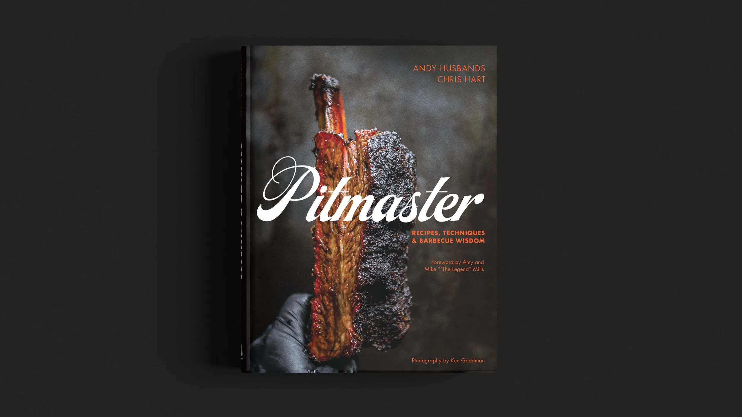
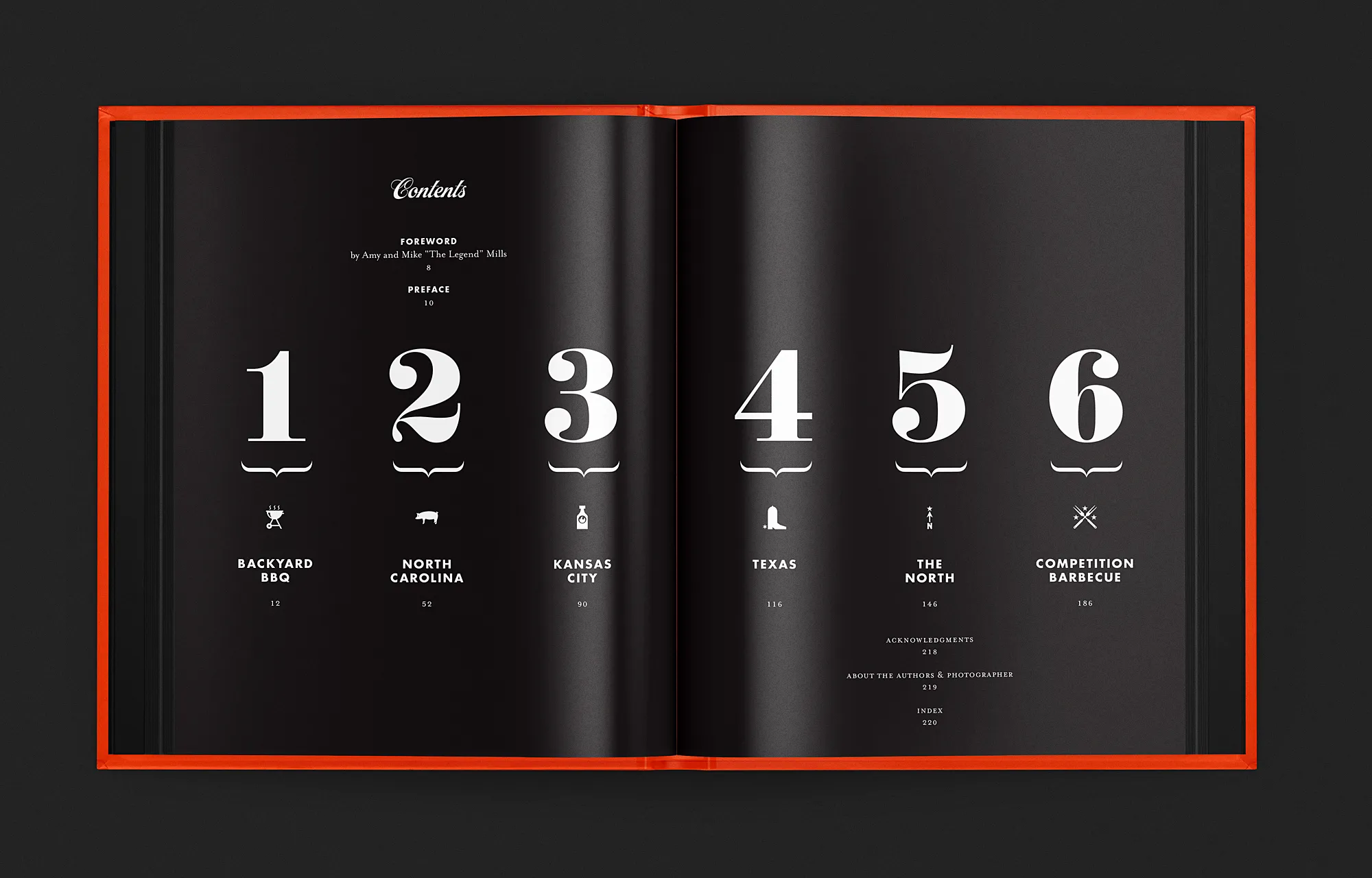
Pitmaster
Authors: Andy Husbands & Chris Hart
Publisher: Quarto Publishing Group, Faiwinds Press
Photography: Ken Goodman
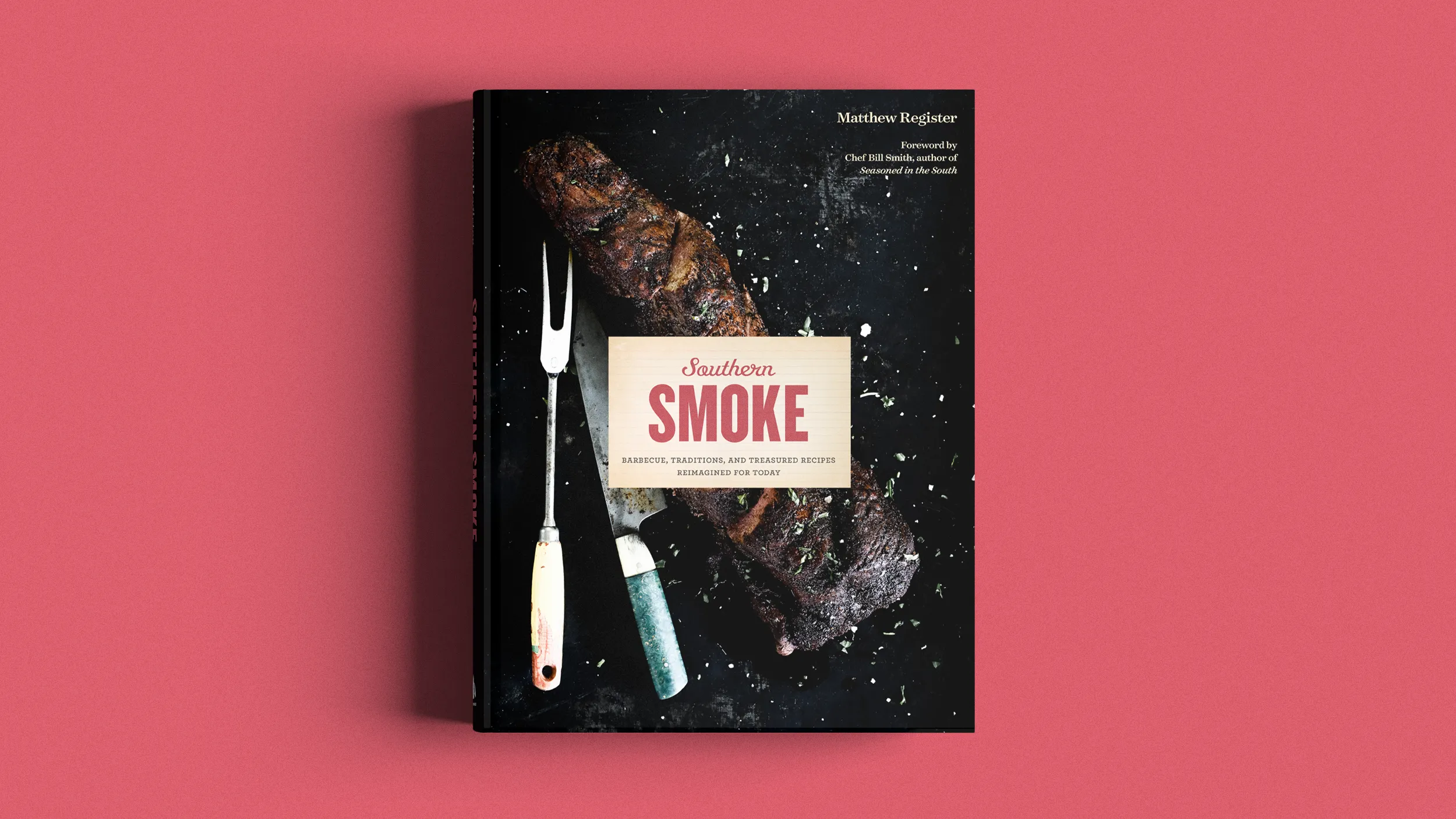
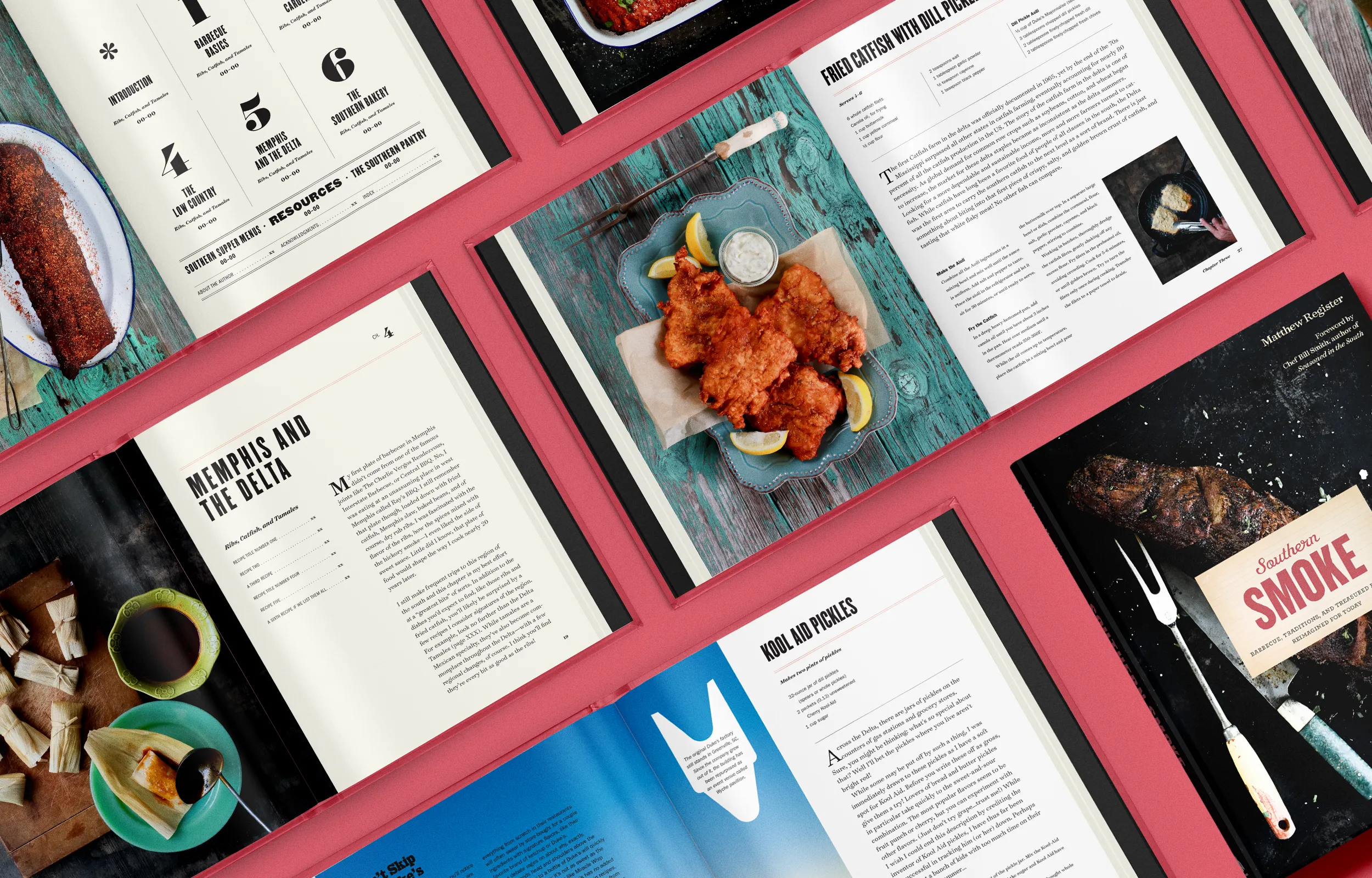
Southern Smoke
Author: Matthew Register
Publisher: Harvard Common Press
Photography: Felicia Perry Trujillo
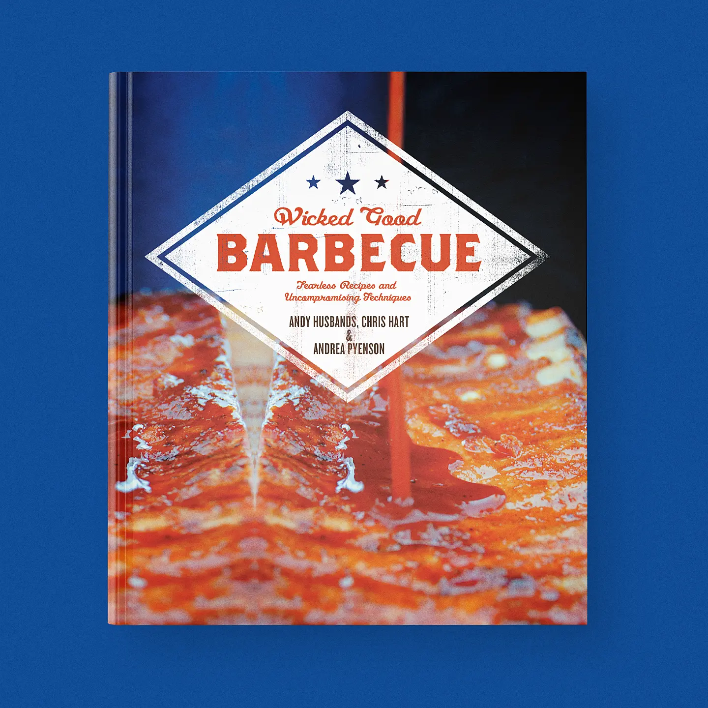
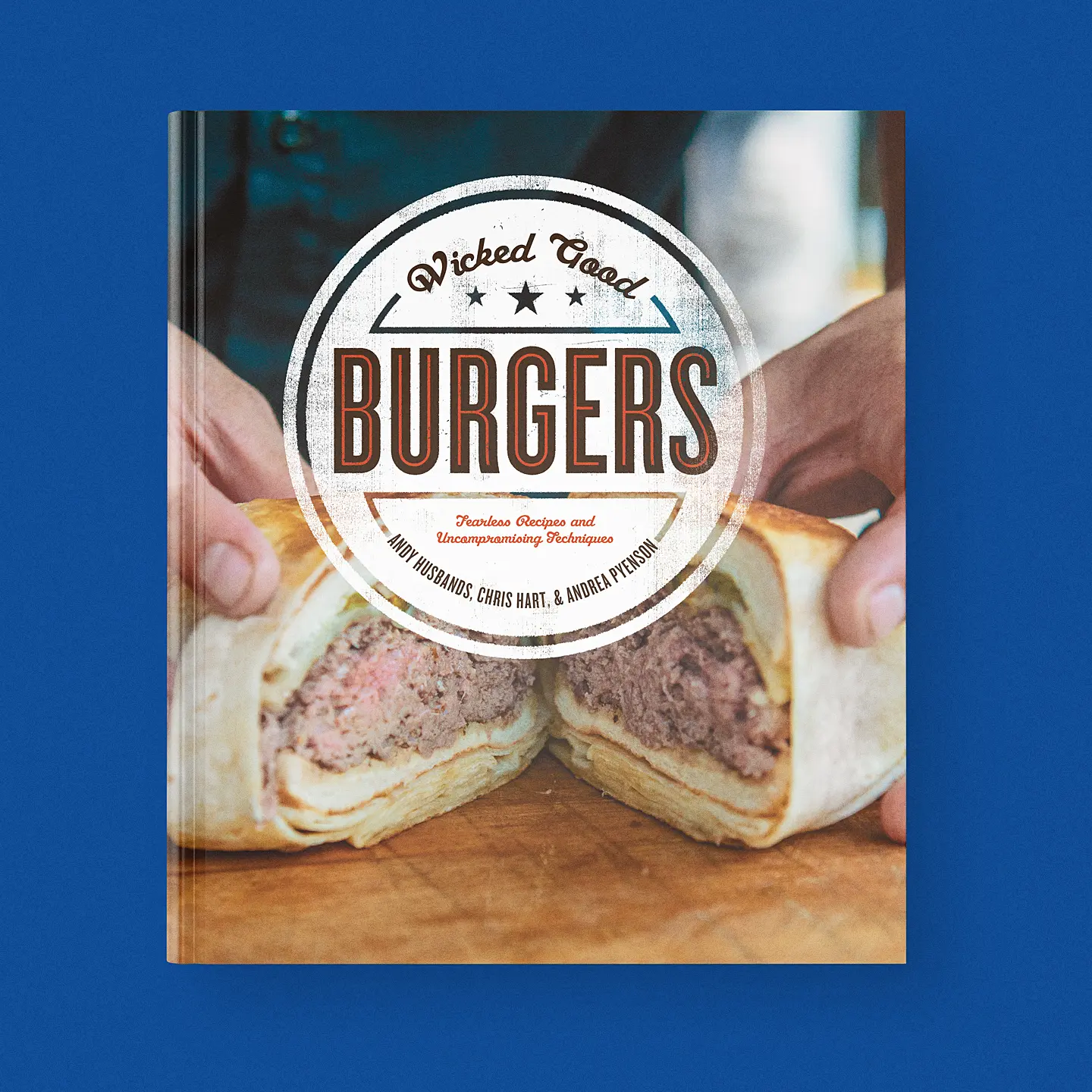
Wicked Good Burgers & Wicked Good BBQ
Authors: Andy Husbands & Chris Hart with Andrea Pyenson
Publisher: Quarto Publishing Group, Fairwinds Press
Photography: Ken Goodman
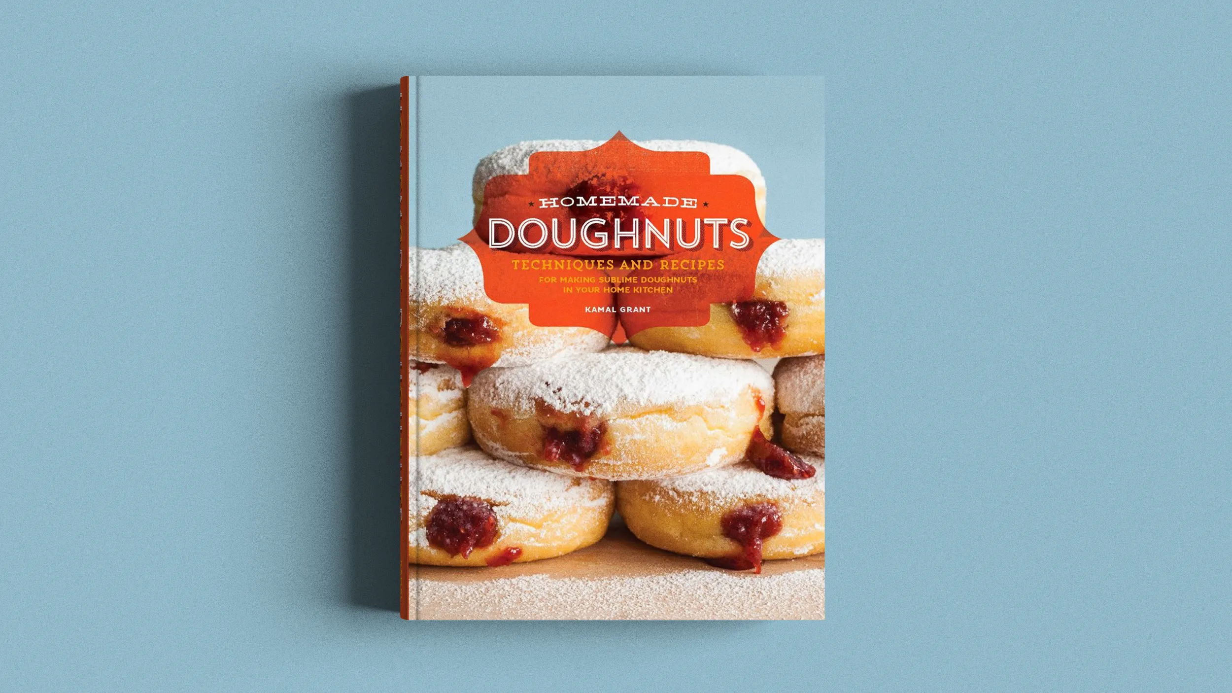
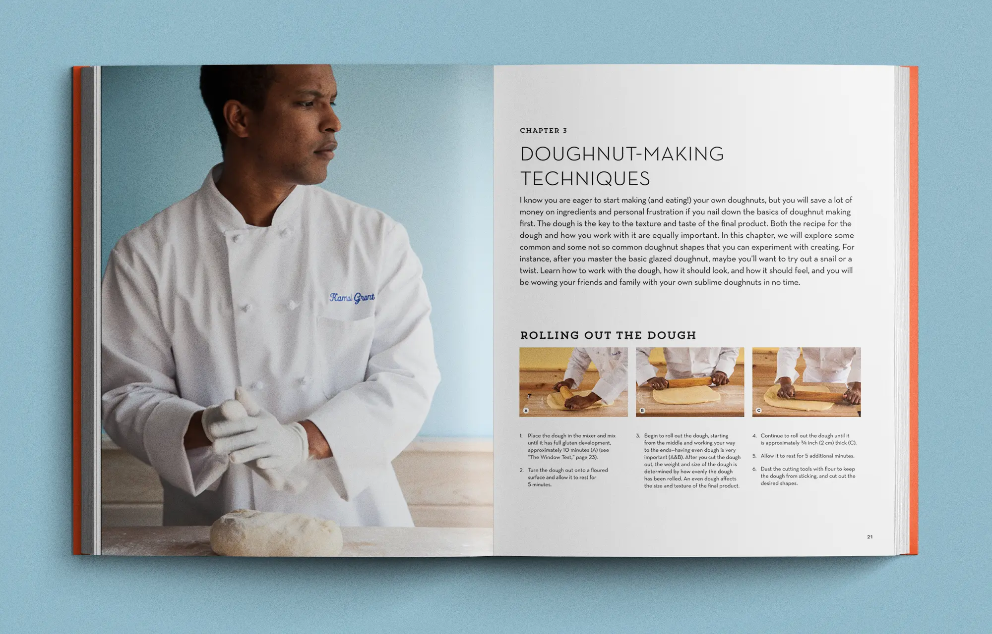
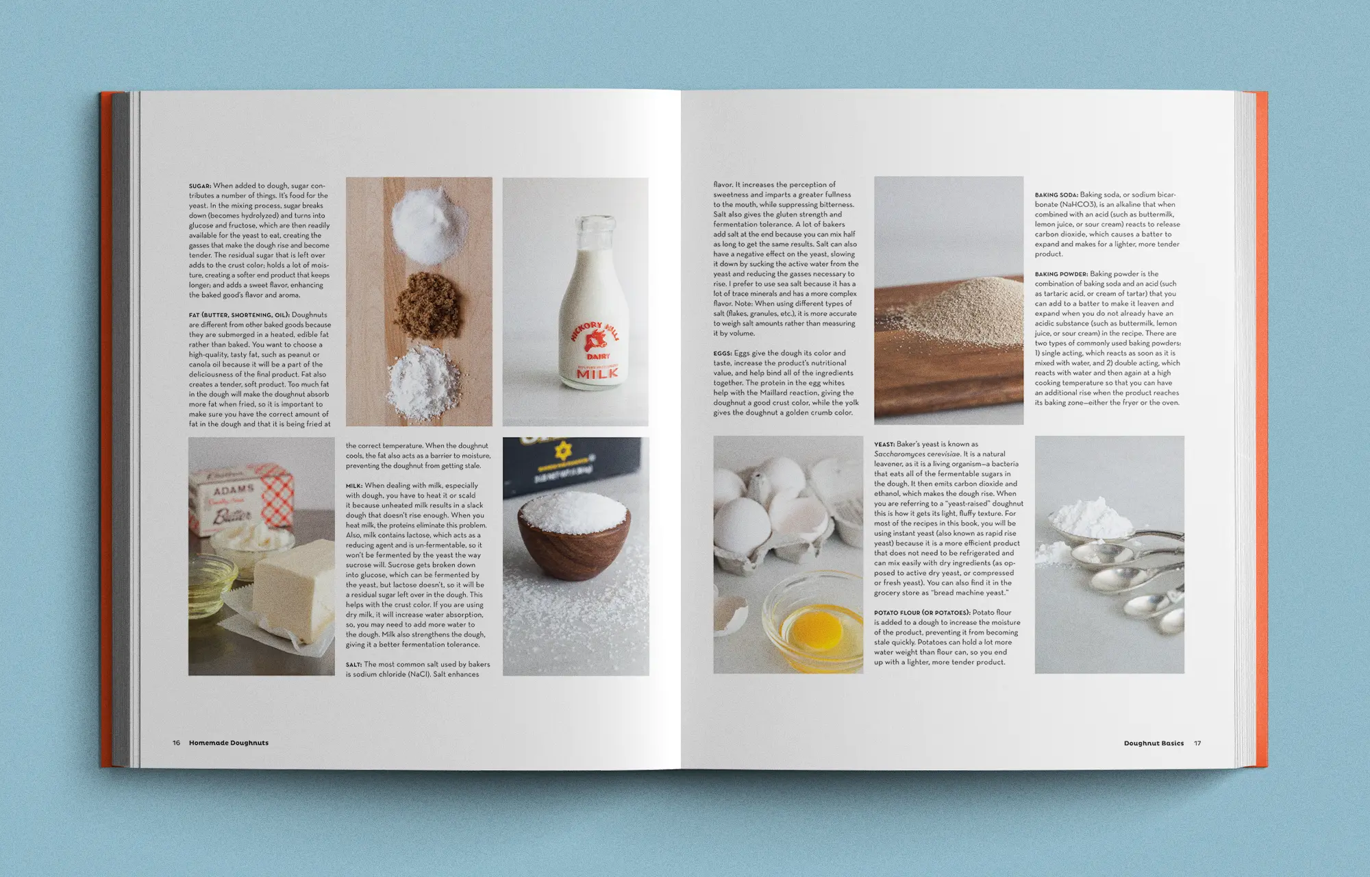
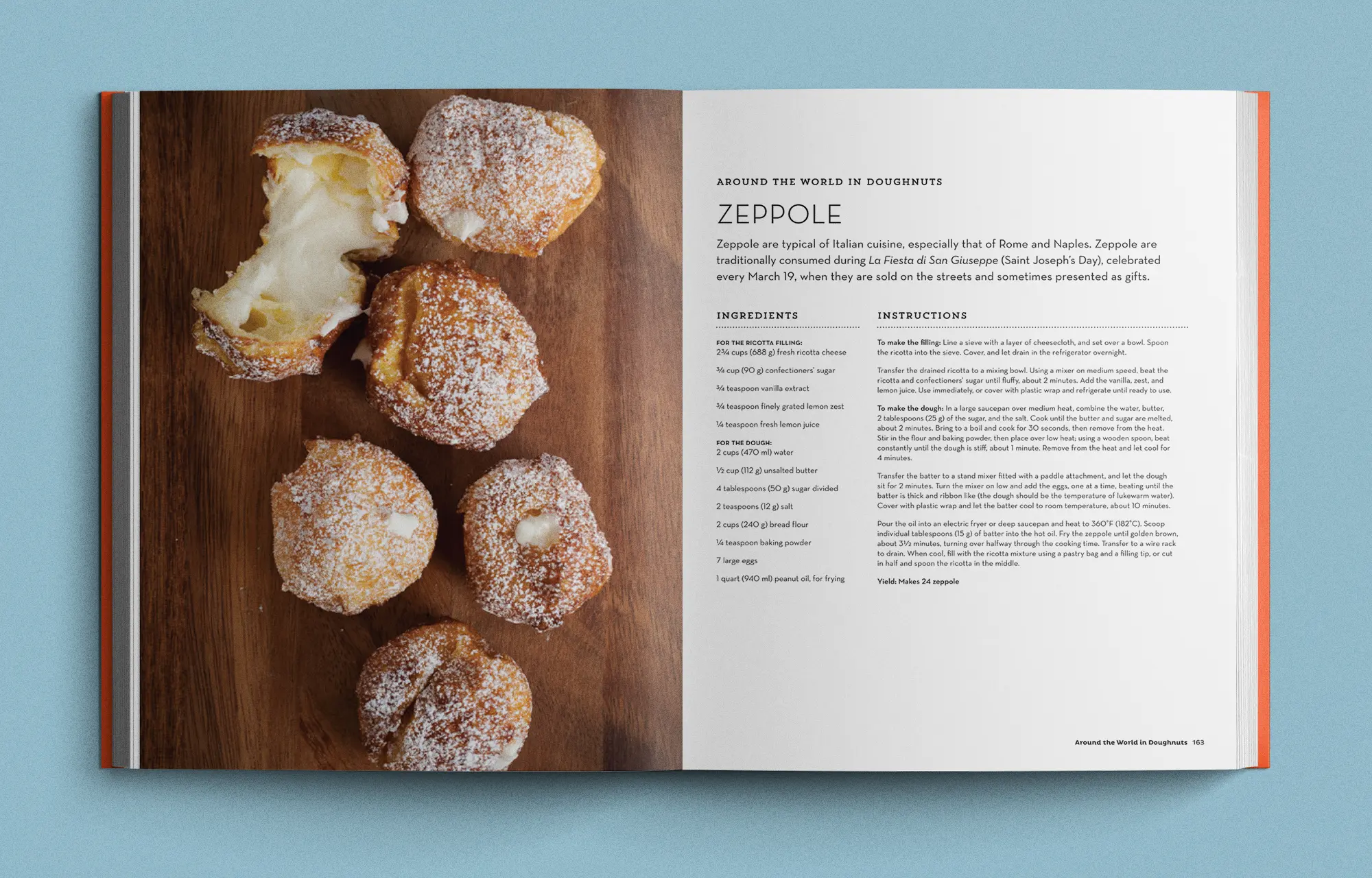
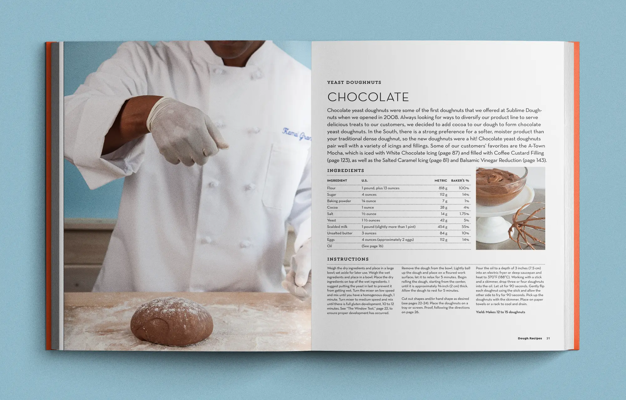
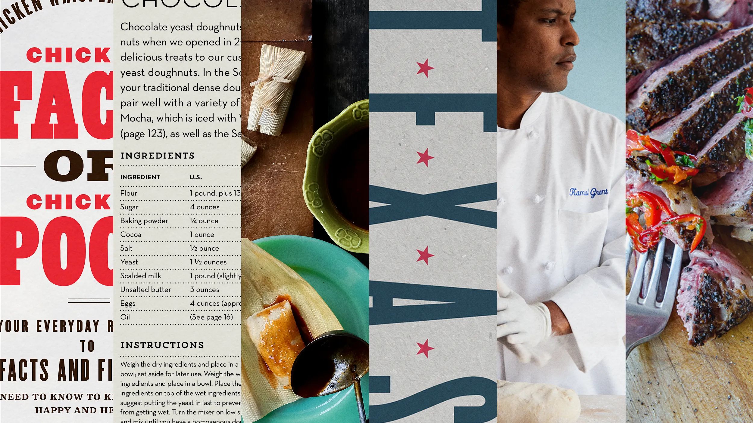
Homemade Doughnuts
Author: Kamal Grant
Publisher: Quarto Publishing Group, Quarry Books
Photography: Deborah Whitlaw Llewellyn
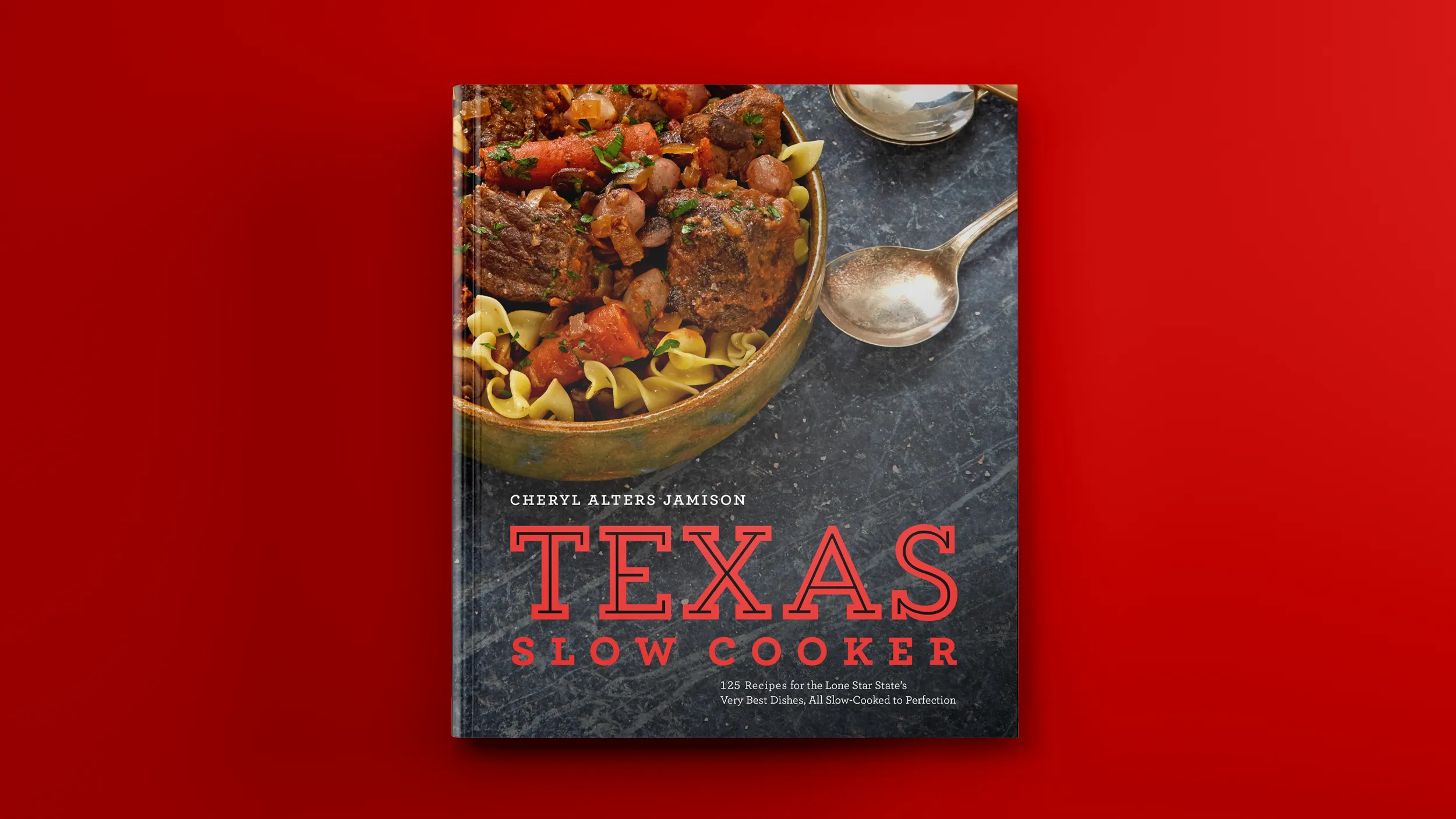
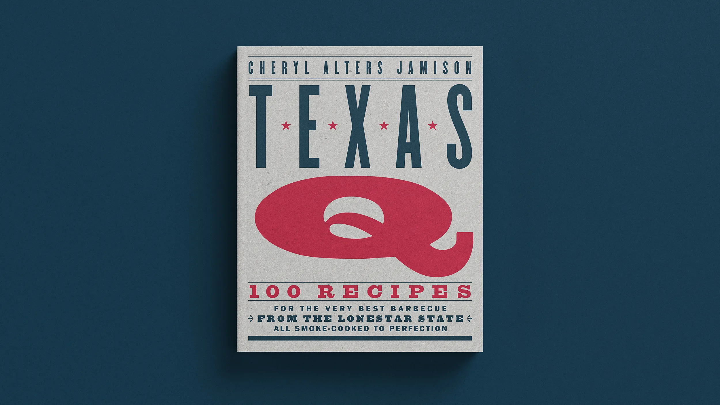
Texas Slow Cooker
Author: Cheryl Alters Jamison
Publisher: Harvard Commons Press
Photography: Glen Scott Photography
Styling: Natasha St. Hailare Taylor
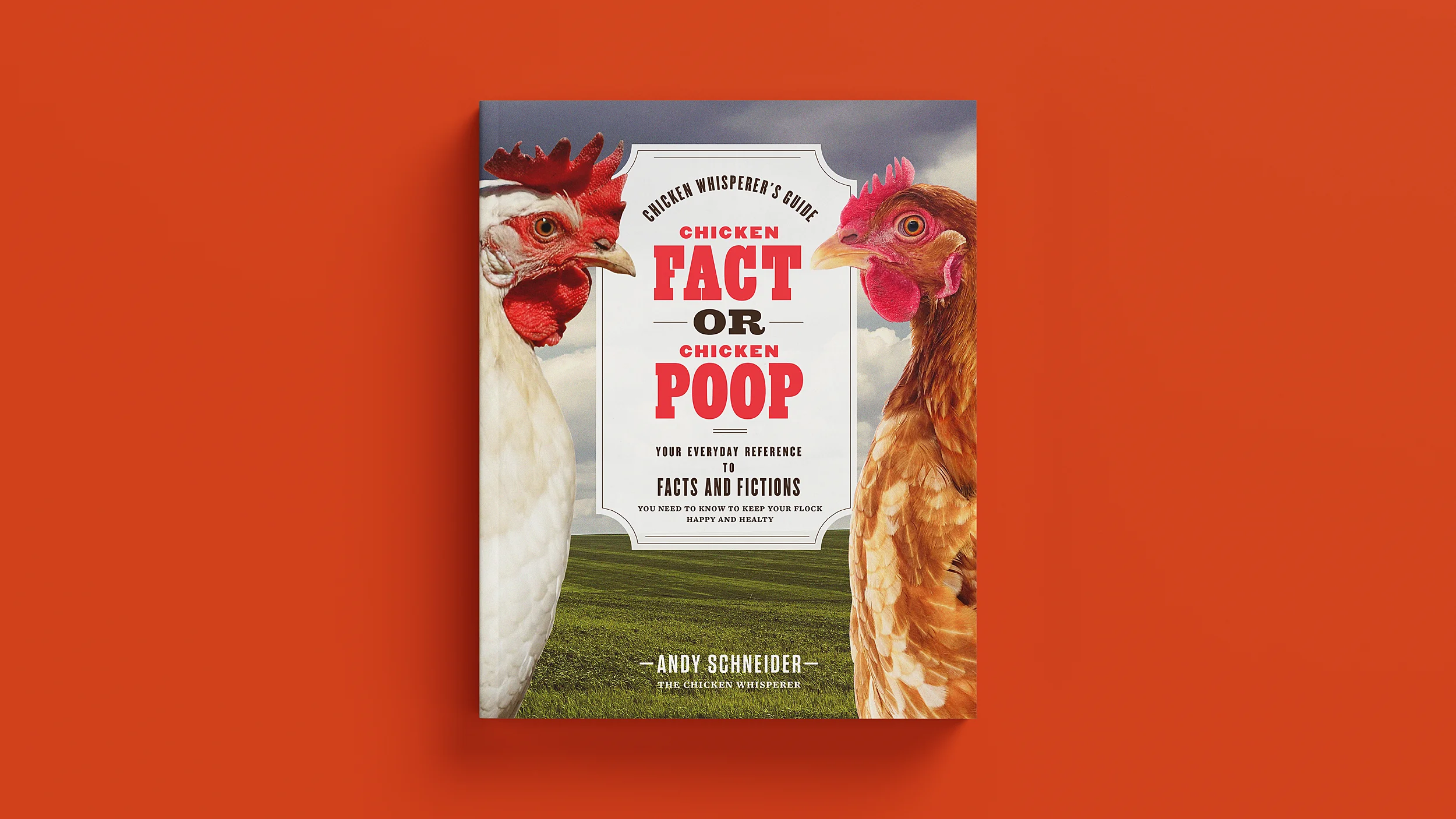
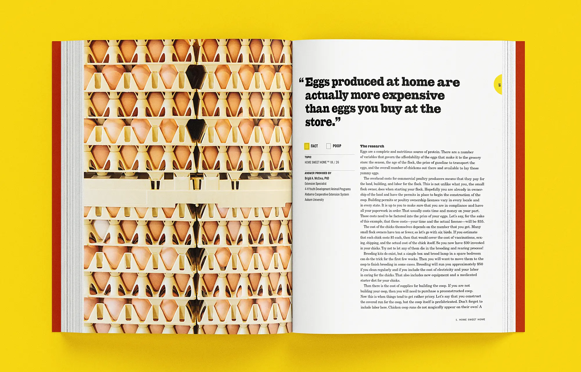
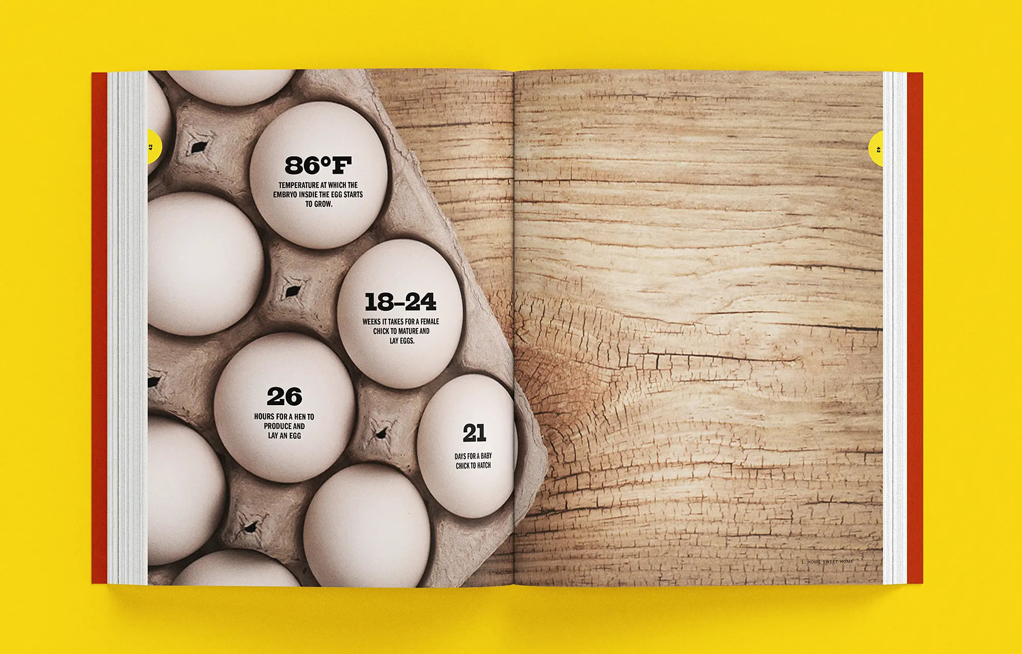
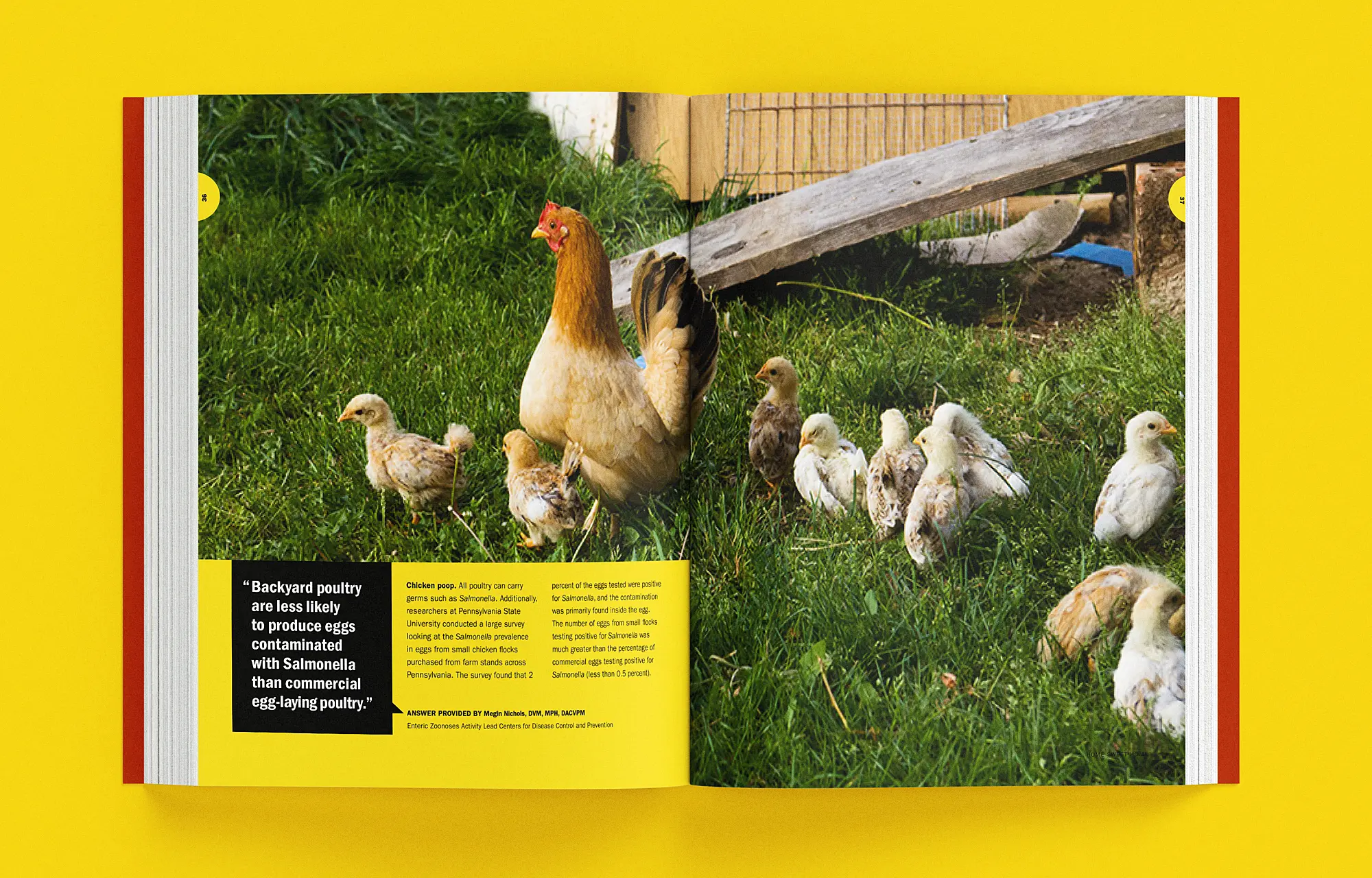
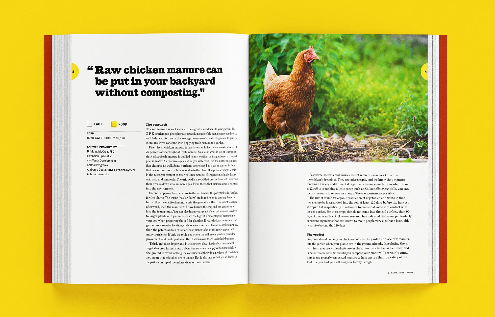
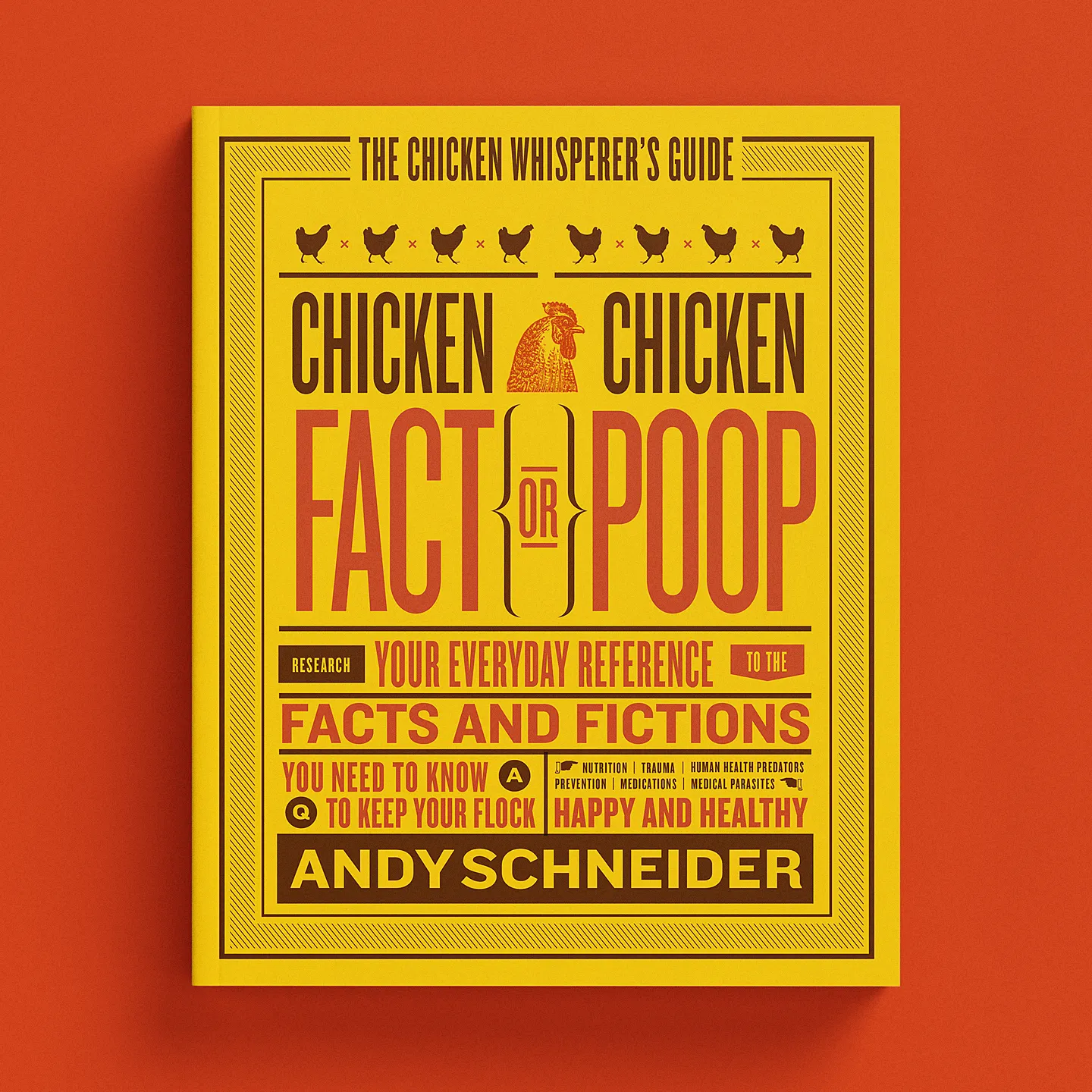
Chicken Fact or Chicken Poop
Authors: Andy Schnider & Brigid McCrea Ph.D. (Contributor)
Publisher: Quarto Publishing Group, Quarry Books