The Jackstraw
Naming and visual identity for Bend’s first LEED Platinum multi-family project that that harmonizes green living with an adventurous Bend lifestyle.
Client:
Killian Pacific
Project Components:
Brand Identity, Editorial Design, Environments
Copy & Strategy:
Thomas Mccraken
Architect:
SERA
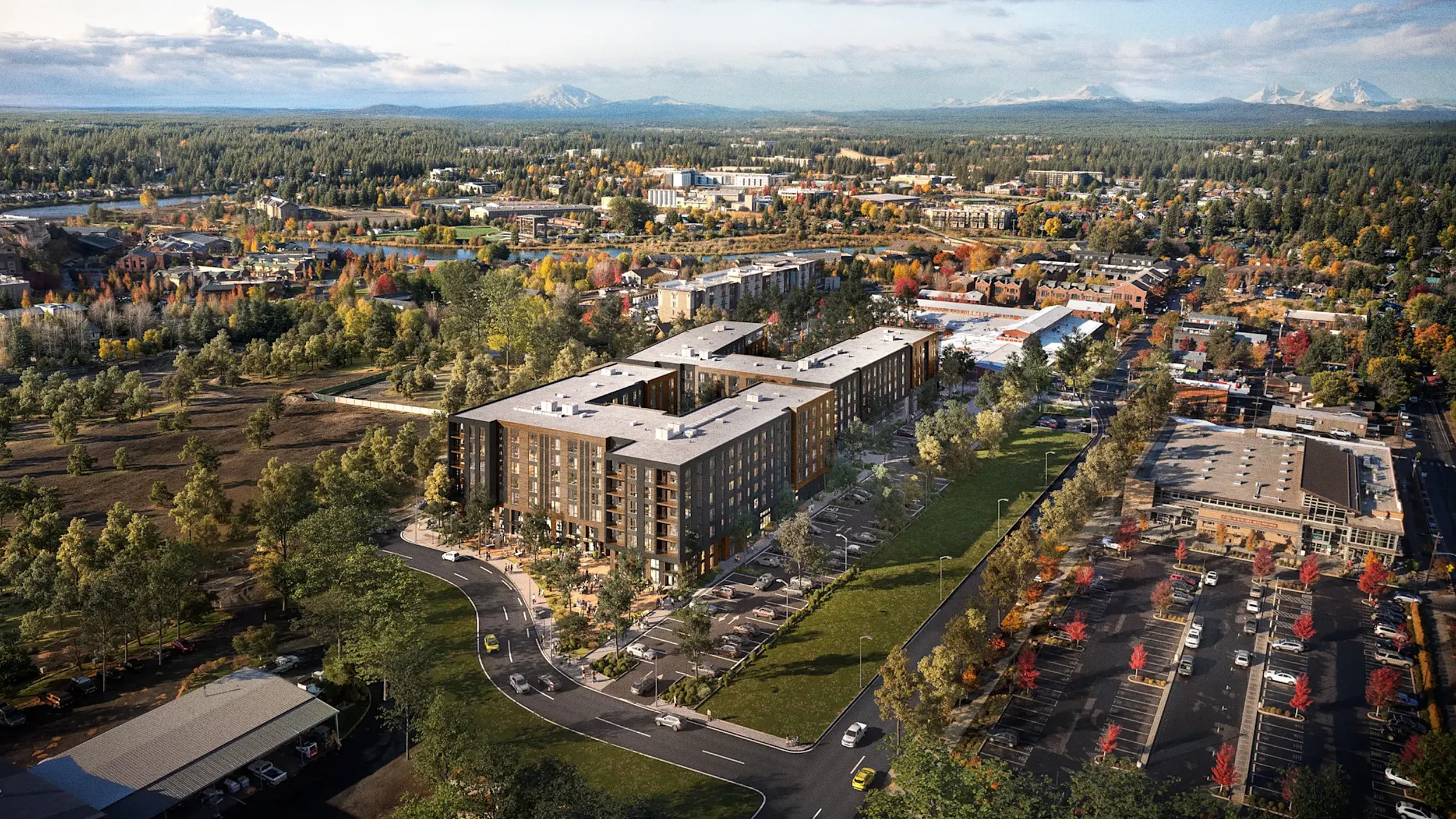
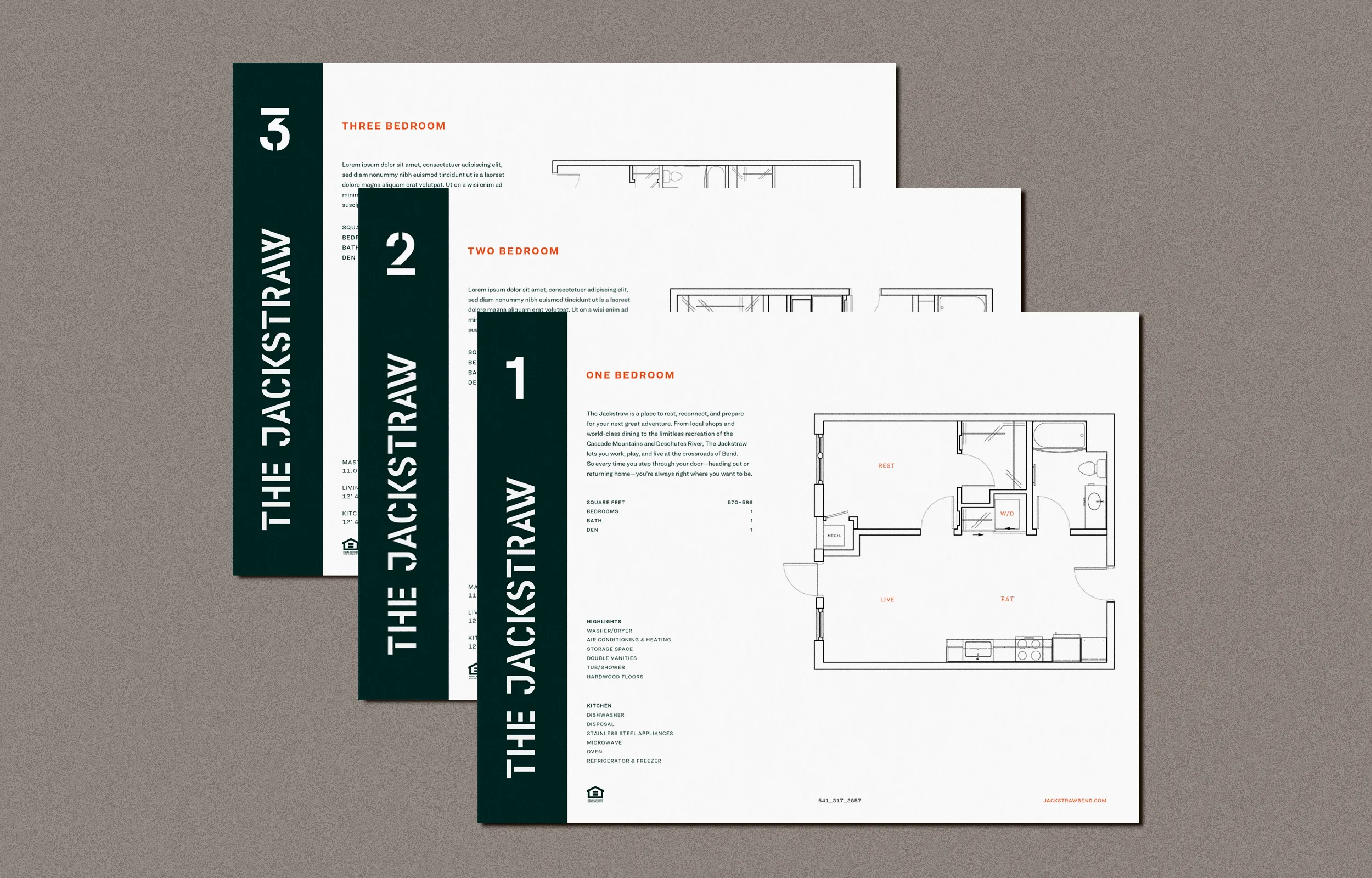
Killian Pacific engaged us to create the naming and visual identity for The Jackstraw, establishing an authentic presence in the Bend market. Located next to The Box Factory in downtown Bend, Oregon, The Jackstraw stands as the city’s first LEED Platinum multi-family project. This 313-unit mixed-use development blends with Bend’s character while advancing its urban landscape through thoughtful design, sustainability, and meaningful social impact.
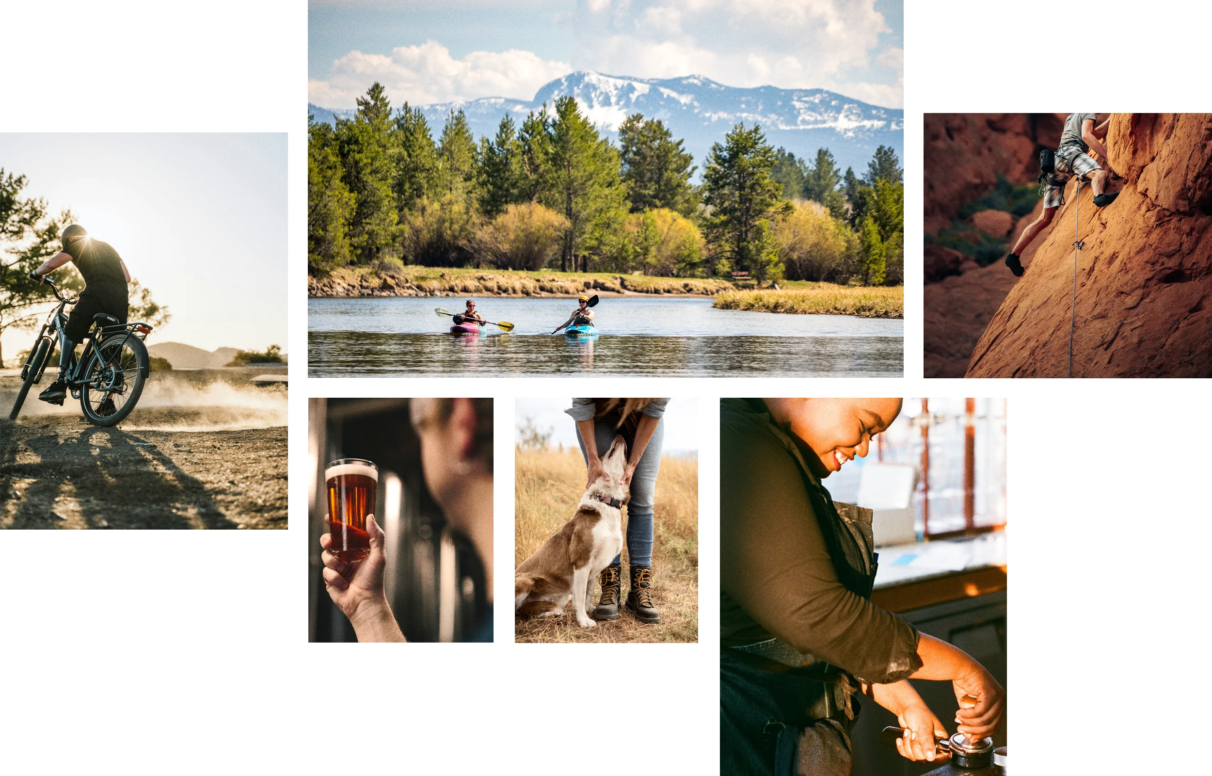
Positioned near the Deschutes River and surrounded by Central Oregon’s outdoor recreation opportunities, The Jackstraw offers residents a home at the intersection of city living and adventure.
We developed a comprehensive playbook and visual identity guidelines, then actively shared and socialized this work with our design partners. They embraced it across signage, print, and digital lease-up marketing efforts for both retail and residential initiatives.

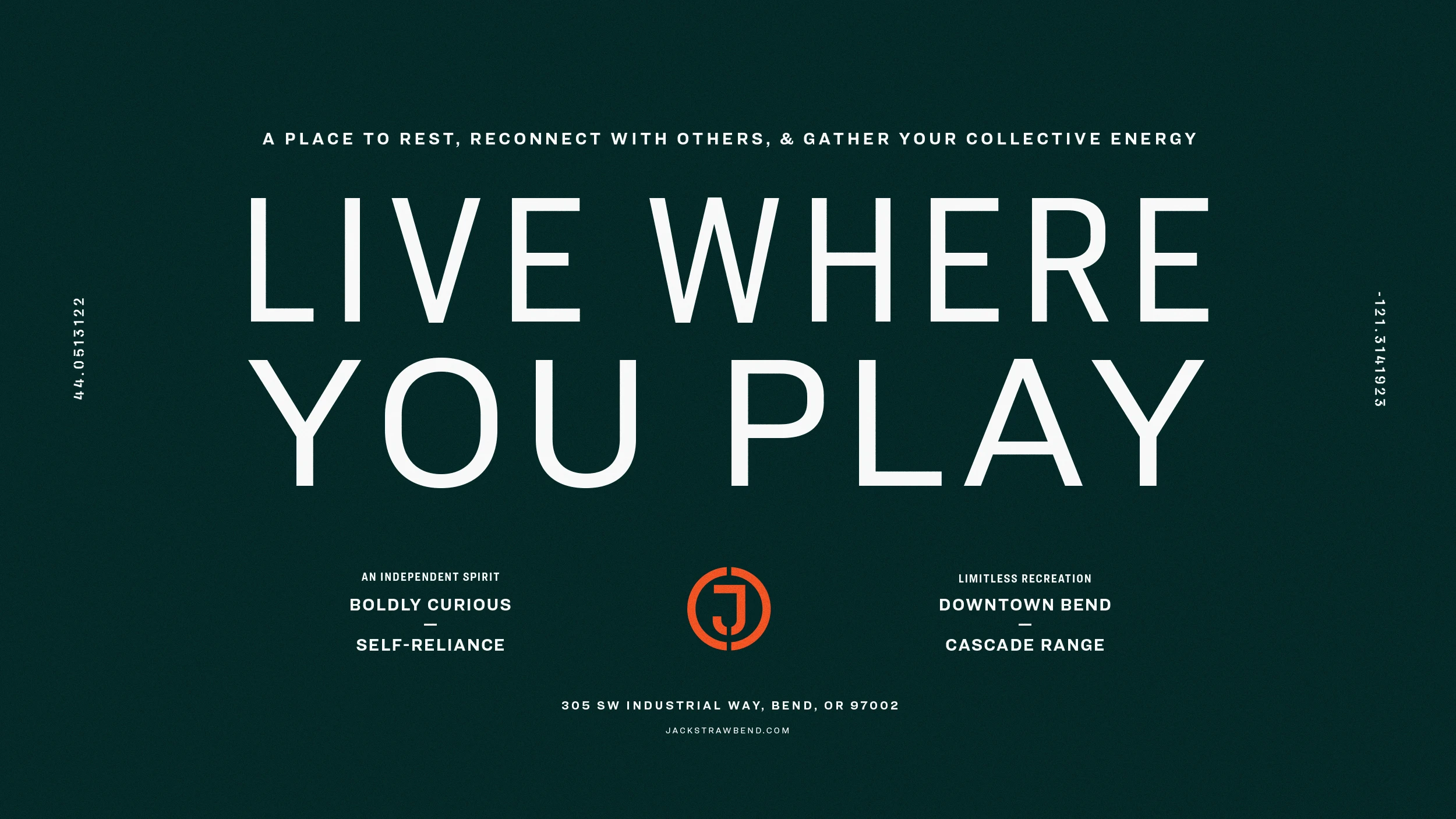
In logging—an industry essential to the foundation of the city of Bend—Jackstraw describes a collection of felled trees. We chose this word not so much for its literal definition as for the sentiment it evokes. The name has a historic richness. It suggests a sort of rustic and rural origin, but with just the right amount of sophistication and independent spirit. It’s strong and memorable with a slight playfulness that keeps it unpretentious—all traits perfectly suited for the culture of Bend. Metaphorically, it can be interpreted to represent a place where residents come together, gather their collective energy, and prepare to set off on their next great adventure.

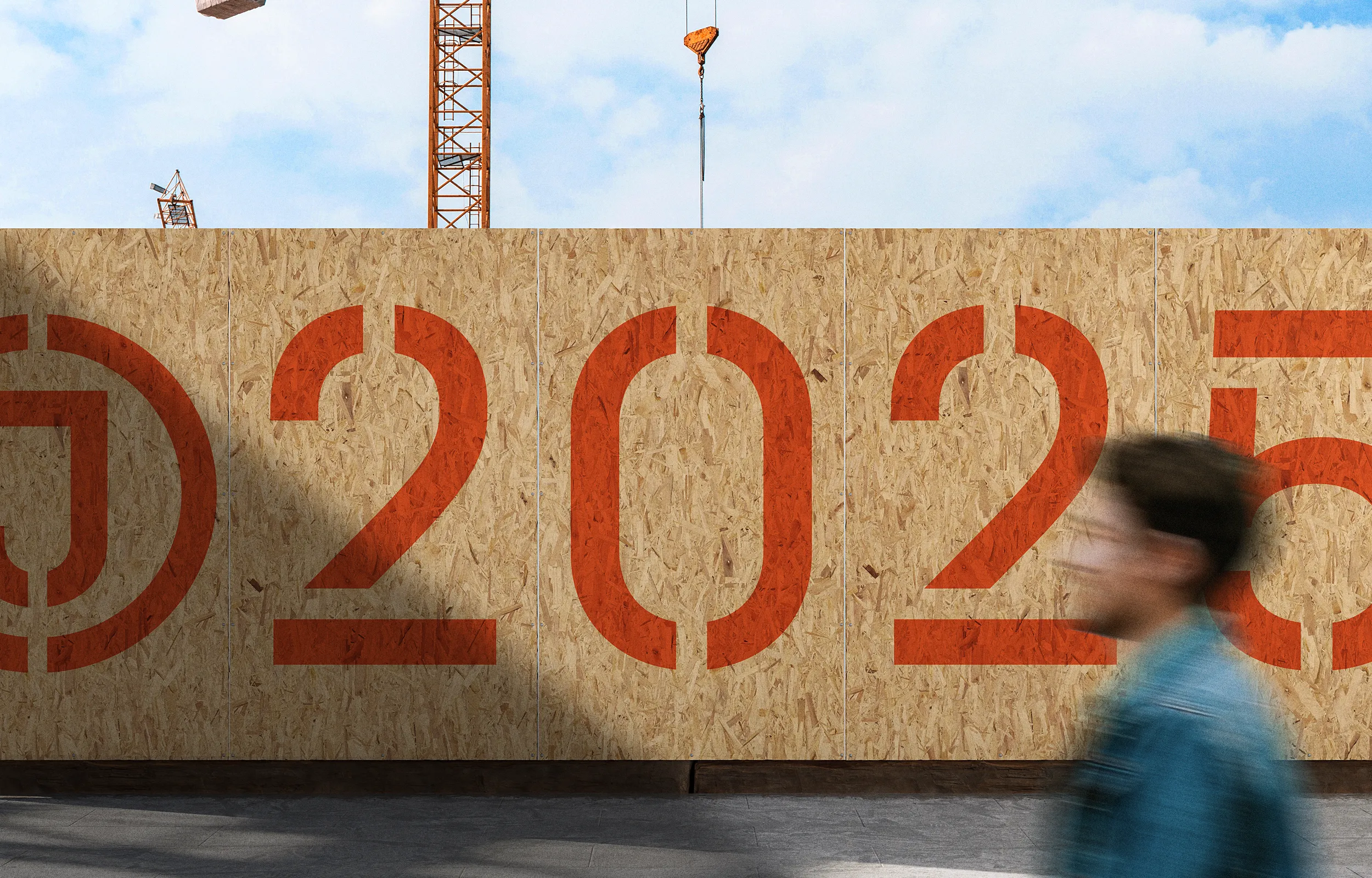
The Jackstraw site is located at the former lumber storage area of the original Brooks-Scanlon Box Factory. This factory produced shipping containers for a broad variety of goods that were often transported by train. The stencil-based typography of The Jackstraw plays homage to the industrial heritage while the details of the letterforms point to a more contemporary expression.
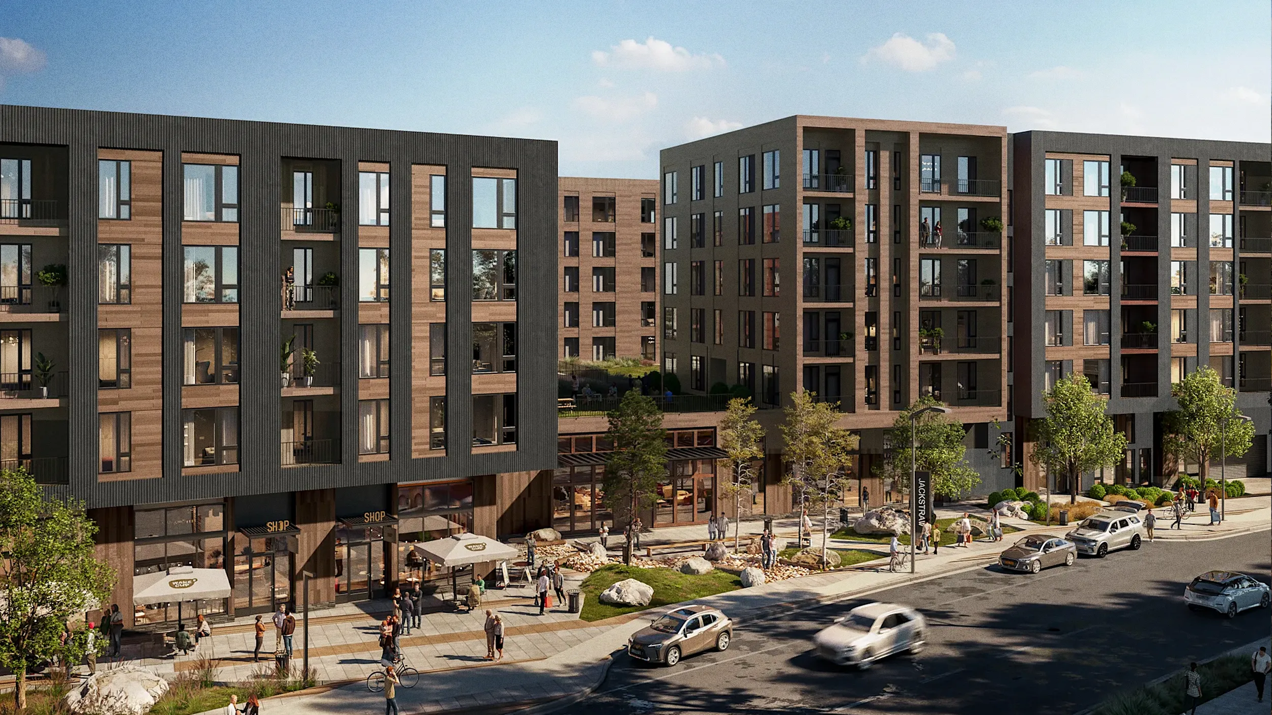
The property includes the concept of a woonerf, Dutch for living street, to be shared by pedestrians, bicyclists, and low-speed motor vehicles. SERA’s dynamic streetscape concept links the existing Box Factory with The Jackstraw and presets the ability to close a section of Lava Road between the two properties for events, concerts, markets, and more.
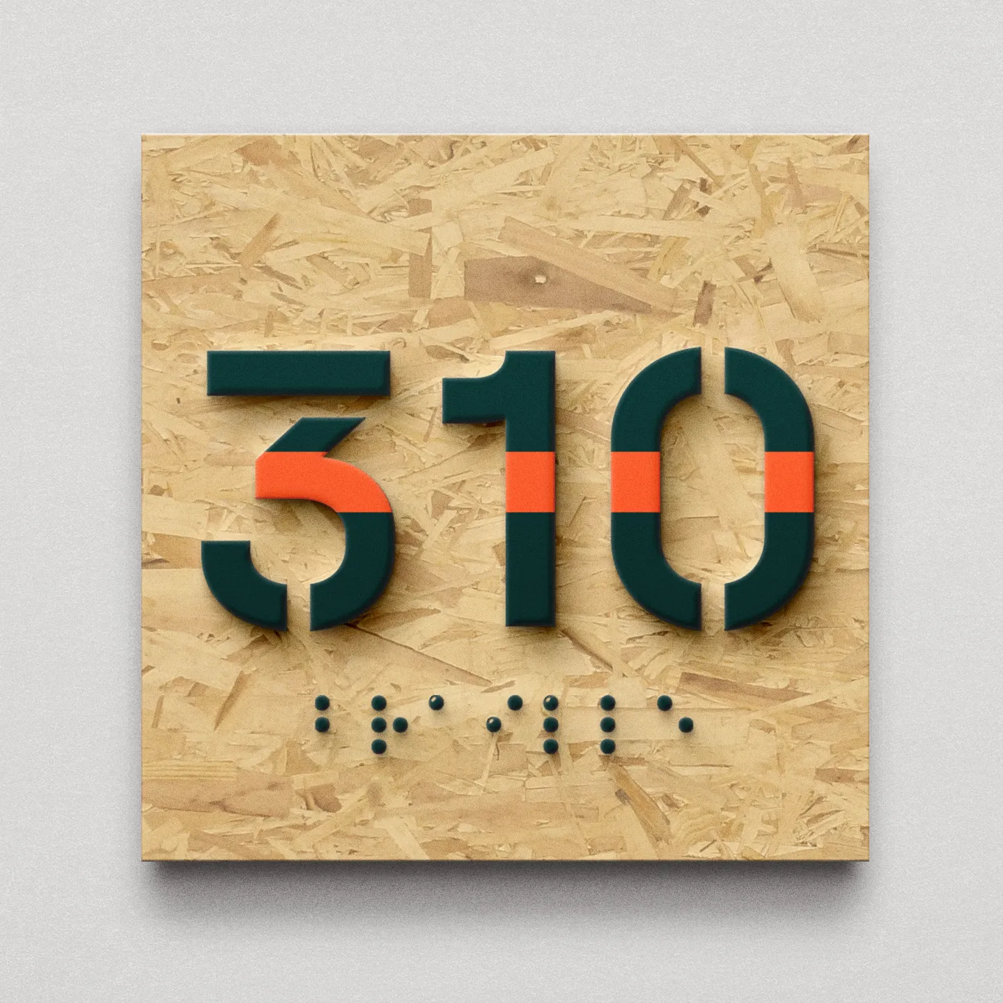
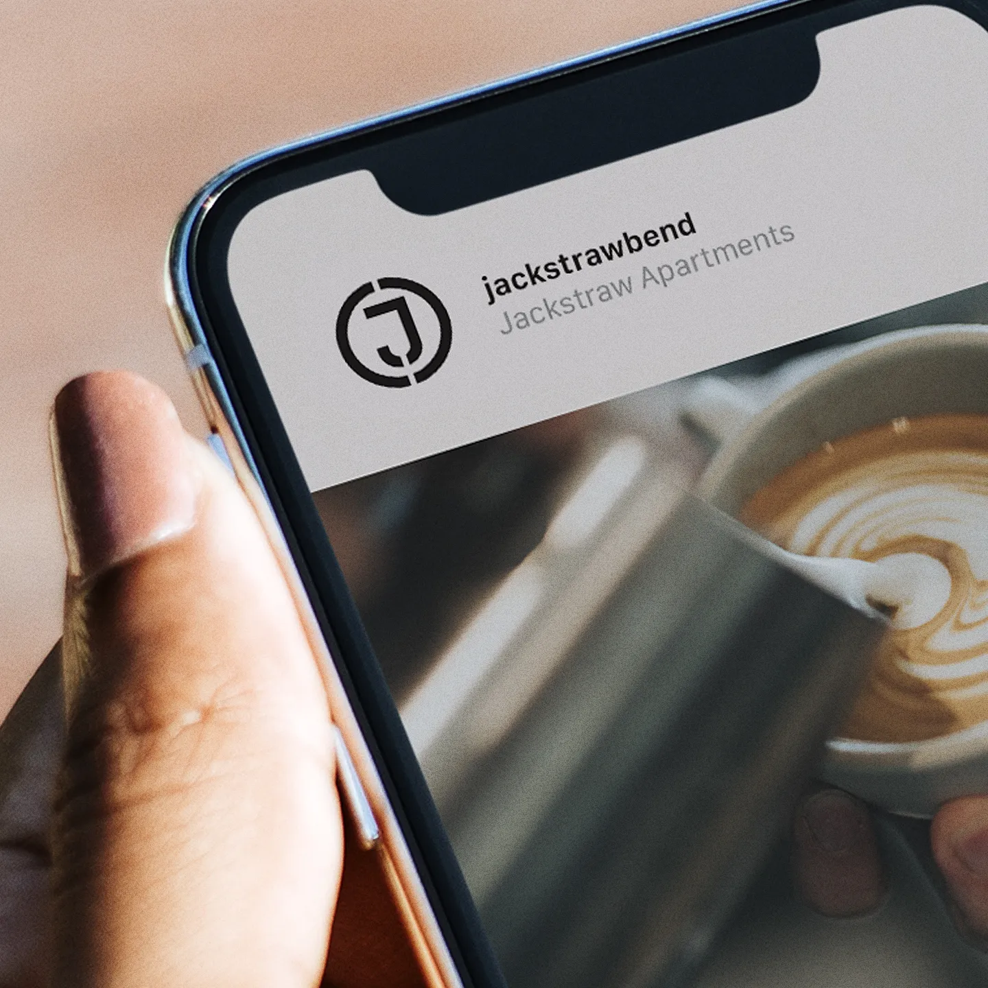
Historically, stencil letterforms have an inherent industrial quality through their utilitarian applications. Traditionally stencils are both hand cut and applied for the purpose of clear and immediate identification. The Jackstraw wordmark and the monogram function to bring this design intent forward and throughout the visual identity.
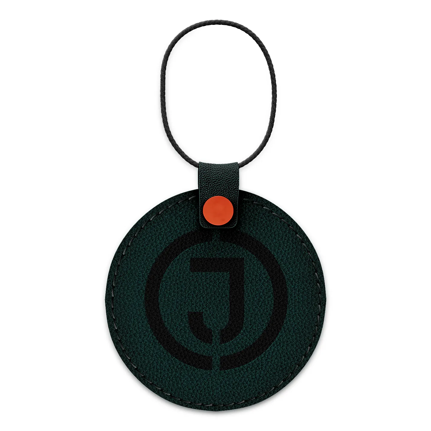
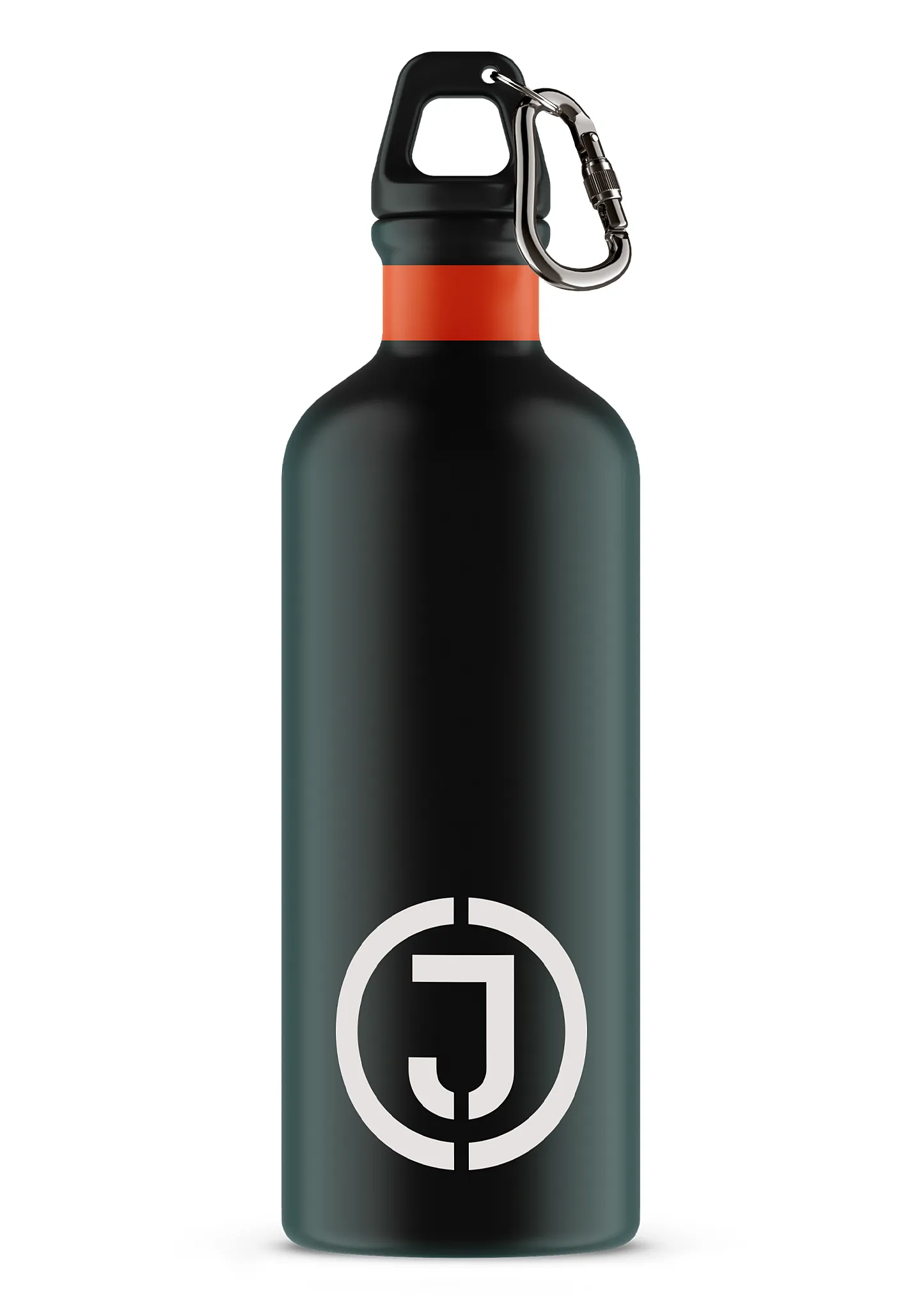

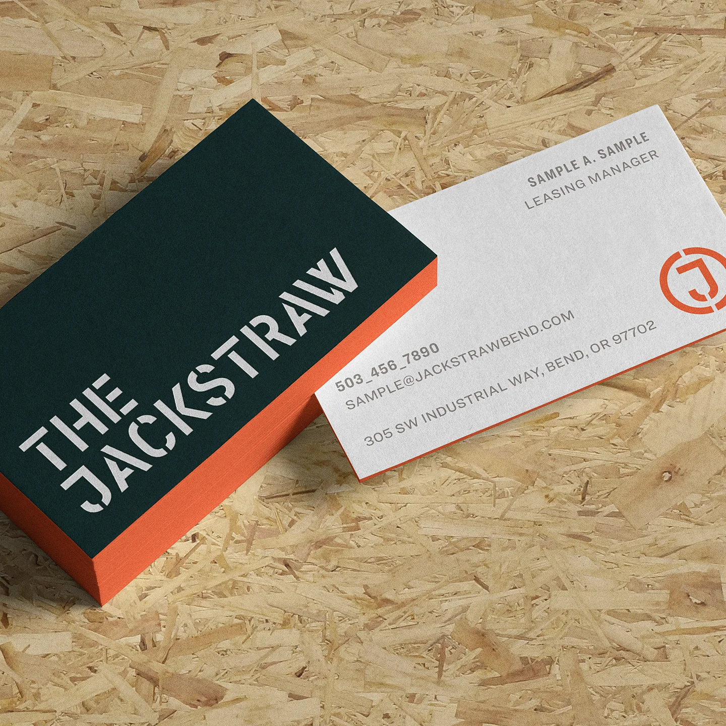
The density of the dark green pine trees, the rocky calcite, and the dusty turf of the Bend environment are the inspiration for The Jackstraw color palette. This warm and modern palette is intentionally concise. The punch of the accent orange (Jasper) contributes to the industrial sensibility of the visual identity and adds the right amount of surprise and delight to the system.