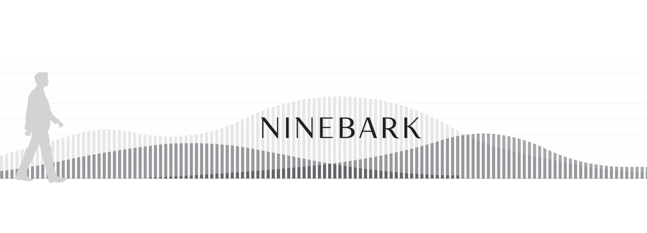
Ninebark
A visual identity and signage system for a multi-family development along the Columbia River that connects and integrates with nature
Client:
Killian Pacific
Project Components:
Brand Identity, Digital, Environments
Architect:
HOLST
Landscape Design:
Ground Workshop
Interior Design:
VIDA
Property/Architecture Photography :
Christian Columbres
Launch Campaign:
Brave New Day
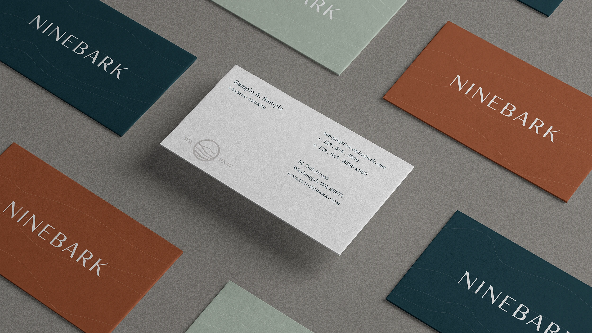
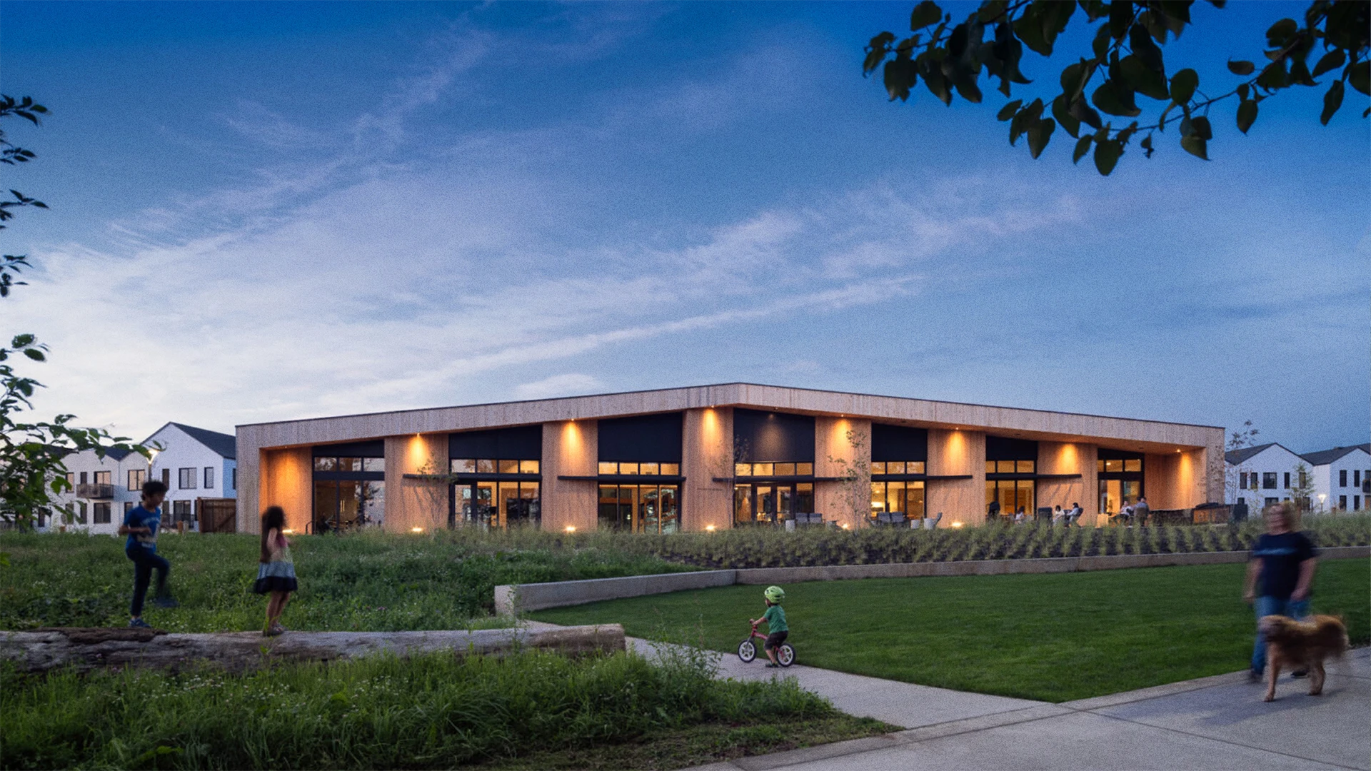
Developed by Killian Pacific, Ninebark raises the bar for multi-family living in the rapidly developing Southwest Washington region through a nature-oriented, thoughtfully designed riverfront community. Killian Pacific understands the value of brand and invited us into the project from the start—together with the architecture team at Holst, interior studio Vida, and the landscape architecture crew at Ground Workshop we established overarching principles and thematic concepts that connected all of our efforts, resulting in a harmonious experience across all touchpoints. We were tasked with establishing the name, positioning and messaging platform, visual identity system, and led the way in conceiving and implementing a comprehensive signage and property-wide wayfinding system.
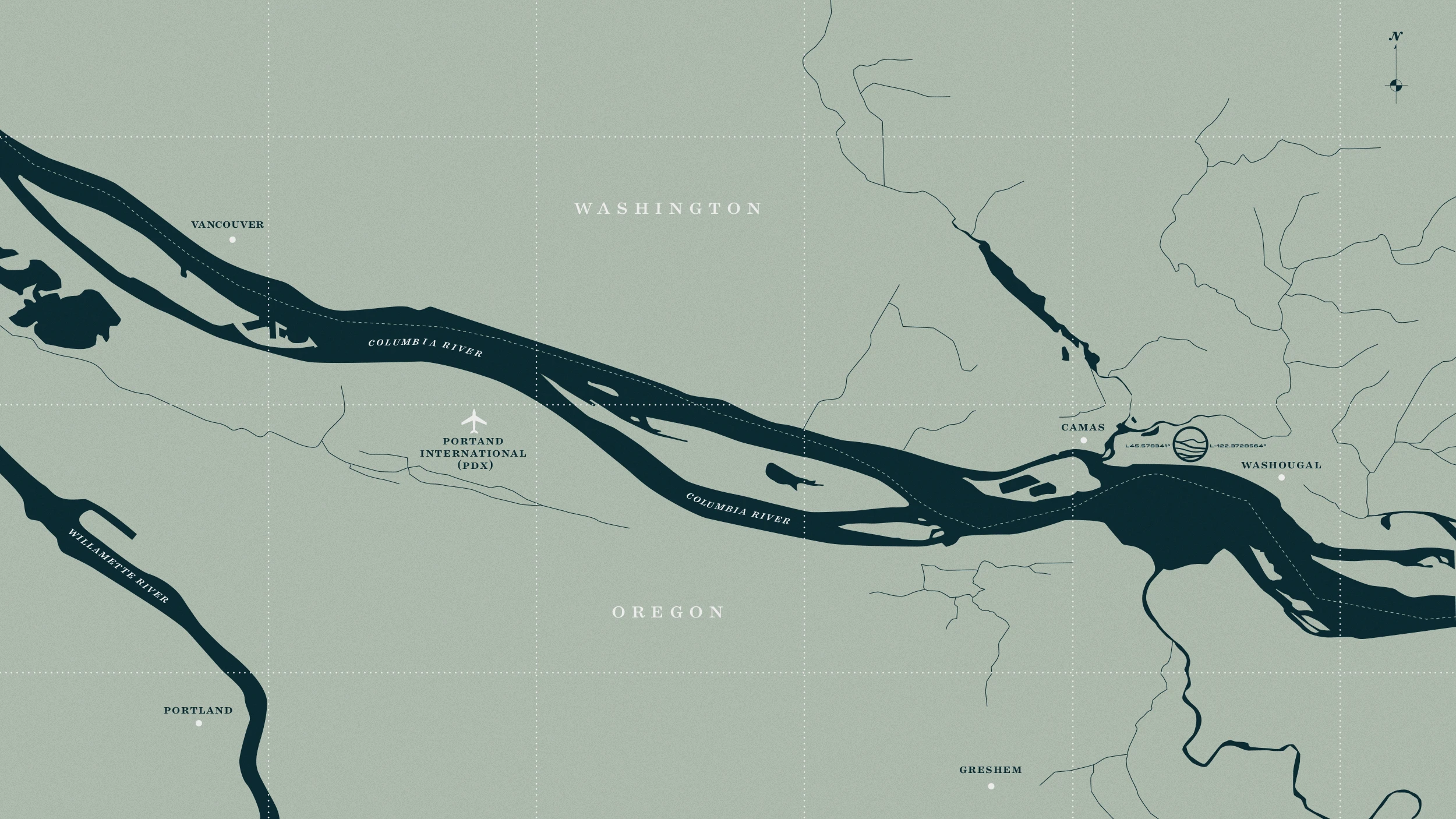
As part of the master plan redevelopment of the Port of Camas-Washougal, Ninebark aims to attract residents seeking an escape to nature and a smaller, more welcoming community while still having access to great city-like amenities and conveniences. Holst’s design weaves Ninebark’s nine buildings, public park, and open spaces into the surrounding natural environment while employing high quality, sustainable, regionally sourced materials.
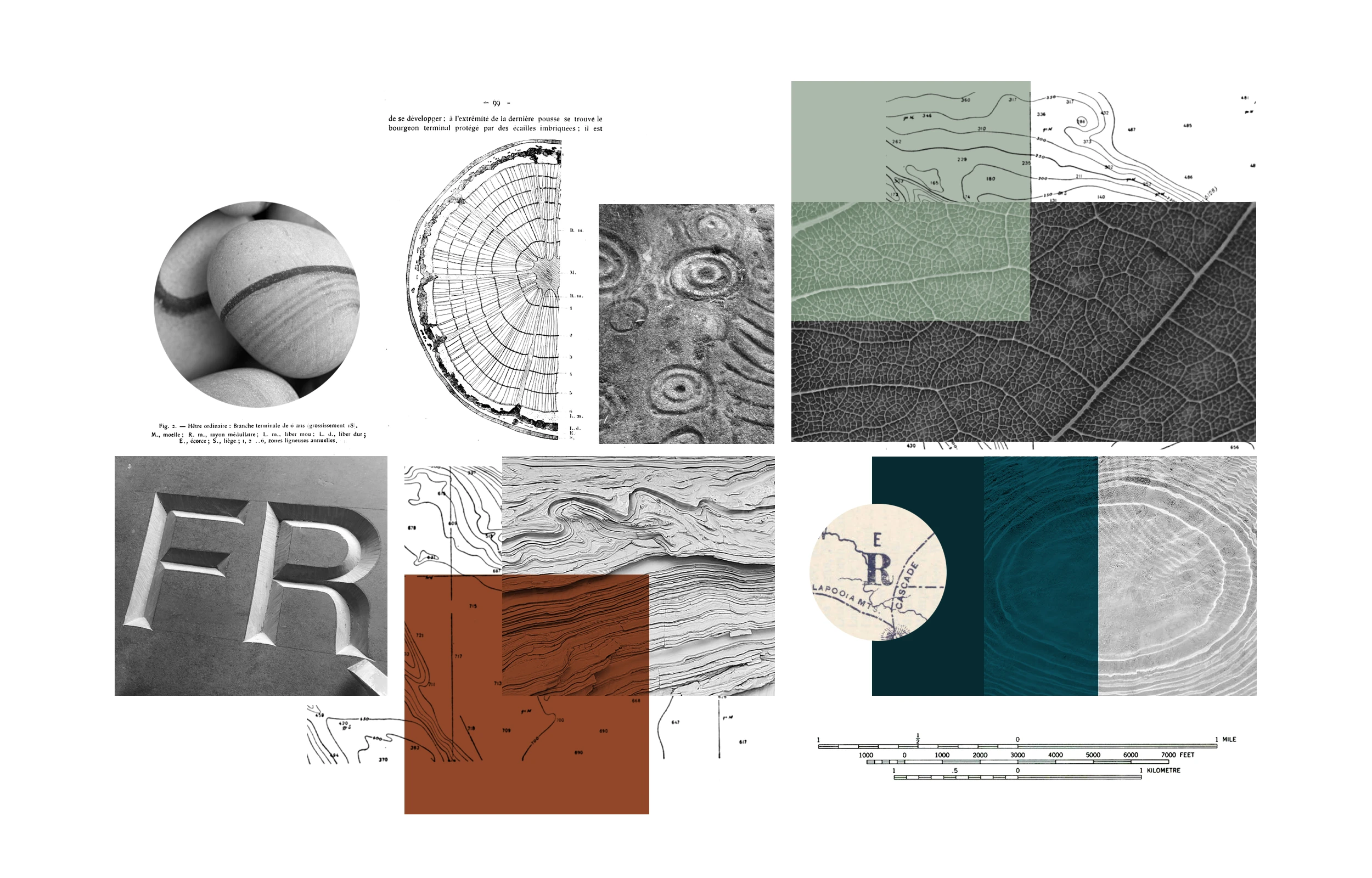
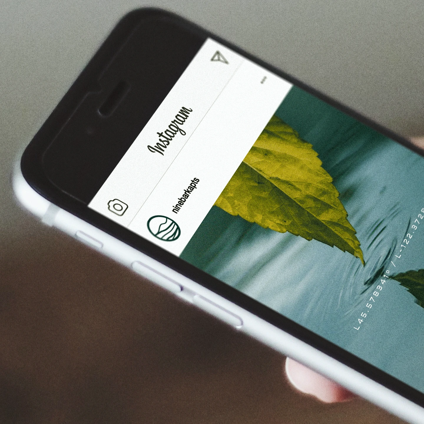
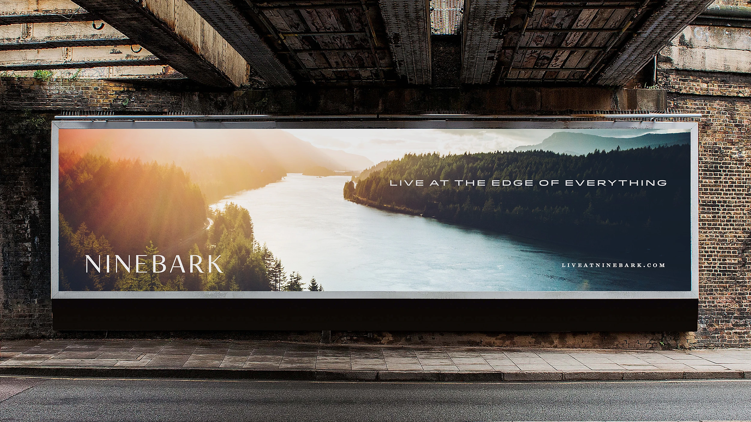
The name of the property was derived from Physocarpus — a flowering varietal native to the Pacific Northwest, found growing along the riverbank. The plant is considered tough and persistent and are often incorporated into landscaping for their versatility, heartiness, and diverse range of colorful foliage. Like its namesake plant, the residential community at Ninebark is diverse, dynamic, and vibrant. Typographically, we established a custom semi-serif logotype inspired by the toothy edges of the Ninebark leaves, while the thick and thin forms of the body express a careful sensibility of modern craft.
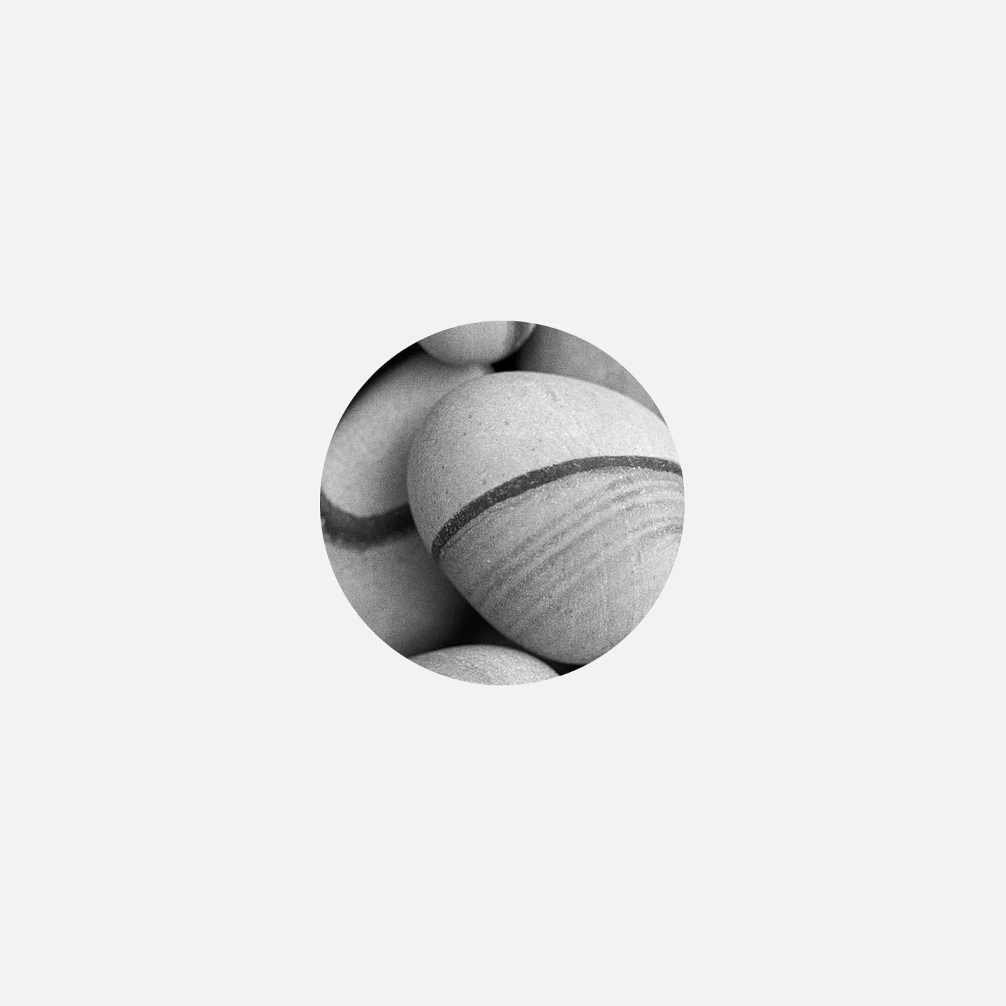
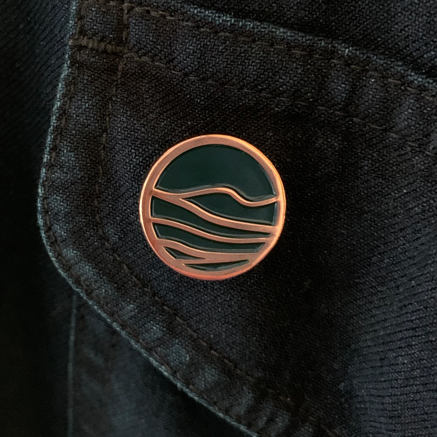
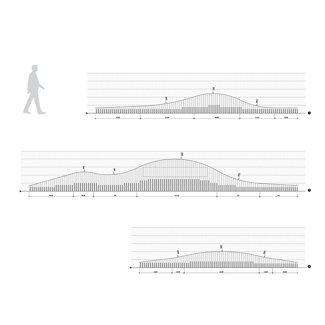
Petroglyphs can be found along the banks of the Columbia. We were inspired by the idea of creating an identifying mark unique to the Ninebark property as graphic asset that the could be used independent of the logotype. The mark that we created took cues from the river rocks along the banks of the Columbia—specifically, the natural wave forms, and striations found in the rocks. The organic quality of the mark intentionally offsets the more sharp qualities of the Ninebark logotype.
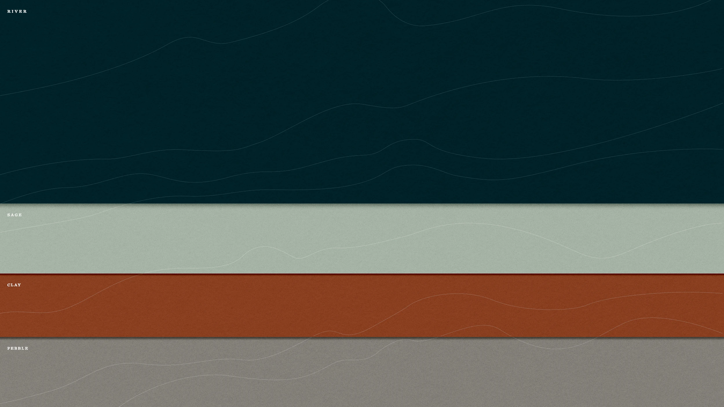
To stay true-to-place, the Ninebark color palette was immediately derived from naturally toned palette of the site —the deep tones of the river, the soaring multi-layered bluffs, and natural grasses and sage.
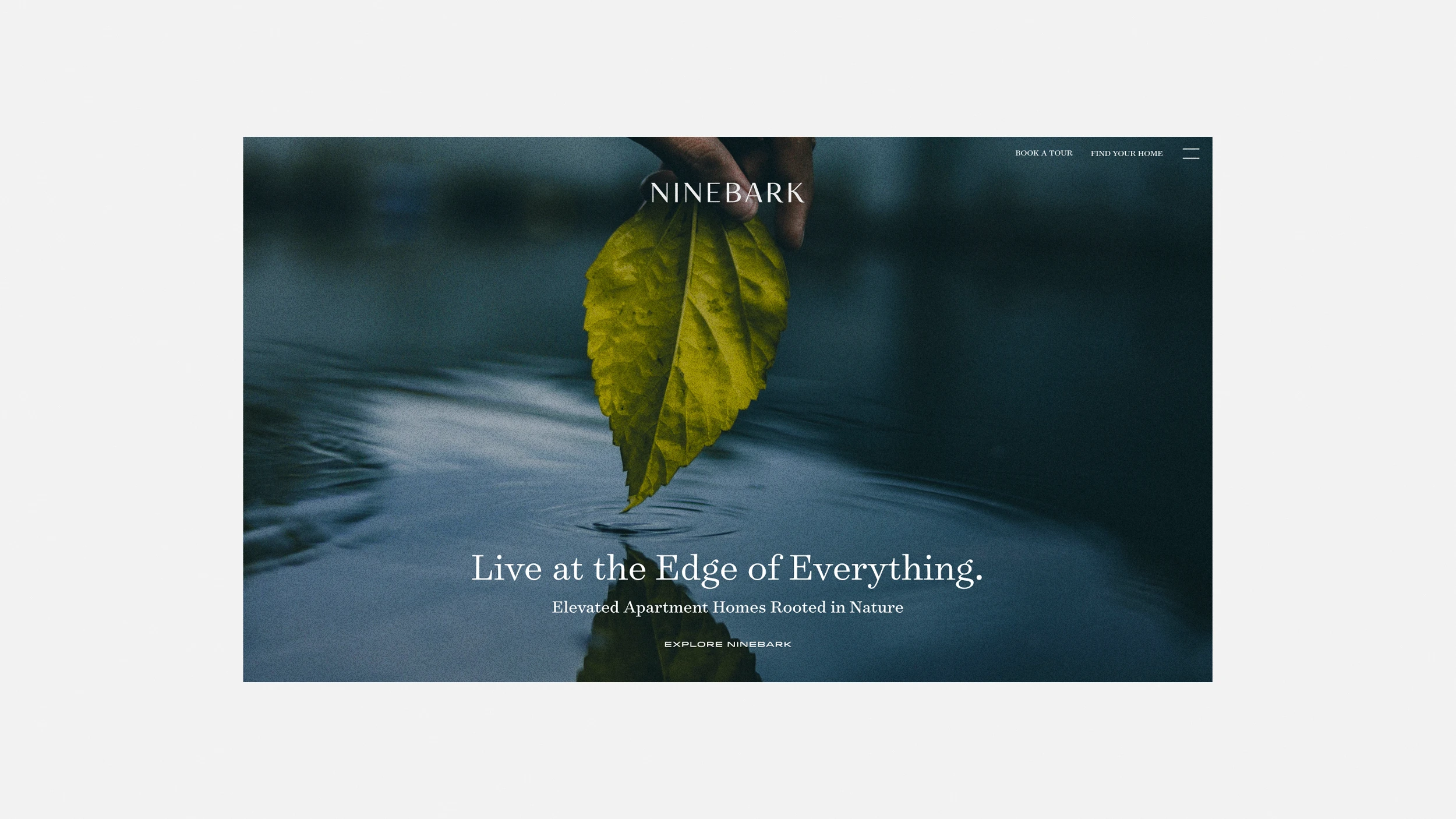

During lease up, to synchronize with the location renderings, we built a tight collection of images to help express the vision of the intended lifestyle vibe of the area, while the team at Brave New Day carried the identity forward in a launch video and photoshoot. Our tagline “Live at the Edge of Everything” serves as an enticing introduction and sign off across marketing communications and was set in a low profile typeface designed to span the logotype and express the breadth of the riverfront views.
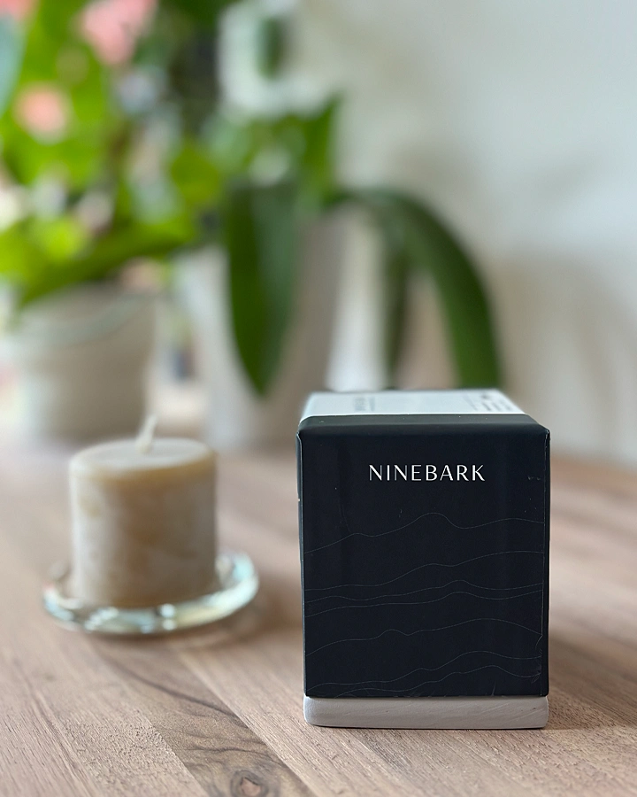
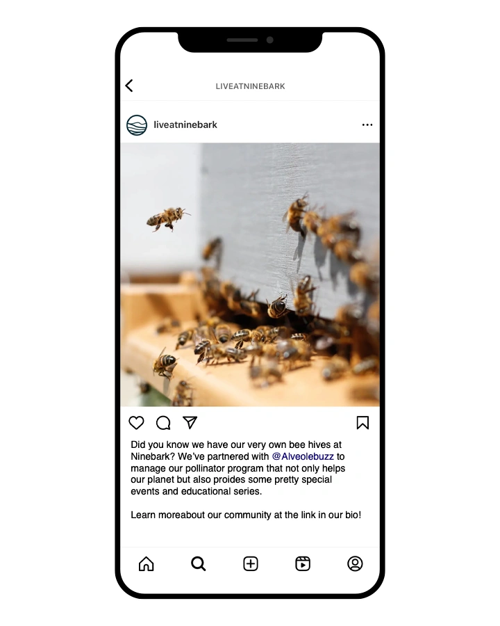
As part of Killian Pacific’s position of delivering places that have a positive sustainable impact, bee hives were installed on location and provide an educational component for residents and visitors. The wax and honey harvested from the hives are used to create candles that are given to residents as a welcoming gift.
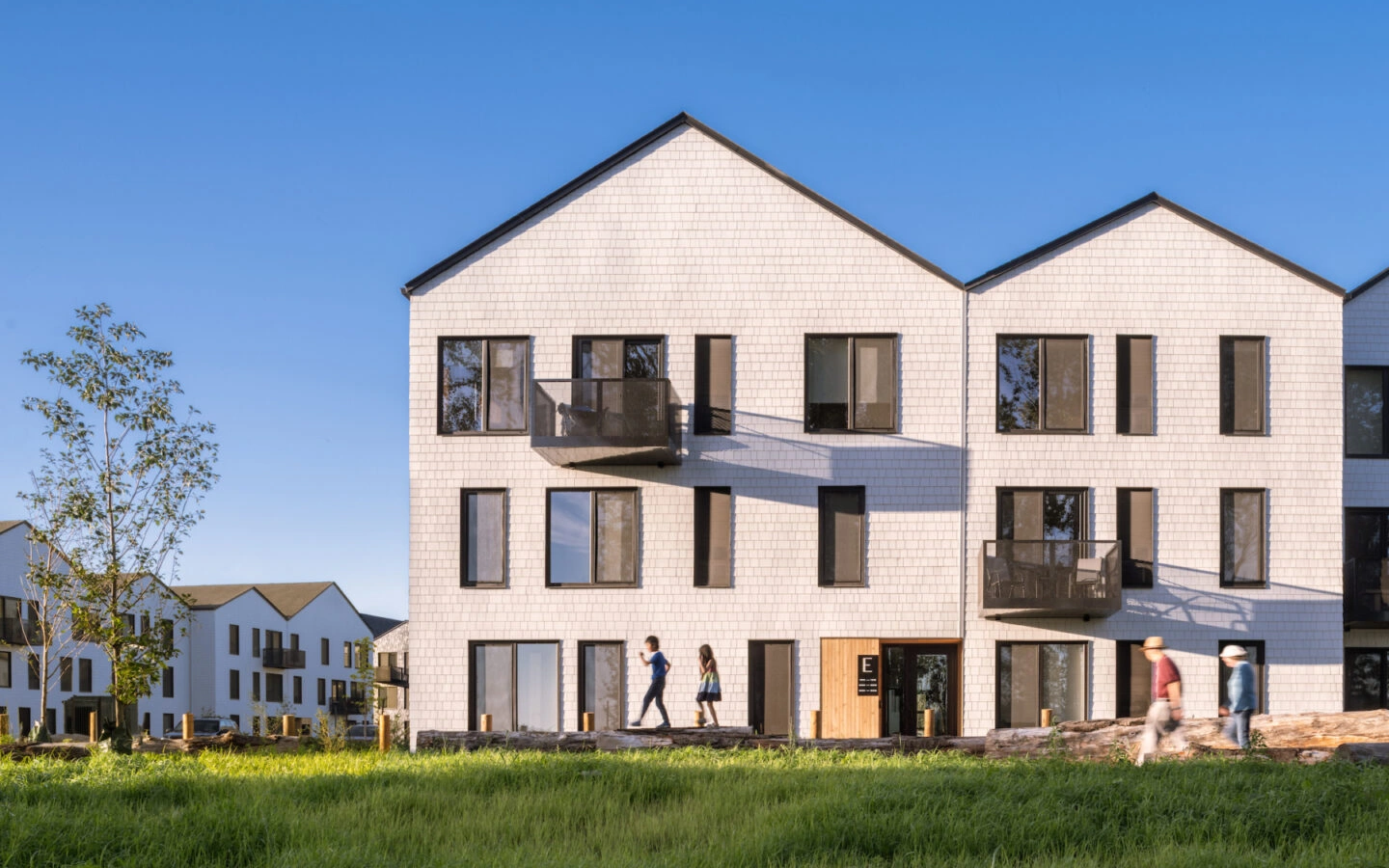
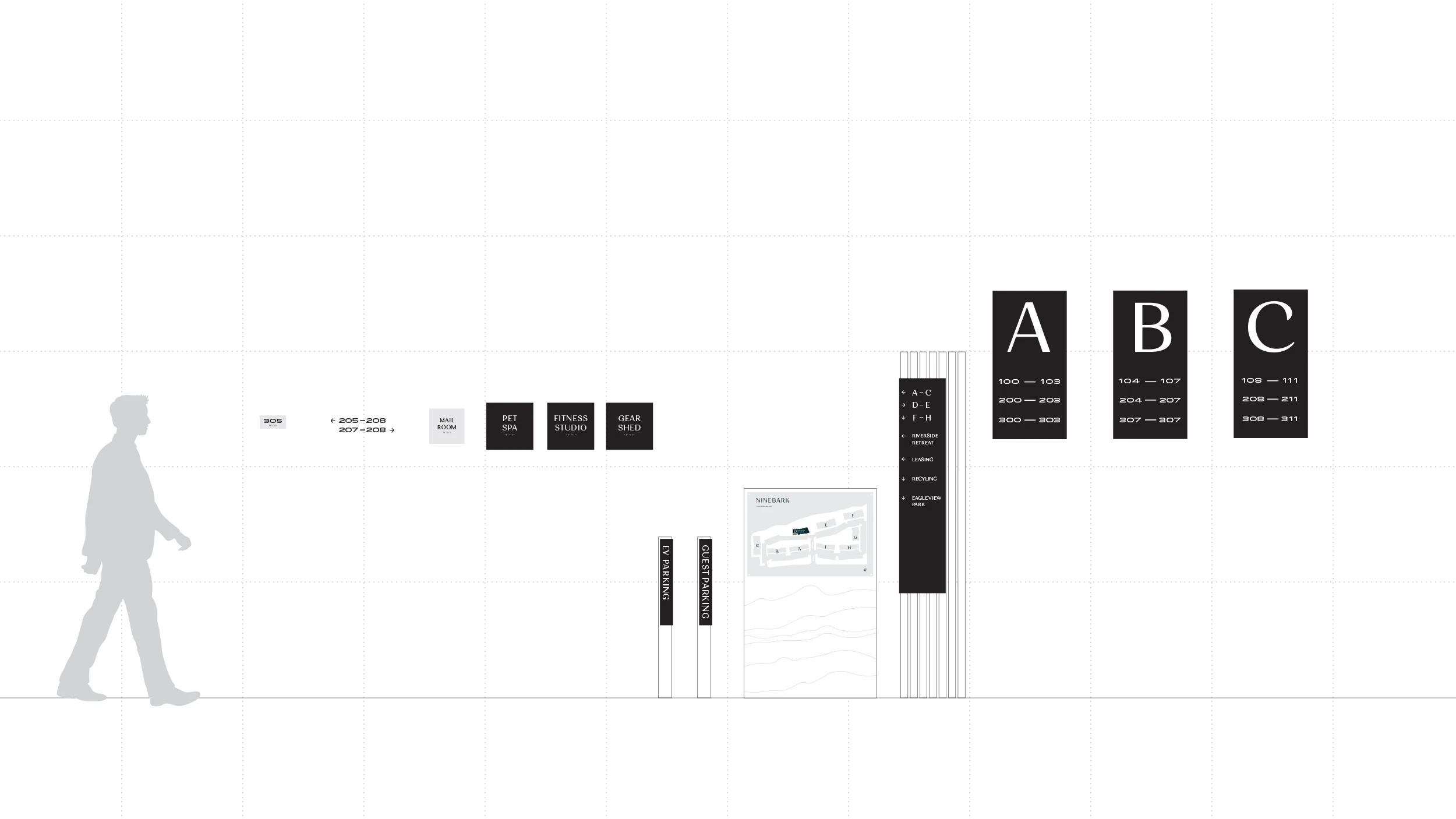
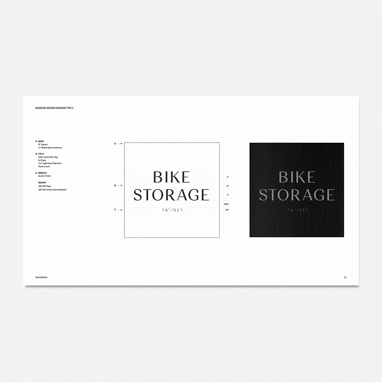
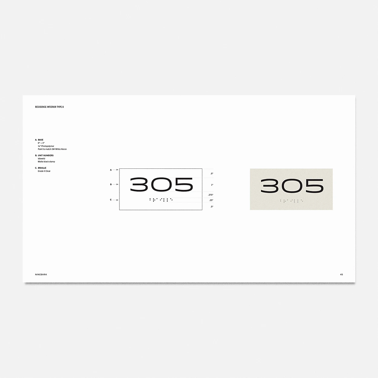
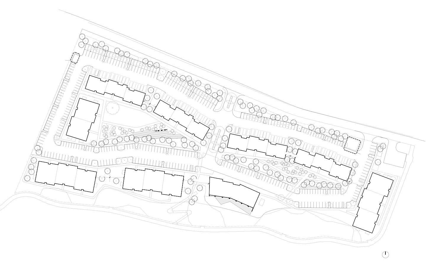
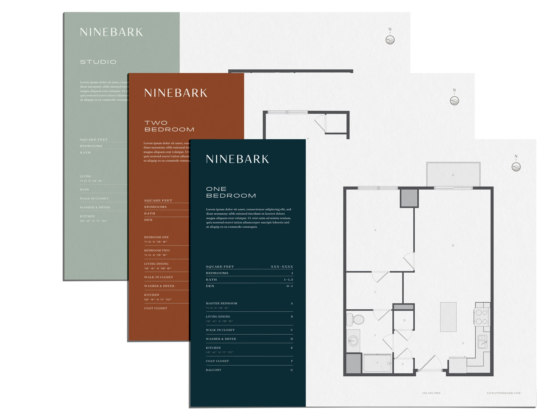
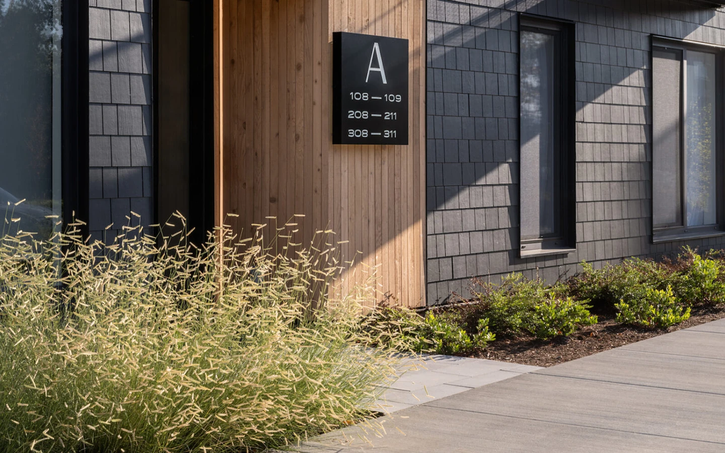
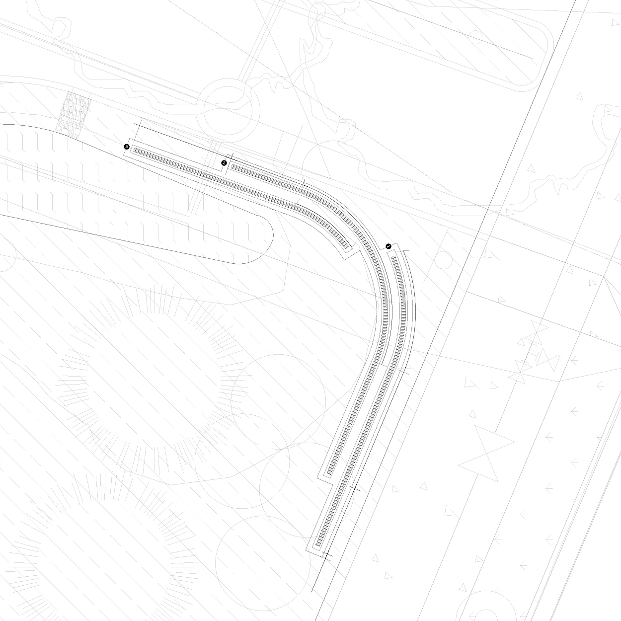
We developed a signage and way finding system for the nine acre exterior property, the interior of each of the eight residential buildings, as well as the freestanding clubhouse. The intent of the system was to consistently ensure enough distinction and clarity, while not overwhelming the location surface or resident experience.
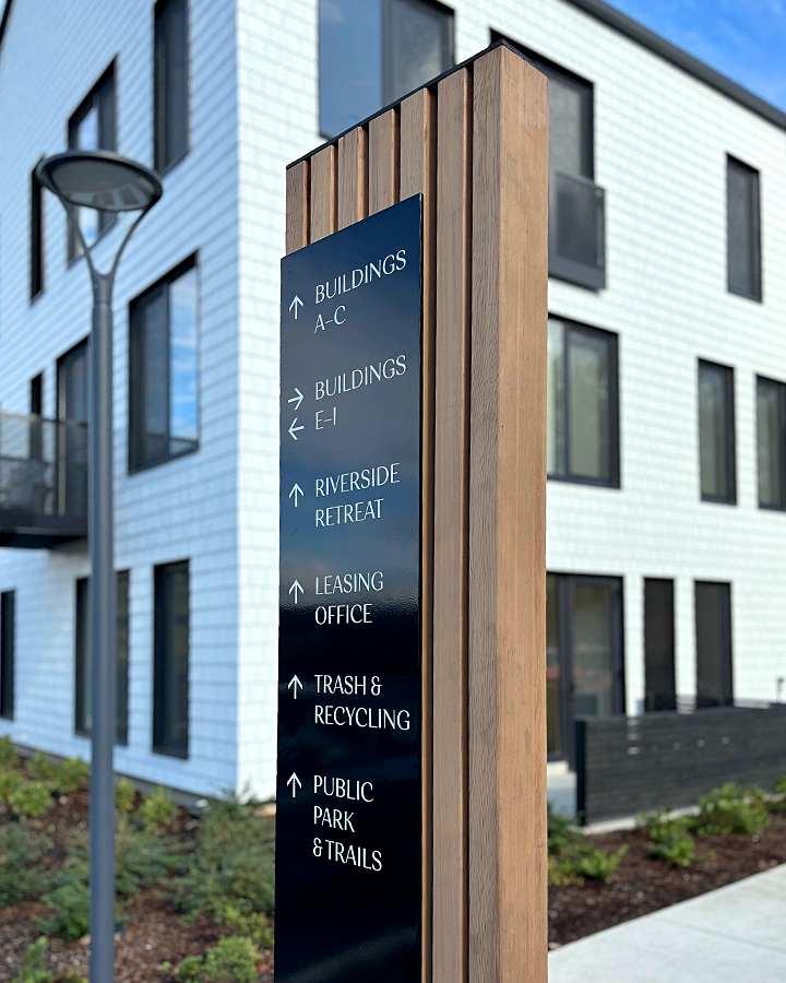
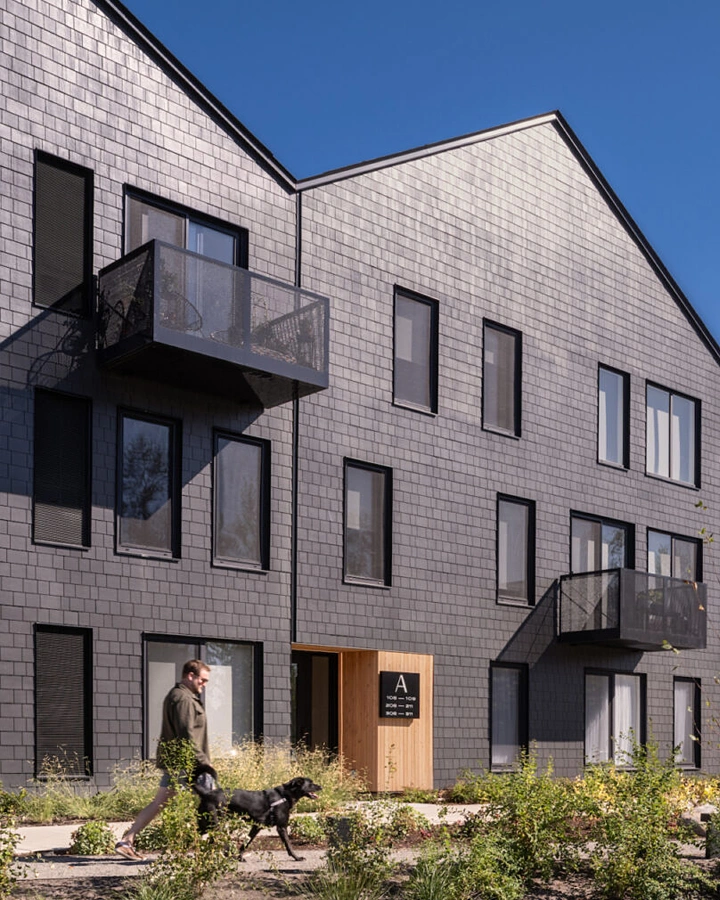
The multi-layered property monument sign aligns to the use of the vertical cedar slats found throughout the property and quietly reflects the same pattern we imbued into both the brand mark and pattern.
Two principle typefaces, were used across the signage system with the low profile gothic sans being used exclusively for numbering. The more upright typeface carried enough personality and distinction to align with the Ninebark logotype while still meeting all of the strict ADA compliance requirements for accessibility legibility. A complete signage guide was developed in coordination with development and serves as a guideline for ongoing maintenance and updates