Reardon Briggs
A contemporary visual identity designed to refresh a beloved community staple in upstate New York
Client:
Reardon Briggs
Project Components:
Brand Identity, Environments
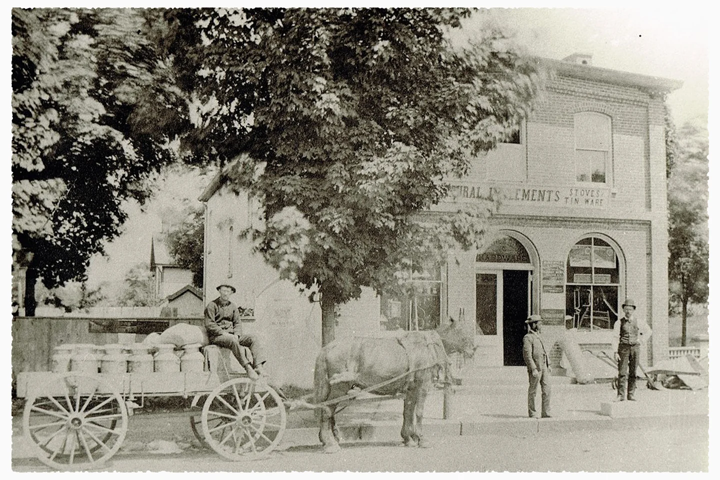
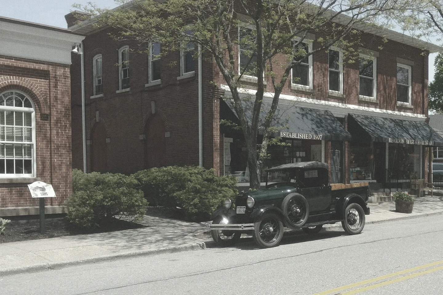
The Reardon Briggs visual identity was developed as part of a larger effort to refresh and carry forward the legacy of a beloved Millbrook, New York institution. Reardon Briggs has been a cornerstone of the community since 1895—first as an agricultural equipment supplier and later as the hardware store locals know and trust today. After more than 70 years of multi-generational family ownership, the store changed hands, and the new owners saw an opportunity to honor its deep roots while reintroducing it to a new generation.
Our task was to create a visual identity system that could flex across a variety of touchpoints—from outdoor signage and in-store displays to product tags and branded apparel. The result is a visual identity that pays tribute to the store’s enduring heritage, while introducing a clear and cohesive look that feels right at home in the small-town charm of Millbrook. It balances timelessness with adaptability, offering the flexibility needed for future applications while standing apart from traditional hardware store aesthetics.
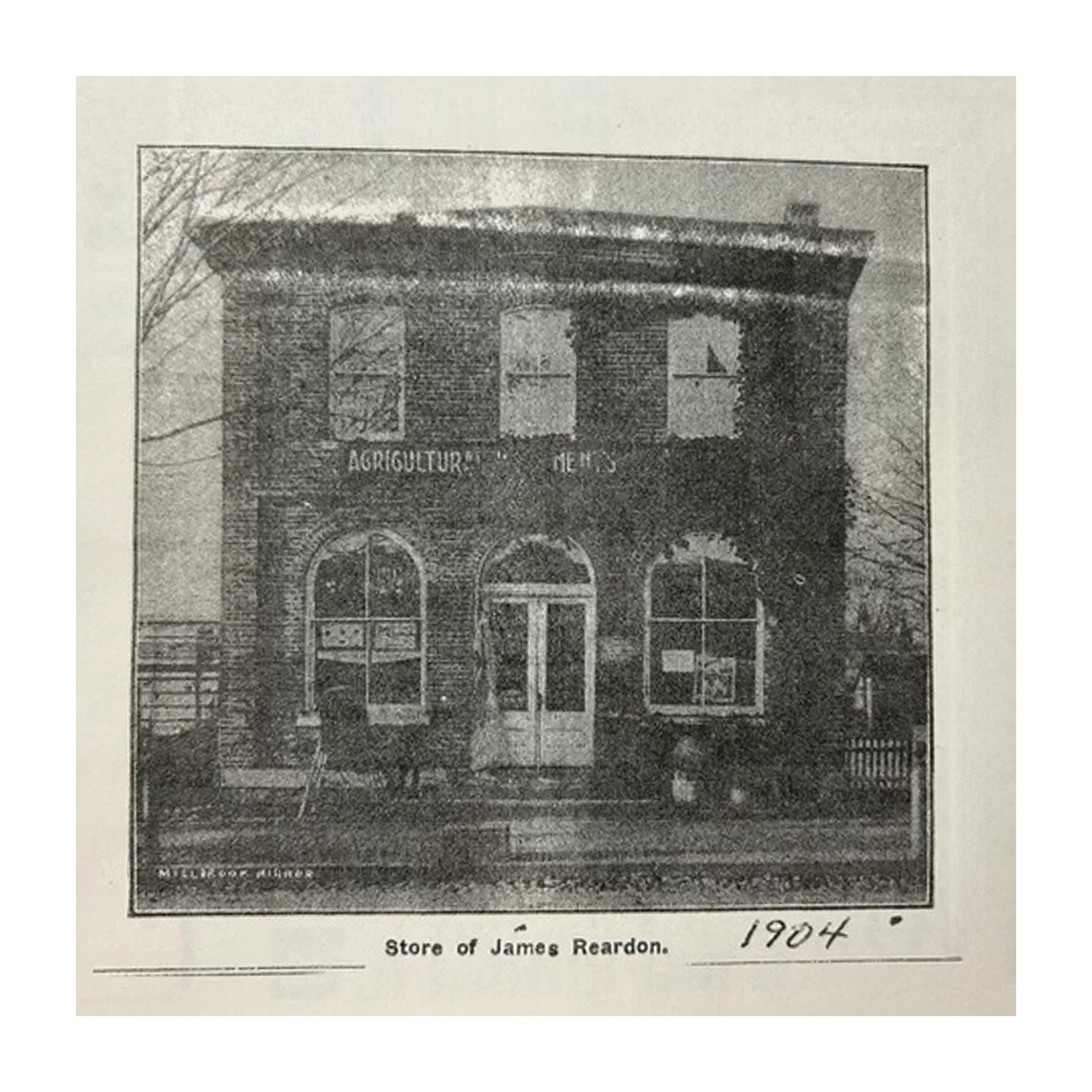
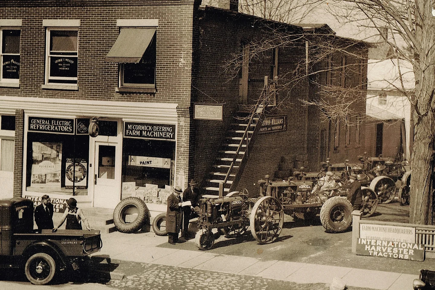
James Reardon, Anthony Briggs and Harold Briggs incorporated their hardware and farm equipment business formally in 1917. The business had been established more than 10 years prior to incorporation when James Reardon invited the Briggs brothers, who had recently left farming to join the business.
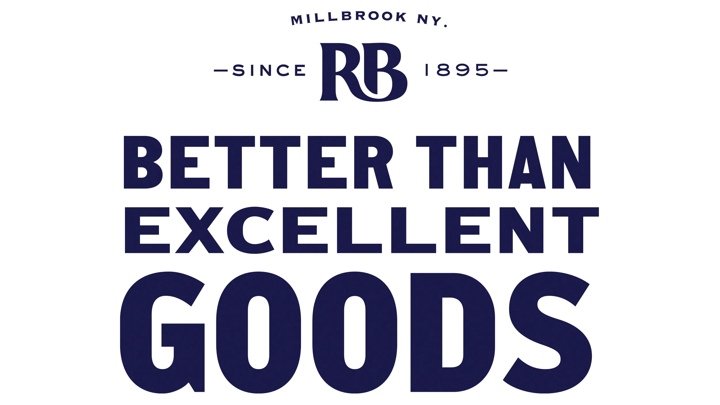
The client’s vision for Reardon Briggs moving forward was to highlight what has always set the store apart: a local, personal, service-first experience. While the product offering remains broad, the goal was to create a more mercantile-like atmosphere—something that feels authentic to Millbrook and clearly distinct from the big-box competition. The Reardon Briggs visual identity plays a central role in supporting this shift, helping to express a sense of place, history, and community.
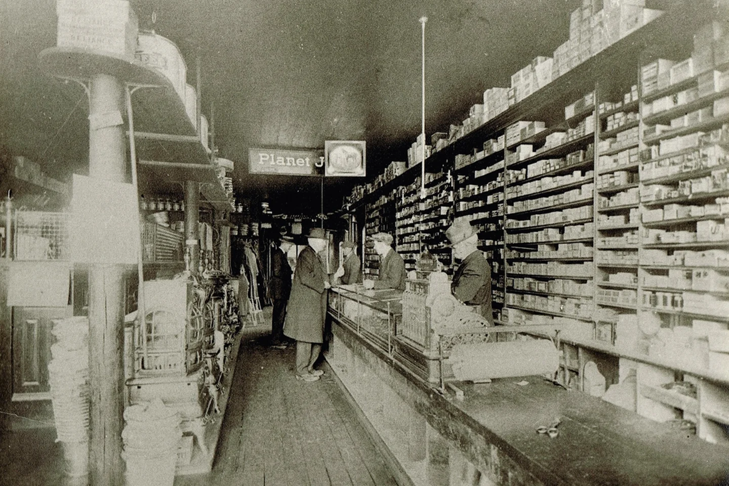
As we began gathering references, we were drawn to the eclectic mix of signs and displays from the store’s early years. That led us down a rabbit hole of vintage hardware store imagery, where we found inspiration in the organized density of products and the variety of signage. Many of these signs were purely typographic, often limited in color, but rich in character. We identified a range of lettering styles—grotesque sans serifs, industrial gothic forms, and distinctive incised serifs—that reflected both utility and personality. This mix resonated with the client, capturing the balance between an extensive product range and a carefully curated, small-town feel—an idea we carried forward into the Reardon Briggs visual identity.
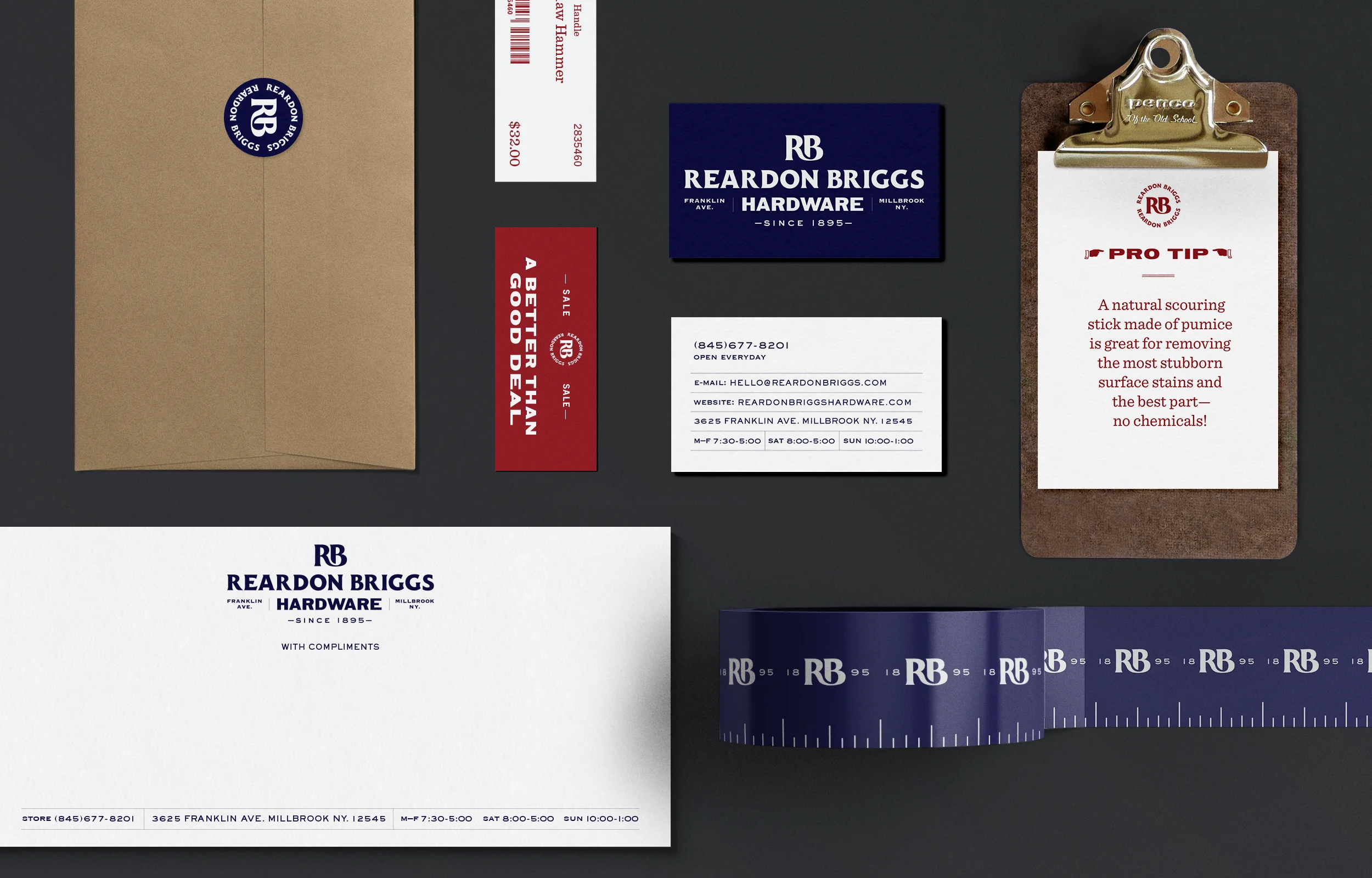
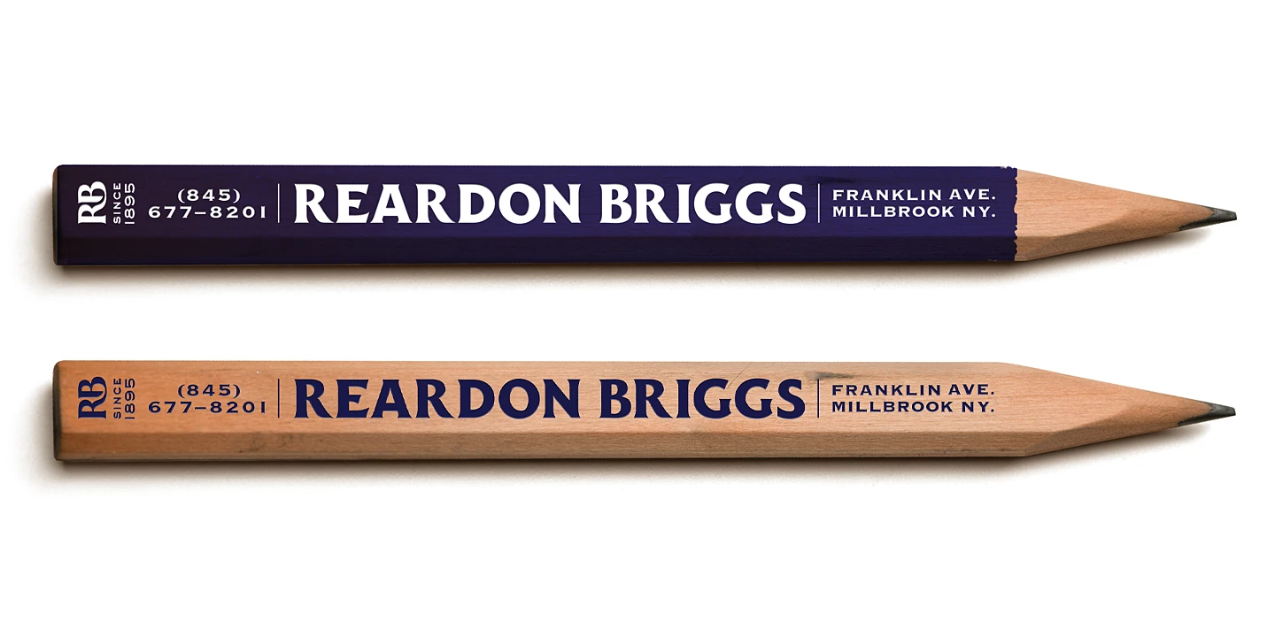
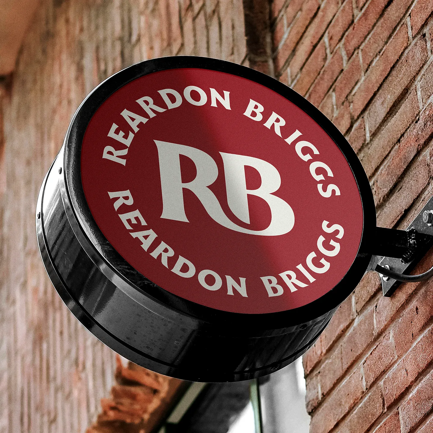
Given the wide range of applications for the Reardon Briggs visual identity, we developed a suite of logo lockups and configurations to ensure flexibility across all touchpoints. While consistent at their core, the lockups were deliberately varied—reflecting the eclectic charm we discovered in our research. From larger-scale building signage to small shelf labels, each version was designed to feel cohesive while allowing for context-specific expression.
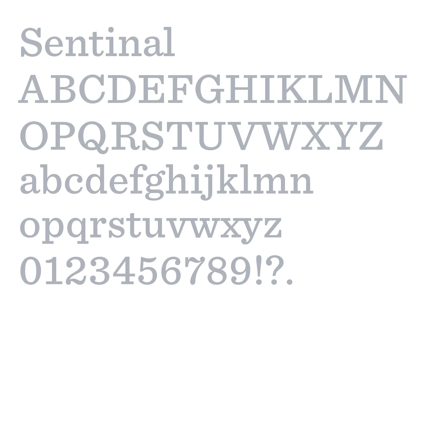
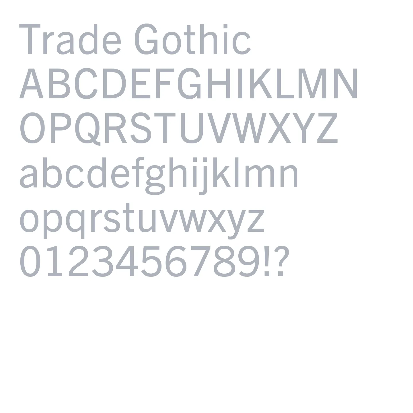
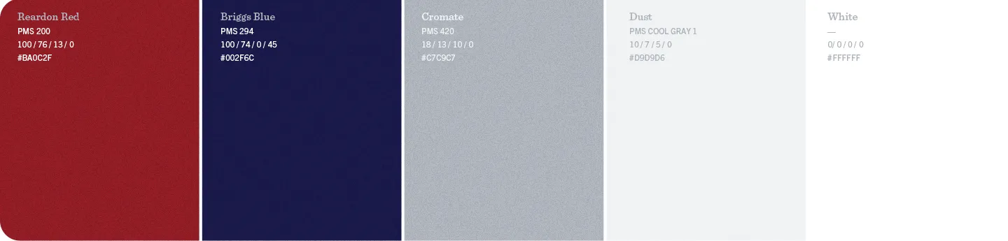
We selected two companion typefaces that could work together or on their own, offering both consistency and contrast across the system. Their character relates to the vintage store ephemera found in our research, helping to ground the identity in the store’s history. The color palette was kept intentionally tight to ensure strong visibility, easy application, and a timeless look—especially when extended to soft goods like hats, shirts, and bags.
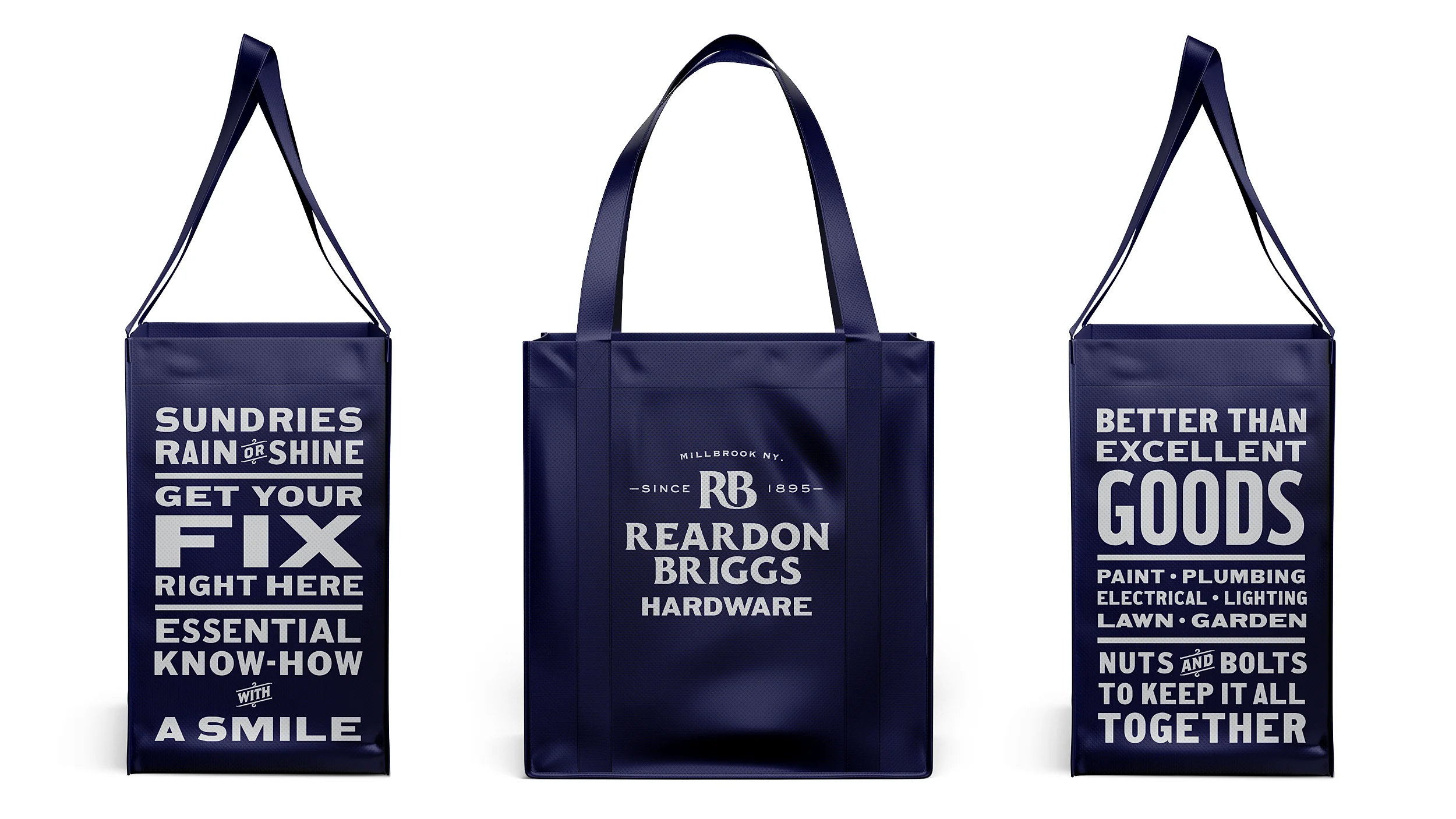
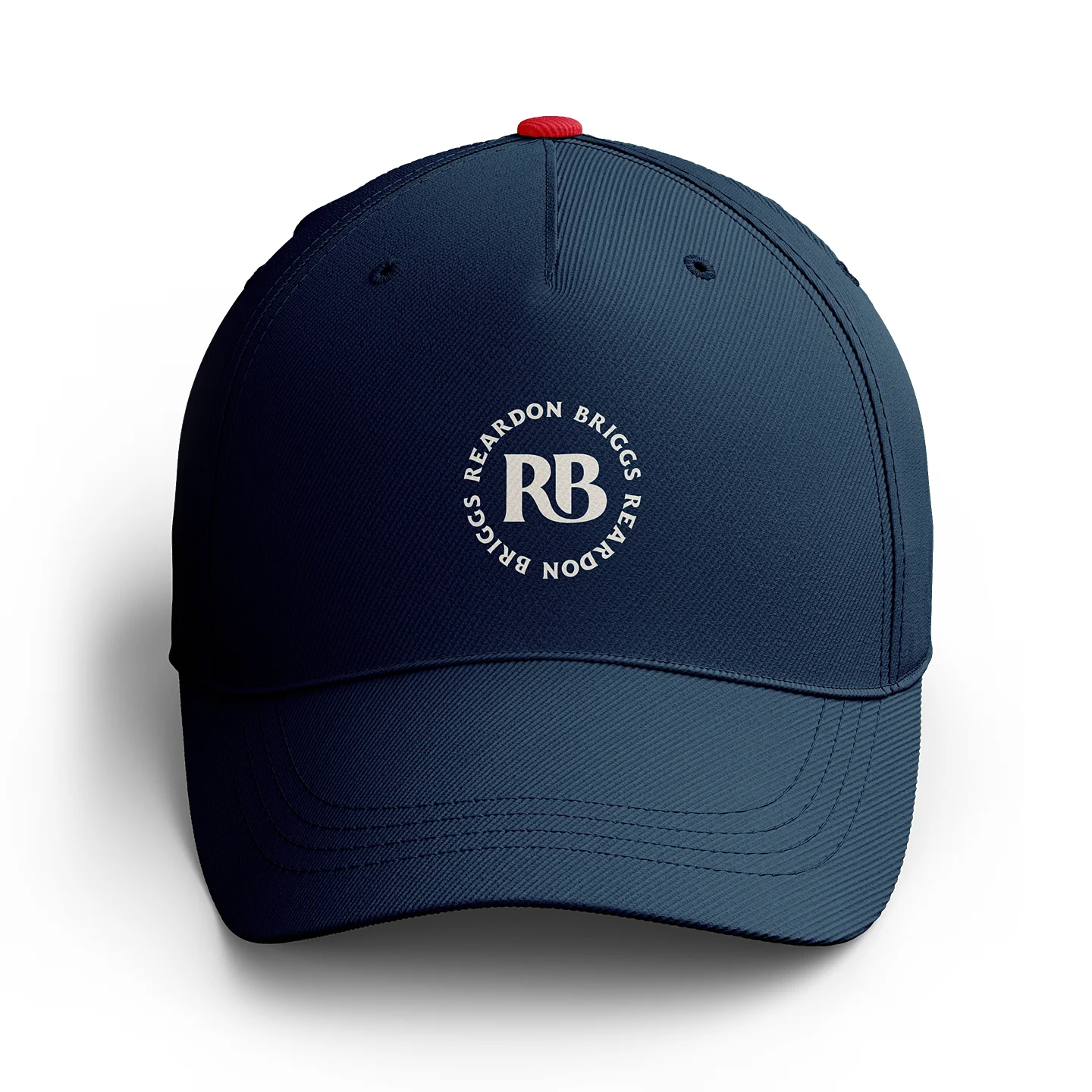
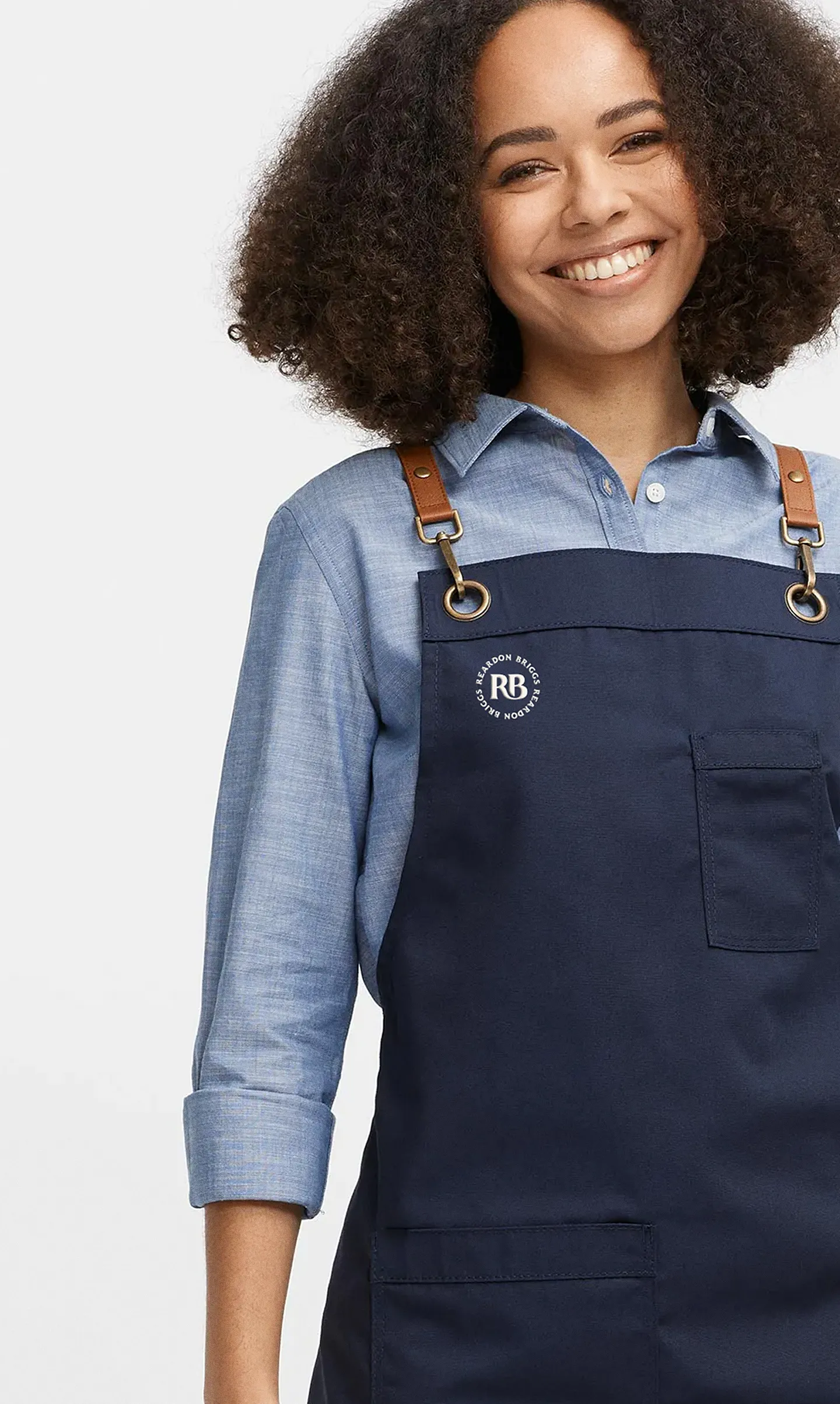
A signature element of the Reardon Briggs visual identity is the custom drawn monogram ligature between the R&B letterforms. We wanted the identity to be something that people would be proud to wear, it speaks to that heritage quality but through a more contemporary expression.
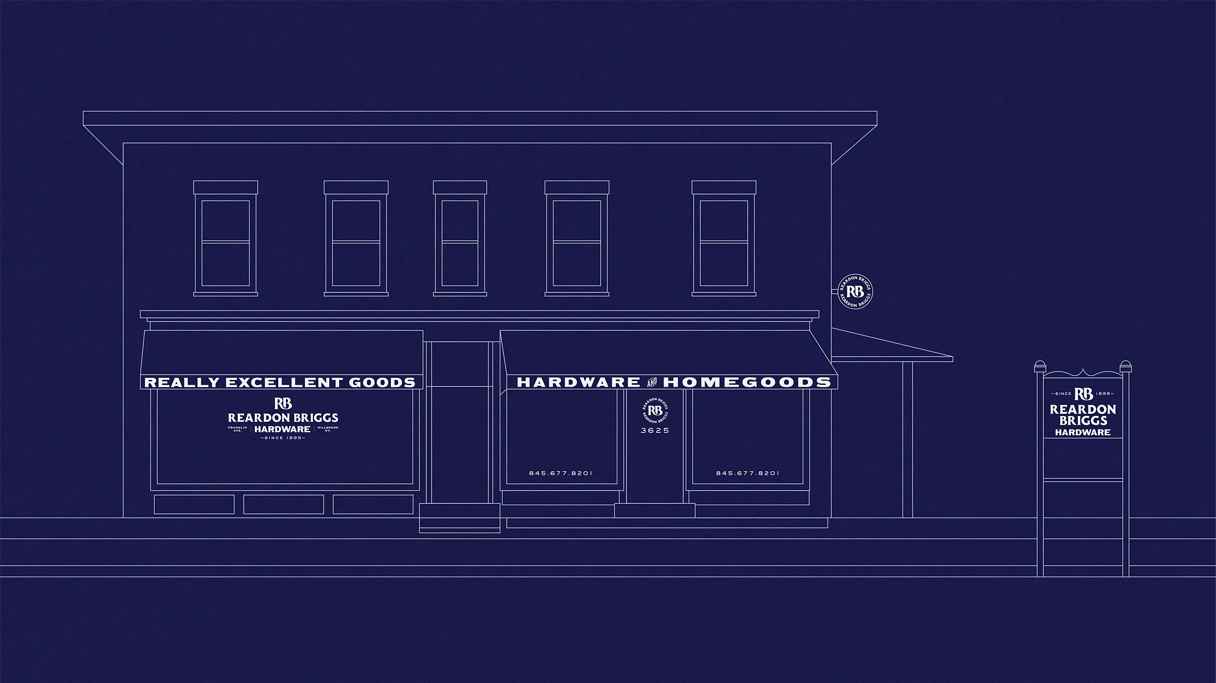
As part of our concept presentations, we explored how the visual identity could come to life through signage. Awnings, in particular, offered a natural, analog marquee for communicating what Reardon Briggs offers. At the same time, we had to carefully navigate Millbrook’s township regulations around retail signage to ensure proposed applications met local requirements and expectations.
The front of the store features large windows ideal for presenting curated displays of products but also as valuable real estate for the new identity.
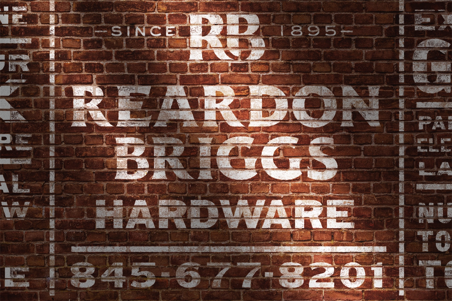
The back of the store is a largely uninterrupted red brick surface. We proposed the future installation of a hand painted ghost sign as an opportunity to draw attention to and create awareness for the store from another angle. Typographic assemblages are a great way to present a large body of content in a graphically powerful way—we’ve looked to this approach on bookcovers as well as branded campaigns—good typography can be a powerful image.
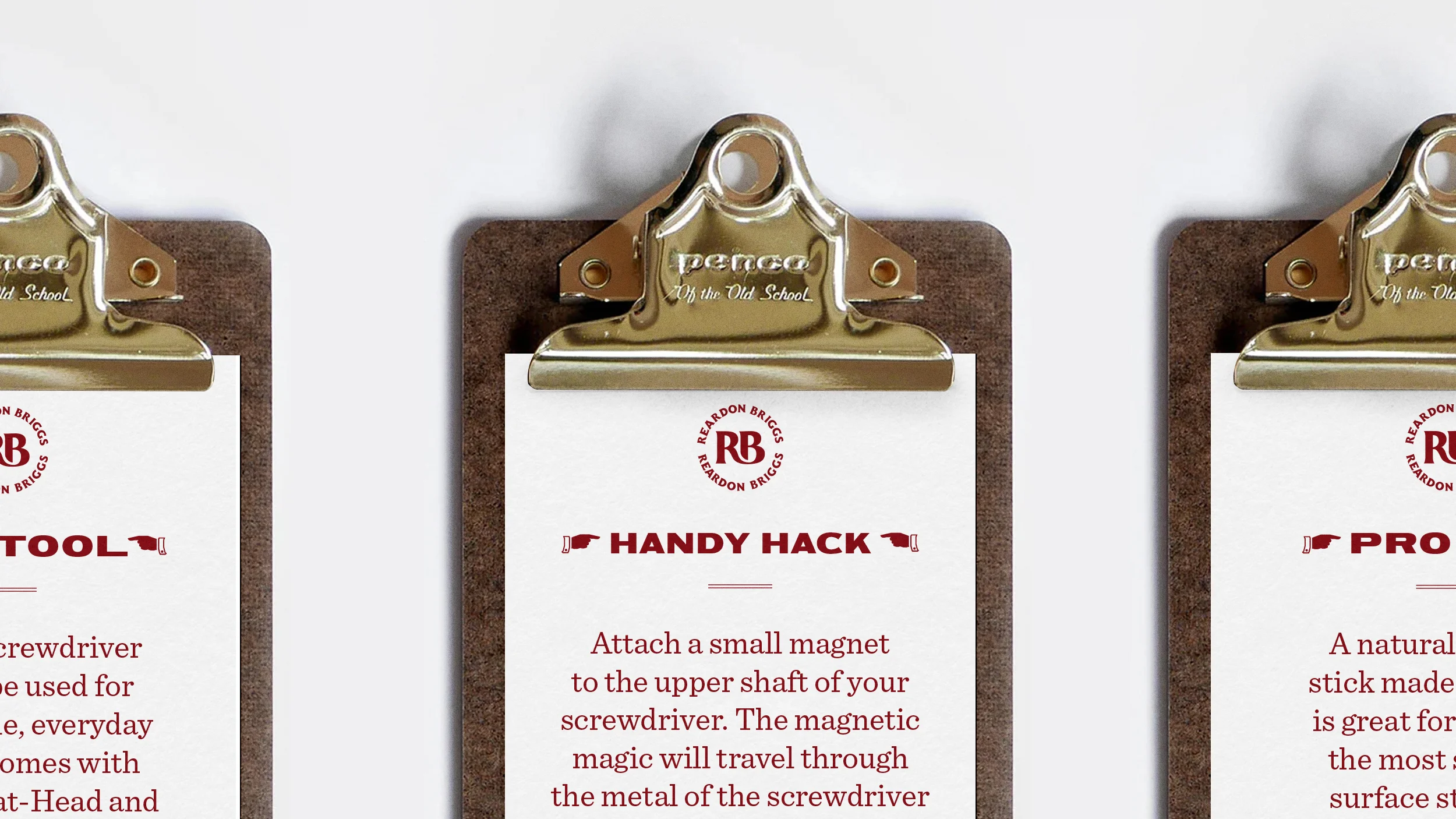
A common practice in small, service-focused shops—like bookstores—is sharing personal tips and recommendations with customers. To bring that spirit to Reardon Briggs, we introduced small clipboards that can hang on shelves, offering helpful advice, product suggestions, and DIY hacks. The notes are easy for the ownership to swap out, making it a low-maintenance way to keep information fresh and extend the store’s hands-on, personal approach to service throughout the shopping experience.