This Is What Happens When Women Read
A typographically-driven identity and messaging platform serve as a catalyst for the vision of achieving liberation through literature.
Project Components:
Brand Identity
Messaging, Voice & Verbal Strategy:
Mary-Catherine Jones
Strategy:
Heidi Hackemer
Website:
Principle
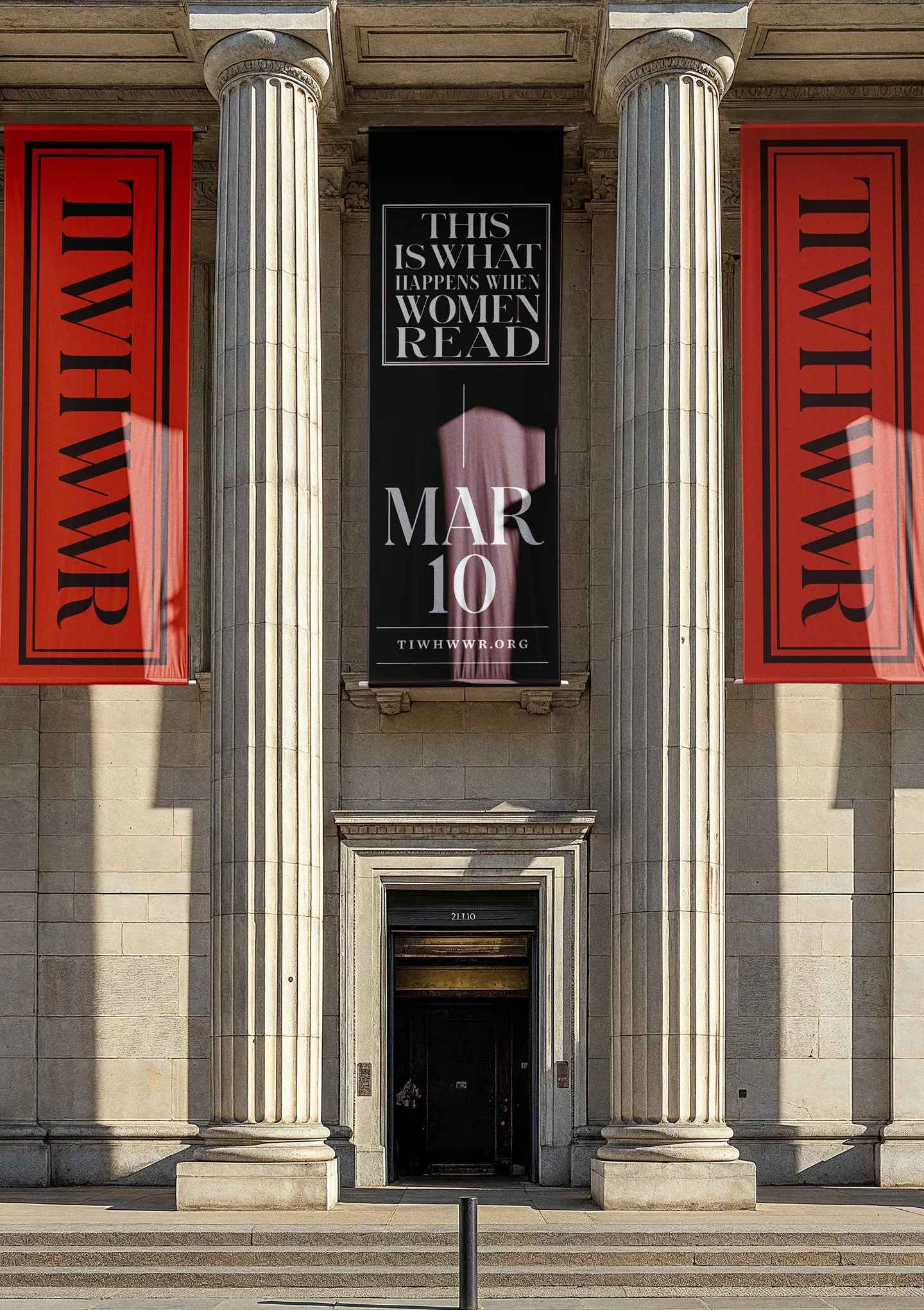
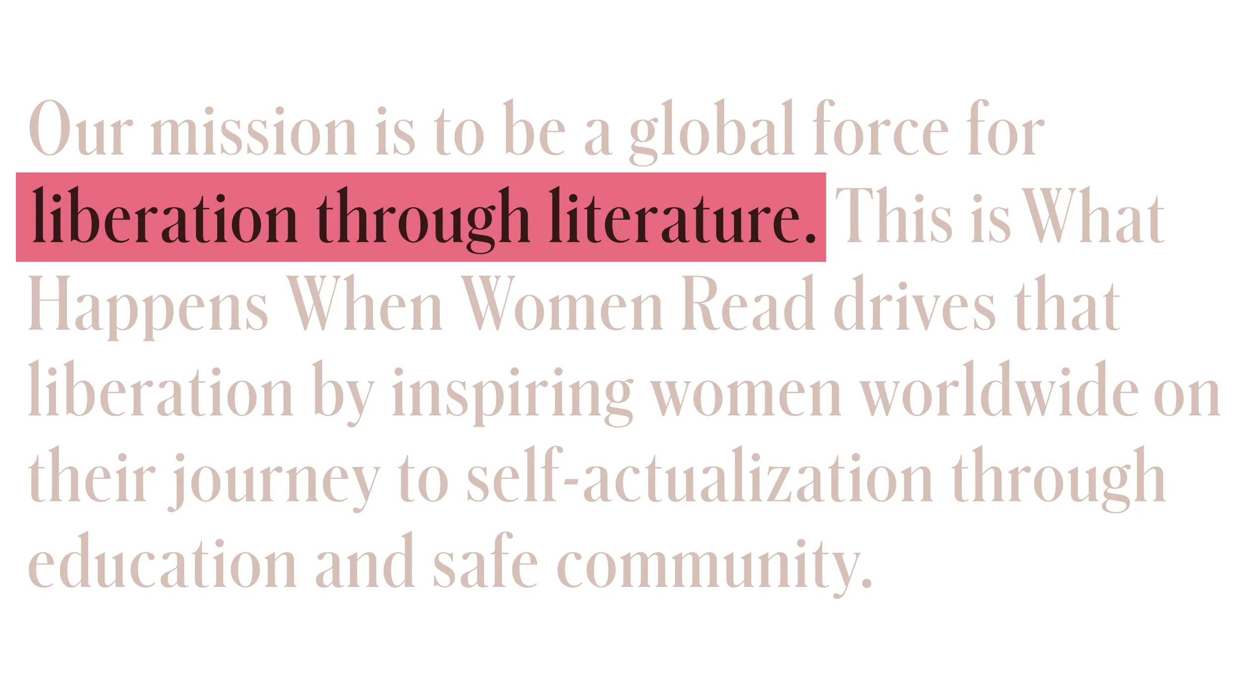
Founded by author and musician Julianna Glasse, This is What Happens When Women Read is a global initiative dedicated to the liberation of women through education and safe community. Our task was to craft a visual identity and messaging platform that would capture the intelligence of the initiative while infusing it with an exuberant energy that would resonate for a broad demographic. The visual identity and messaging were designed to help drive awareness, establish a legacy, and inspire action and involvement—inspiring women to find their true selves while establishing safety for the authenticity of others to flourish.
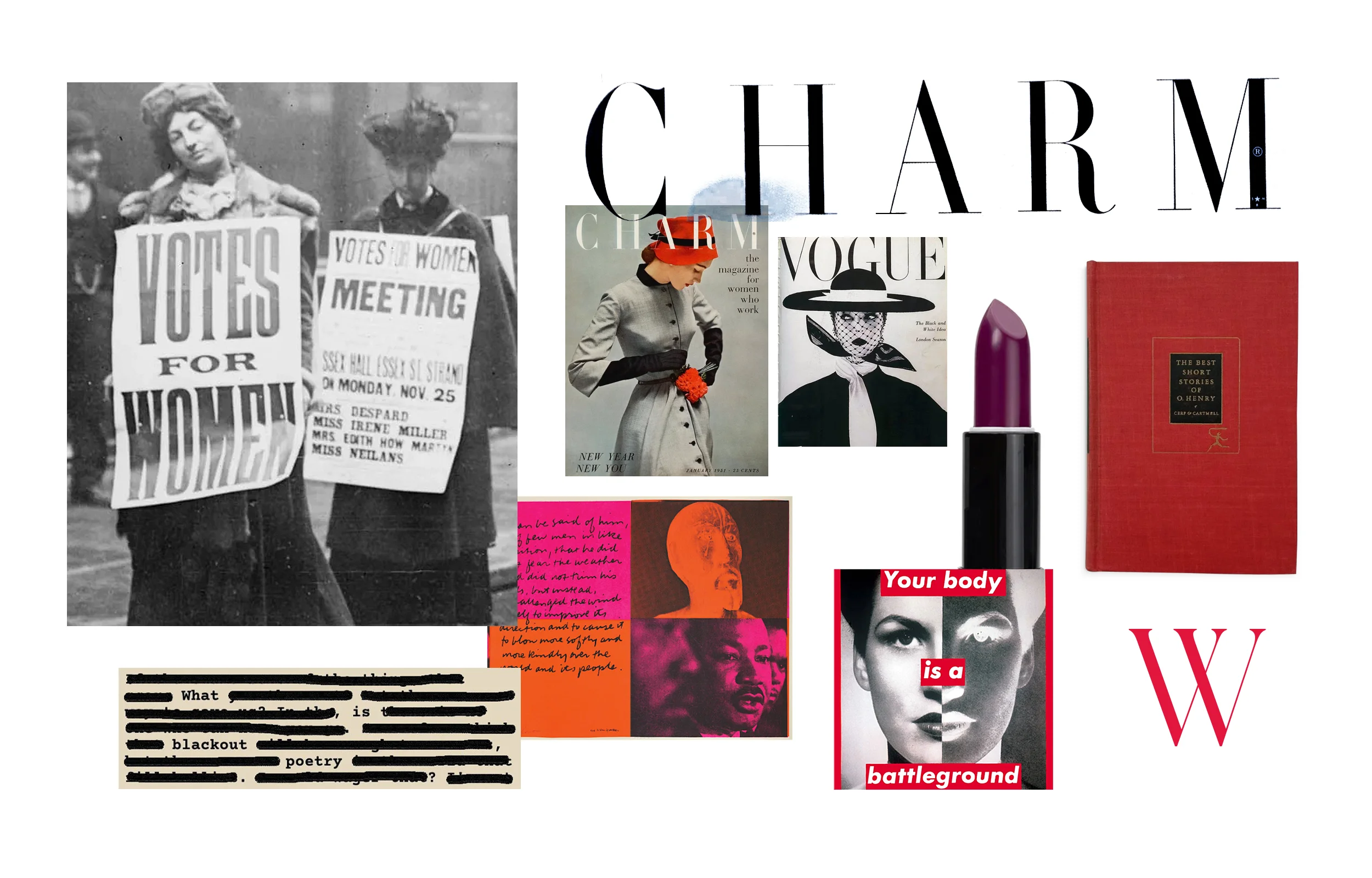
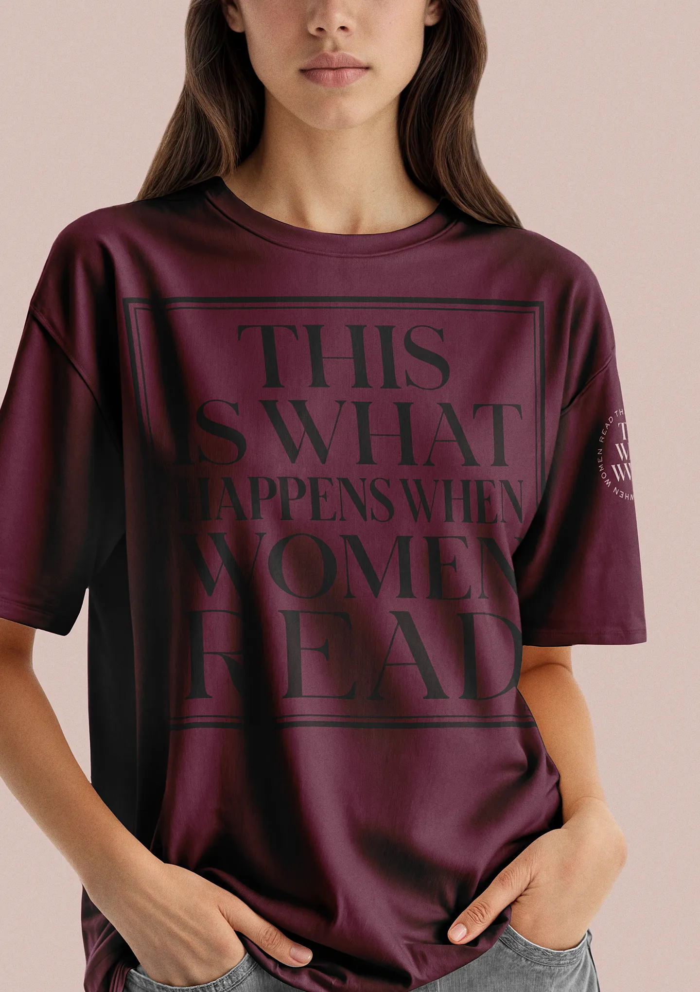
Inspiration was drawn from the bold spirt of the Women’s suffrage movement and merged with the more refined lettering style synonymous with fashion editorial design—specifically the work of Cipe Pineles. The attention-commanding directness practiced by artists, including Jenny Holtzer, Barbara Kruger, and Sister Corita Kent reinforced the concept that the message drives the art and provides the opportunity for subversive vernacular.
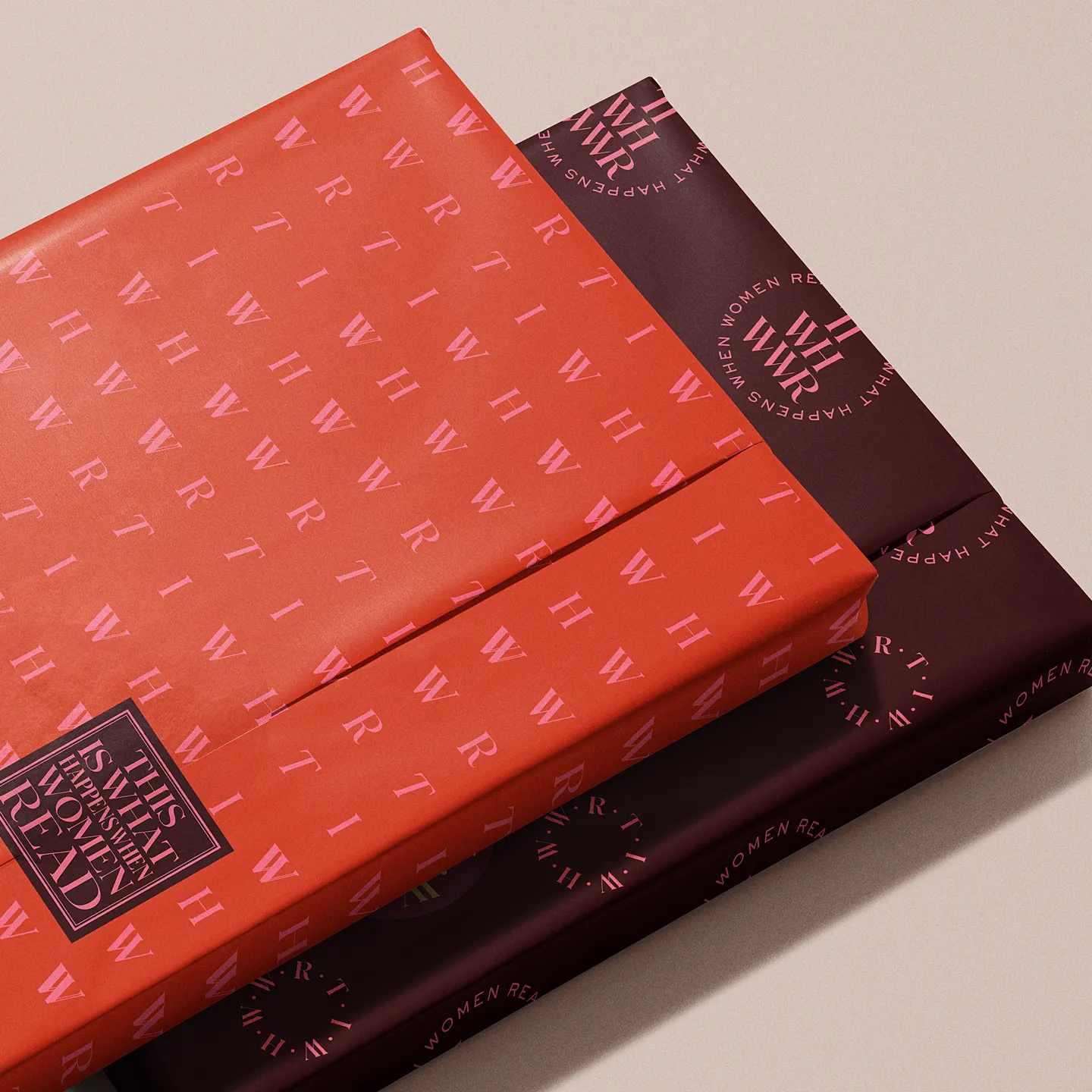
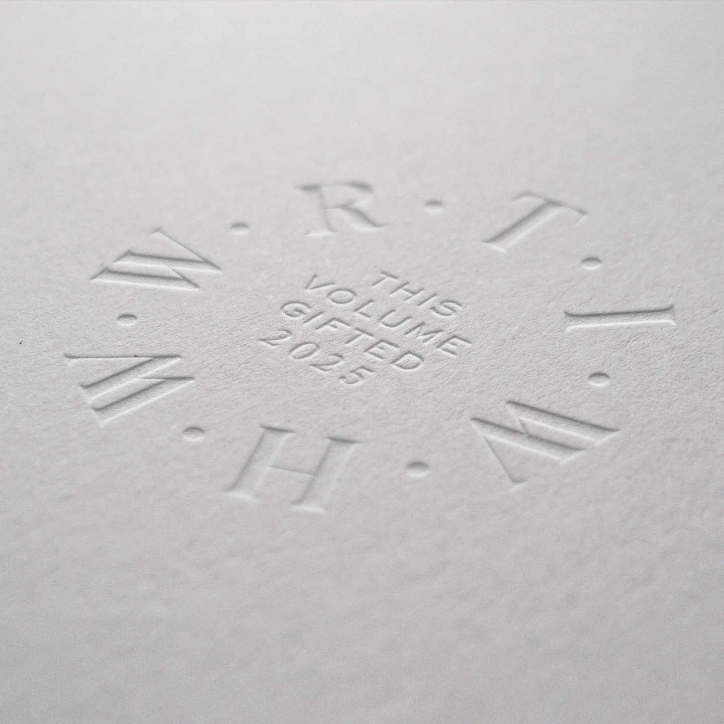
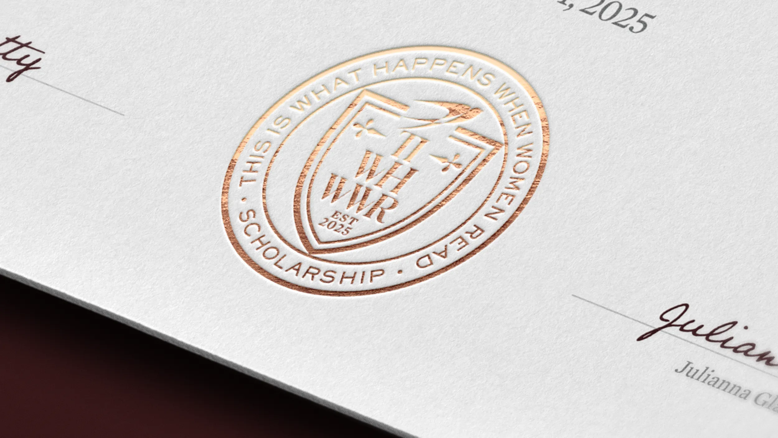
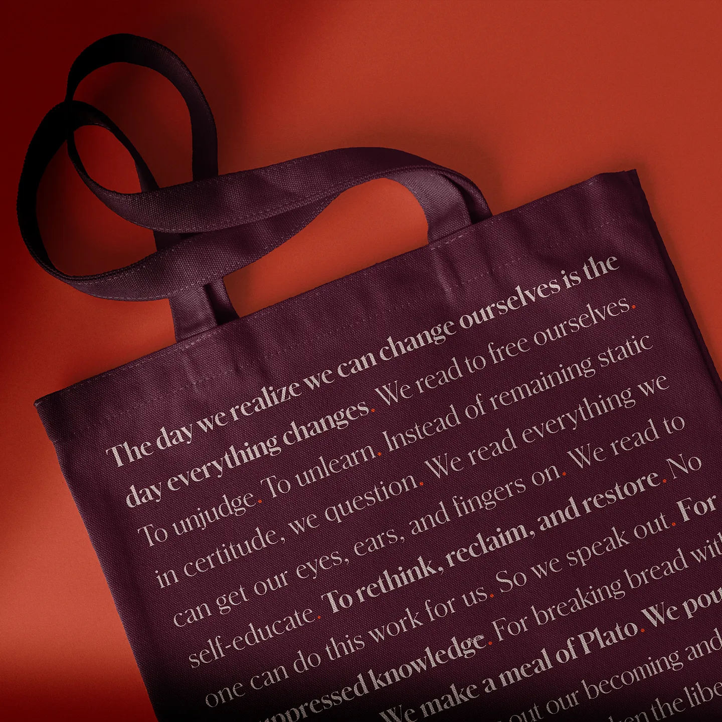
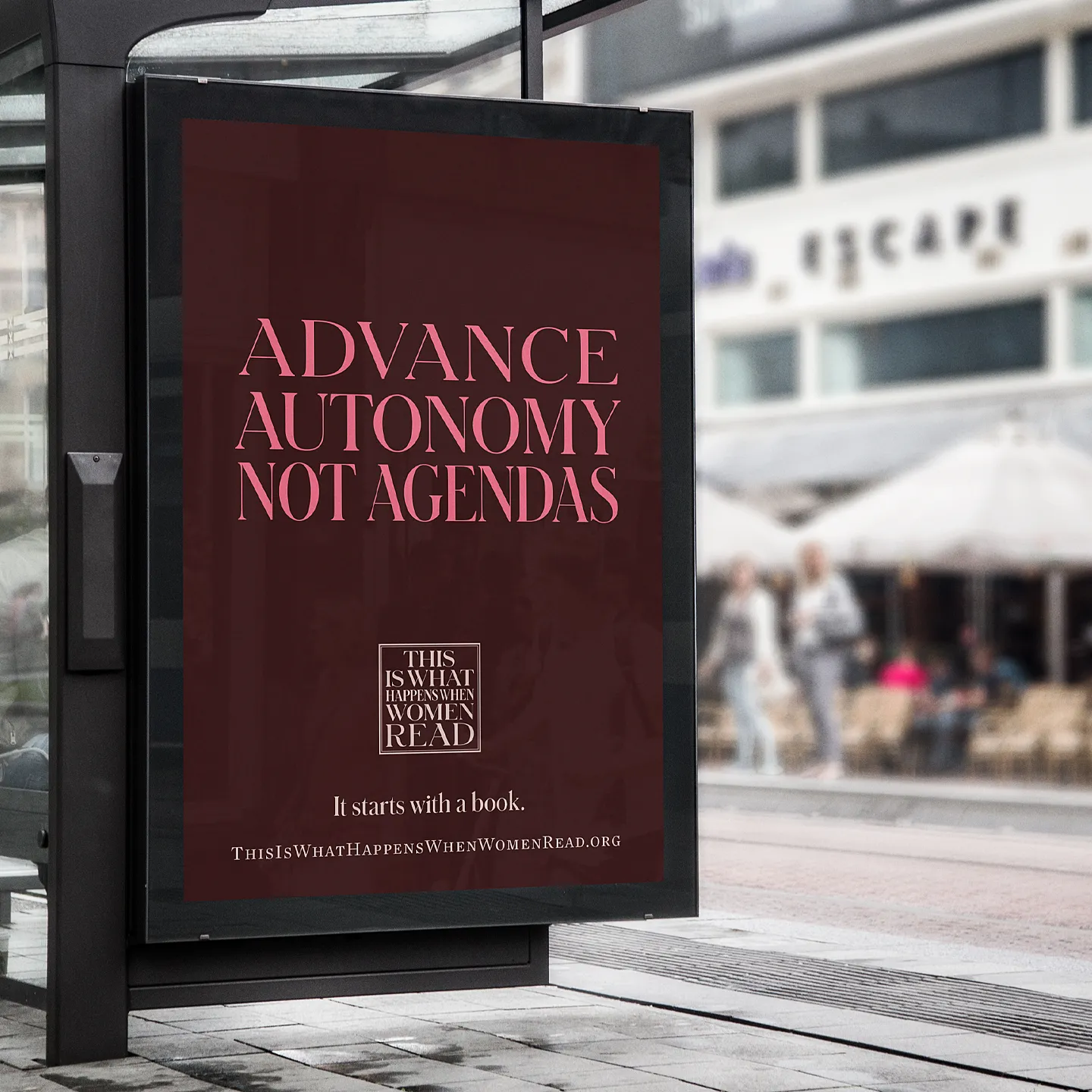
A collection of wordmarks and graphic labels were crafted to provide variation across a range application. The framed holding shape was inspired by classic cloth bound book cover plates. This solution helped to give the identity a visual authenticity and resilience while also helping to retain legibility and clear space.
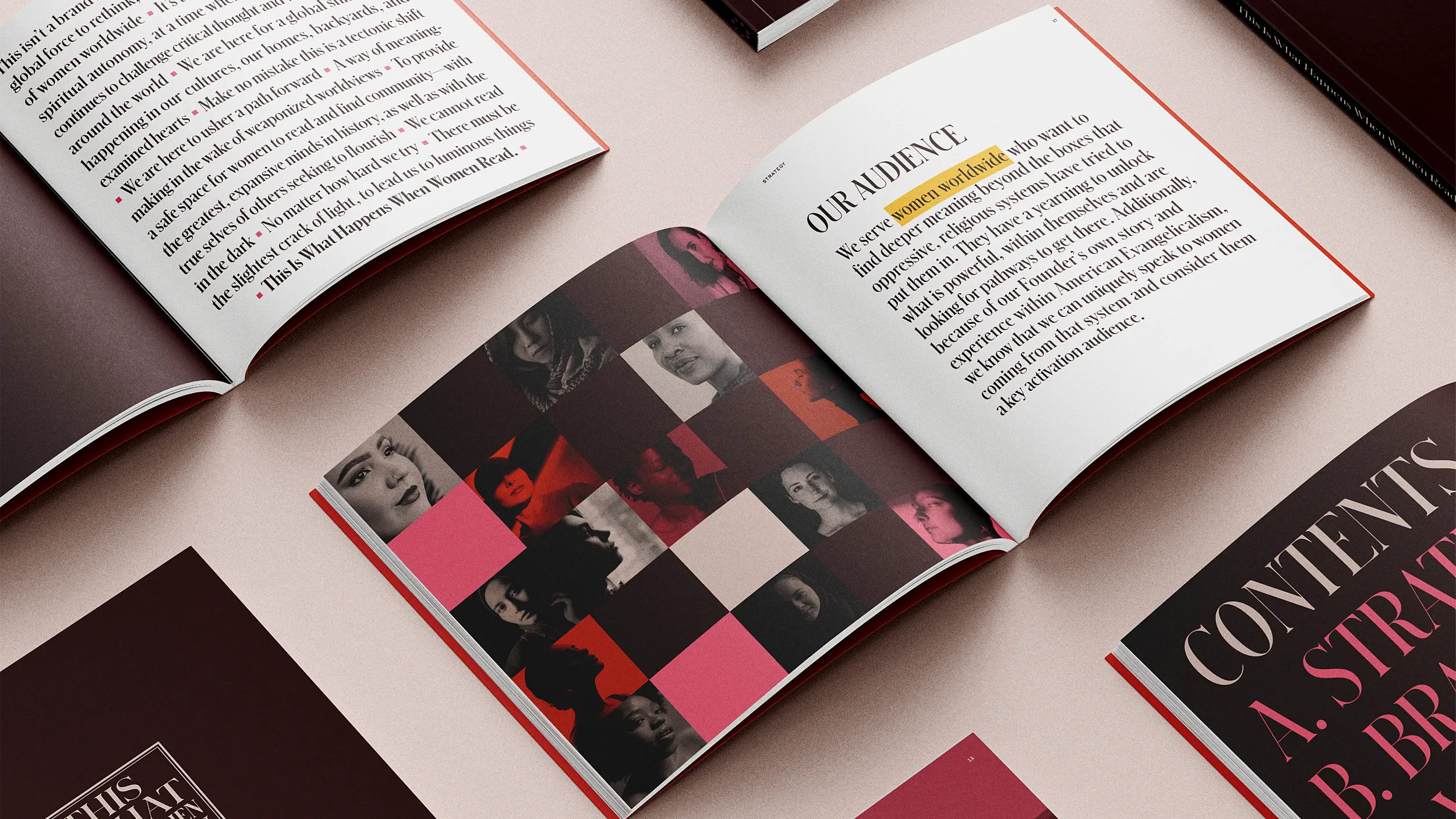
The initial phase of work included the delivery of a brand book to be used by collaborators and creative partners. It functions as a source of truth for the strategy, visual design, voice and tone and functions as a working example of the identity in action. The brand book serves to inspire, empower, and guide—to help ensure a consistent presentation of the brand across all touch points.
Motivated by the founder’s story, the defined brand values and pillars, the brand anthem is an emotional declaration that captures the heart and soul behind the organization.
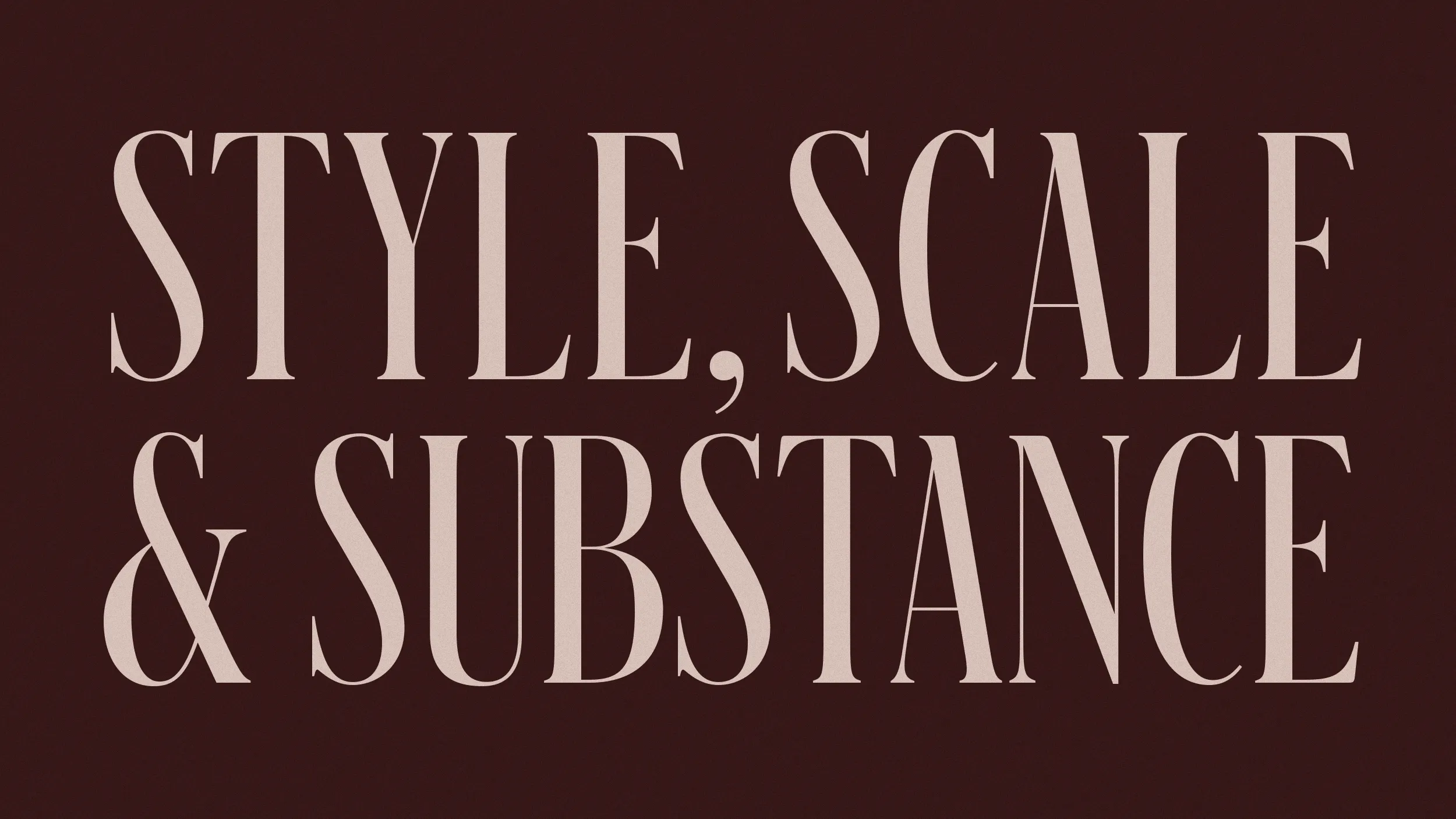
The typeface family Schnyder provided the right balance of refined high contrast and organic variation. The mix of different weights and optical styles allowed us to create visually striking and impactful typographic expressions.